Redesigning the PBS Video App for Mobile
I led the redesign of the PBS Video mobile app to enhance the user experience and reflect the newly refreshed brand. I worked closely with stakeholders to design an experience to improve wayfinding, increase video engagement, and highlight hyper-local content that’s unique to PBS.
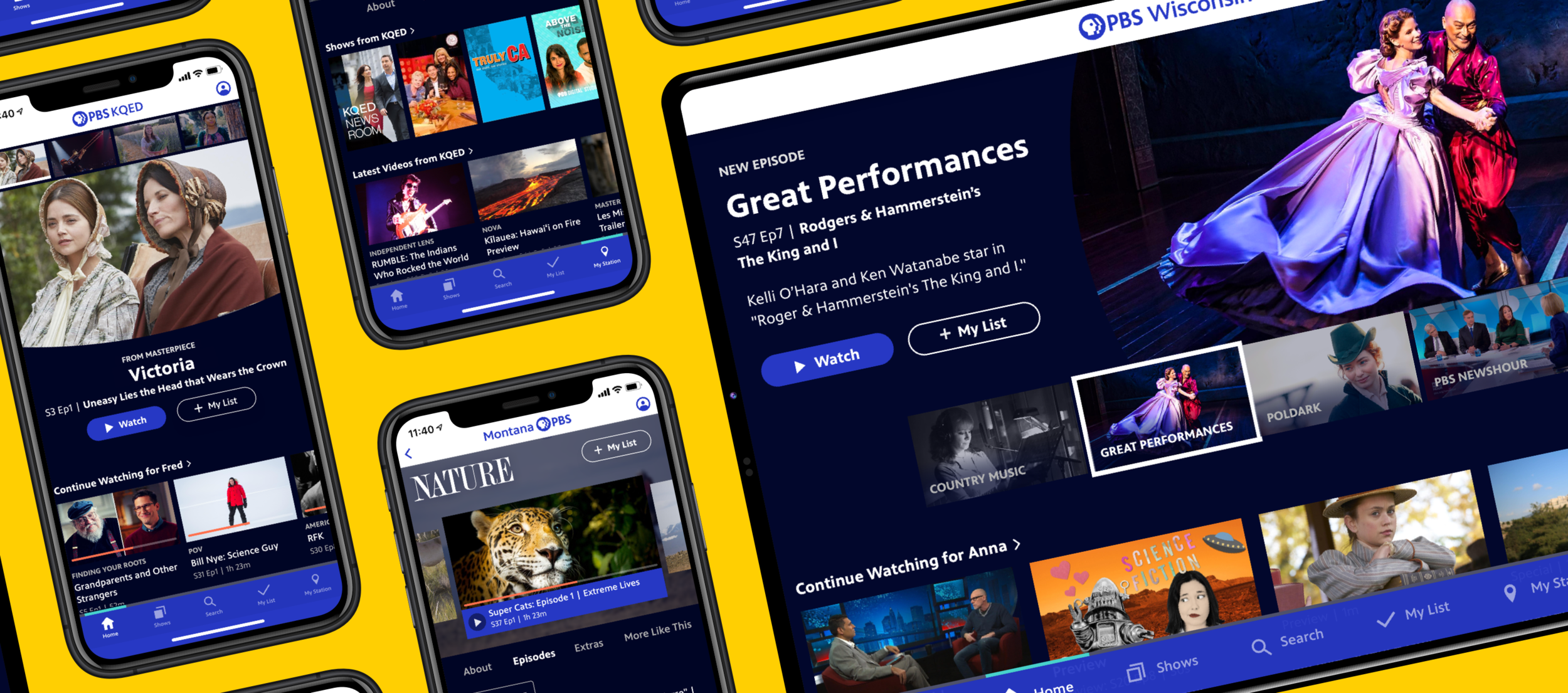
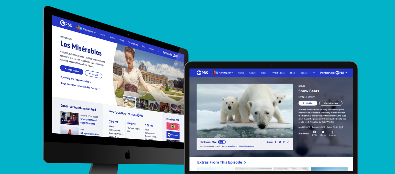
Before
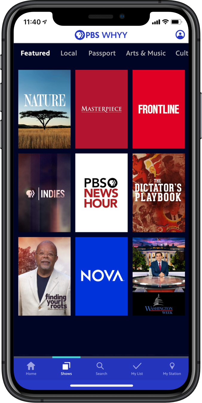
When I first joined the Apps team, we had just undertaken a large data model update: an MVP which was scoped to work within the app’s existing UI, which was designed by my predecessor. That previous version of the app was based on a hamburger menu and left-side navigation structure. It hadn’t seen a major redesign in several years.


Early Concepts
The New Brand
This project began a bit unconventionally, as it was tied to the design process of establishing the new design system for the PBS brand. We collaborated closely with the team doing the on-air motion graphics explorations, to explore what the brand’s core graphic elements could be across platforms. The elements below were born of the circular forms of the logo.
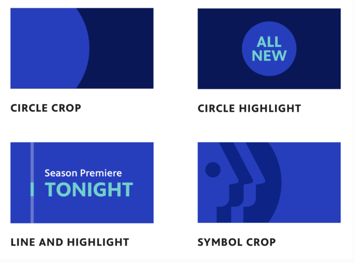

Brand Proof-of-Concept Explorations
I led high-concept creative directions of how these new brand elements (specifically circle crop and line-and highlight) could manifest on our Mobile and TV apps. Since imagery was at the heart of the new brand, and I had pressure test whether the elements would work in a UI, I started with iterating through lo-fidelity wireframes of key screens: options for Home, a Collection, and a Show.


Since this exploration was primarily focused on the visuals, I quickly turned these base wireframes into quick-and-dirty visual design concepts — my aim was really to validate whether the new brand elements could work and see how we could conceptually get the new design principles (Moving, Welcoming, and Bright) across. This was a chance to throw spaghetti at the wall with very loose requirements in mind, so I played with ways we could simplify how we featured and curated content on these key screens. This work was important as early proof-of-concepts of the new brand system.


UX Design Process
Specific Goals
Increase video engagement
Highlight with hyper-local video content that’s unique to PBS
Reflect the new brand
Users and Audience
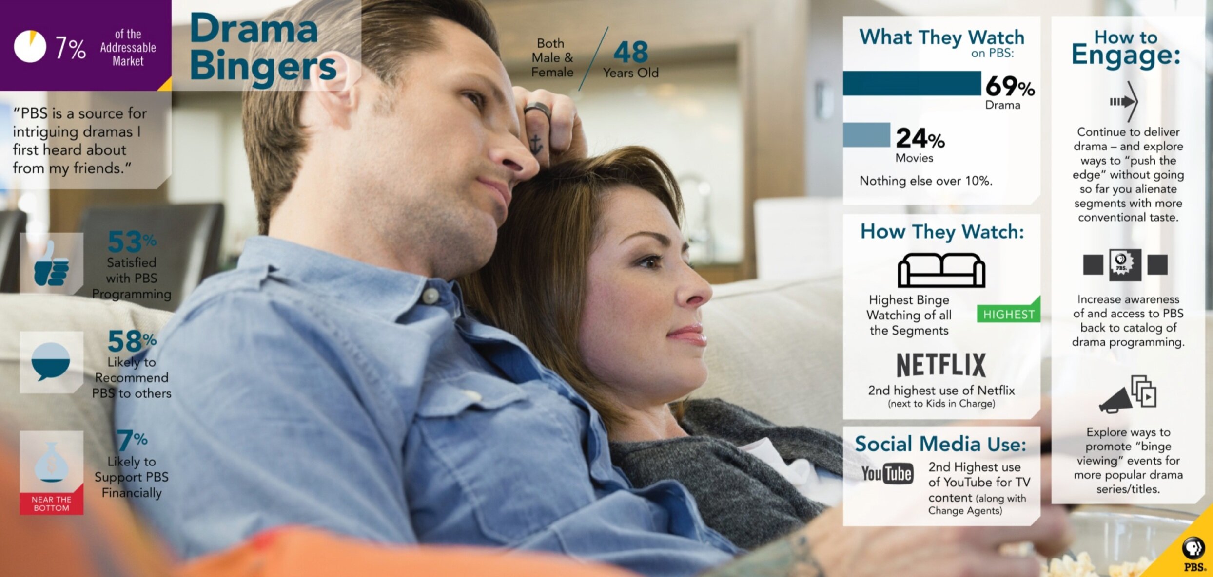
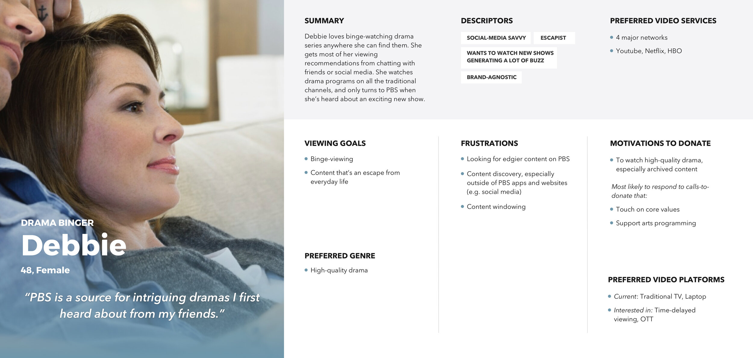
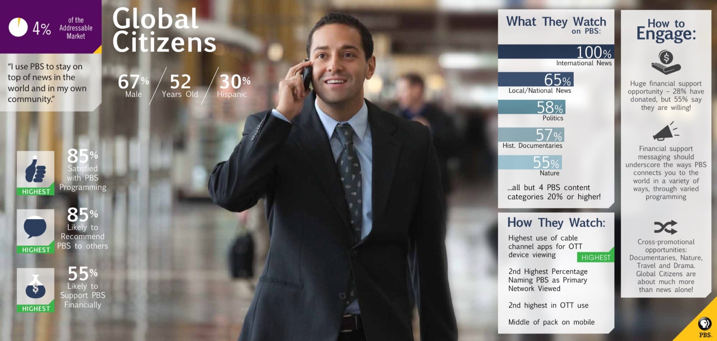
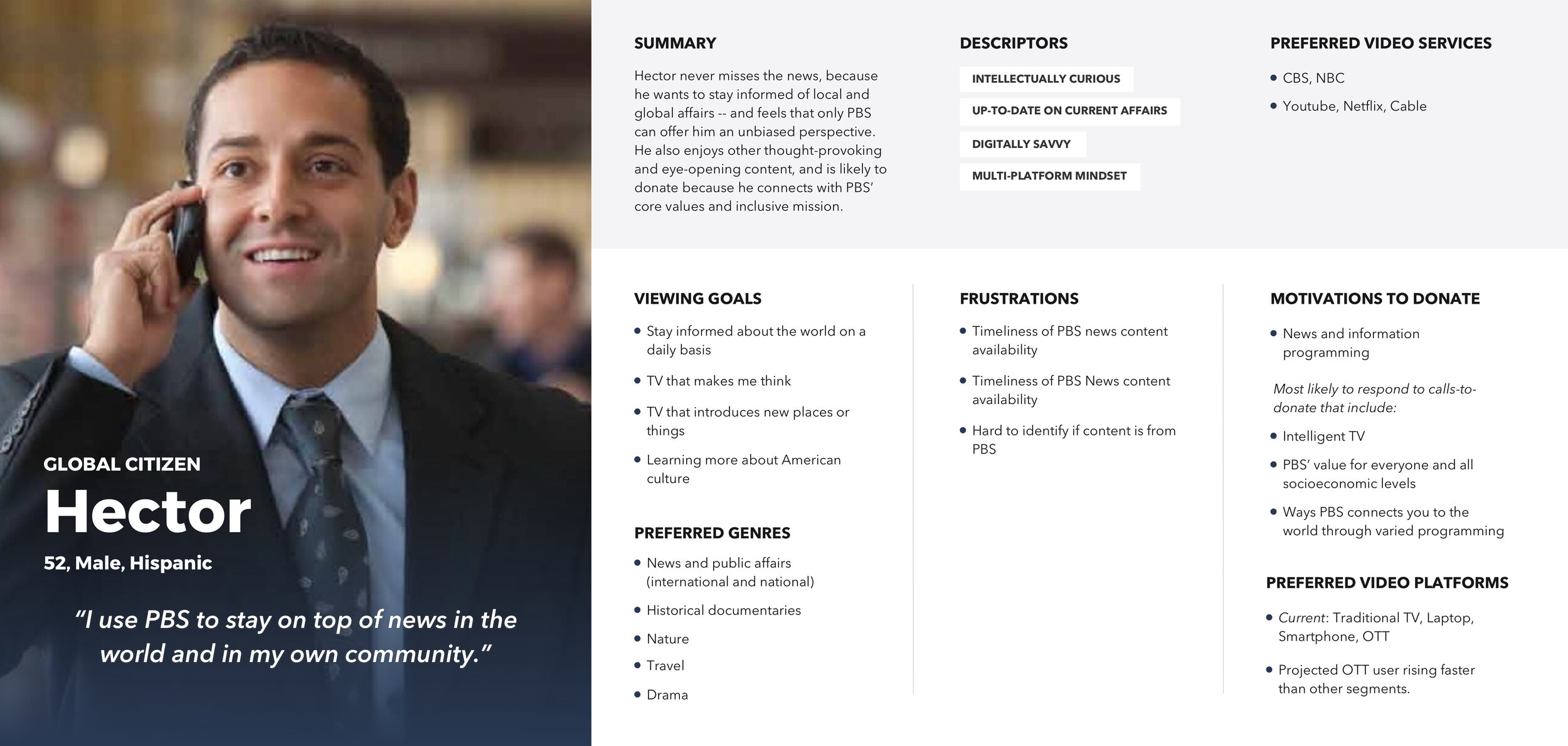
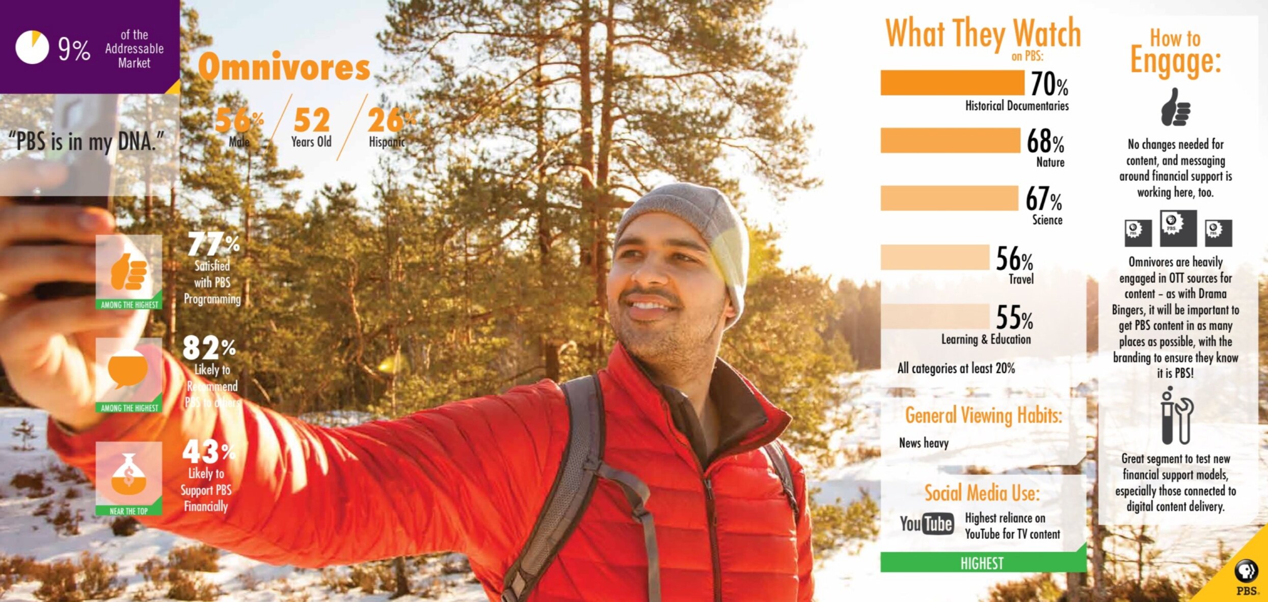
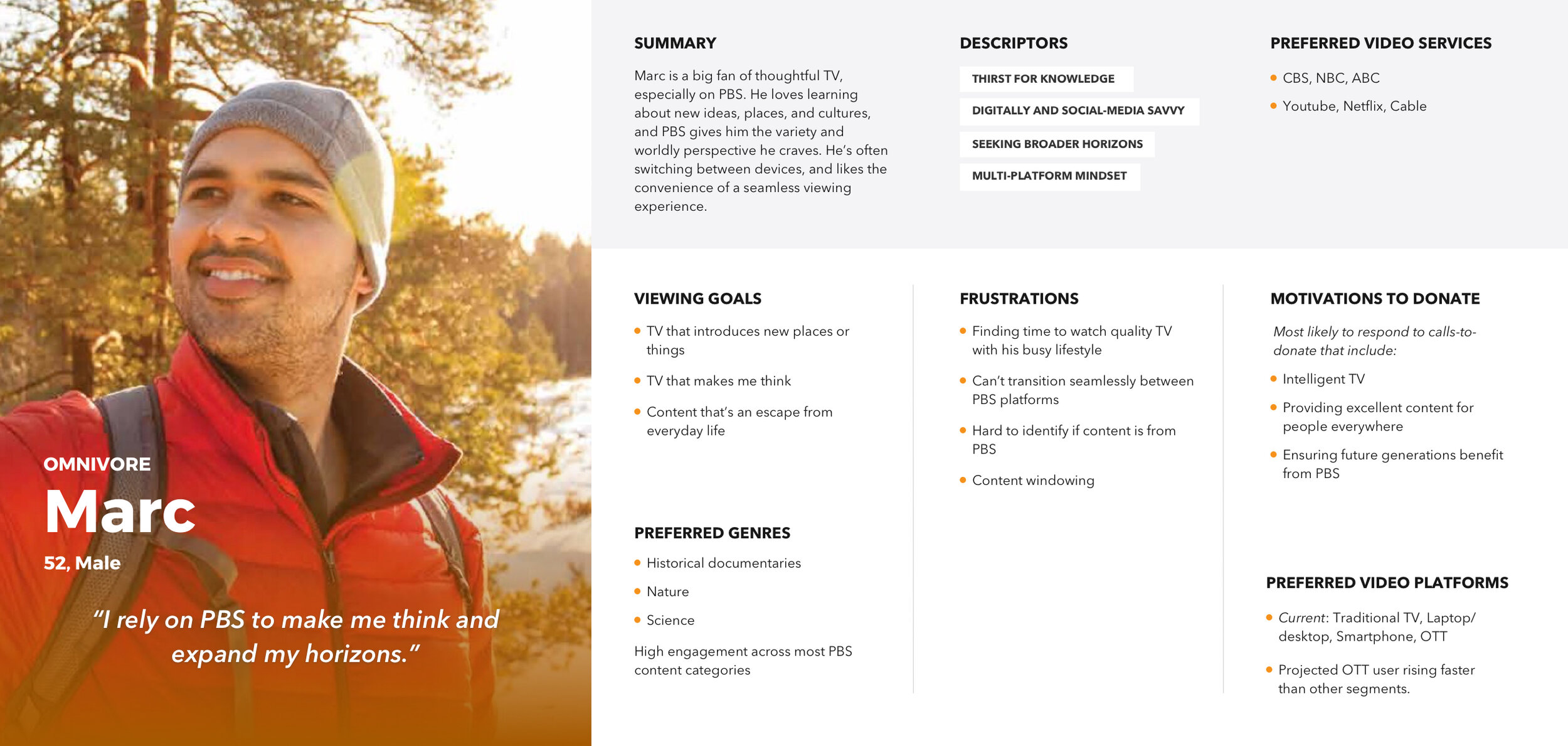
An audience segmentation study of 3000 TV and video consumers age 18-74 in PBS’ addressable market helped inform our work for this project. We identified 3 personas that had the highest mobile usage: the Global Citizen, the Drama Binger, and the Omnivore, and focused on their motivations and viewing goals.
Pain Points of Previous App
Besides Search, many users were using the Home screen as their only jumping-off point and were missing out discovering on a ton of other shows.
A lot of users weren’t opening up the side navigation.
The Show screen was overloaded with too much information, and it took users too long to get to the Episode content they were looking for.
Approach
How do we simplify wayfinding throughout the app?
How do we get our core user group, most of whom come to PBS for 1-2 specific genres of content, to more easily get to the content they want?
How do we boost the visibility of, and give more value to, your local PBS station?
How do we encourage more users to donate to their local station through Passport?
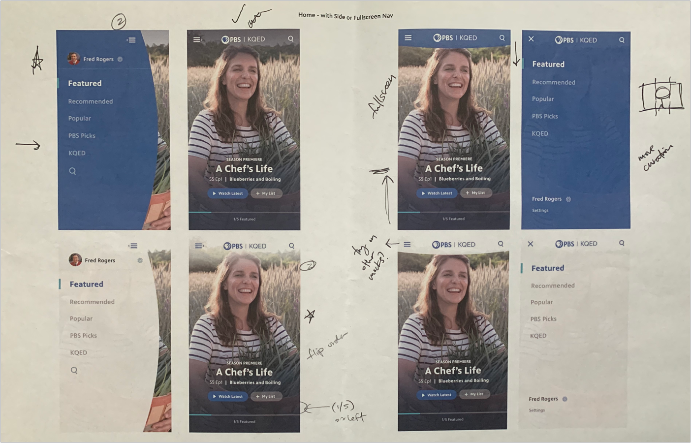
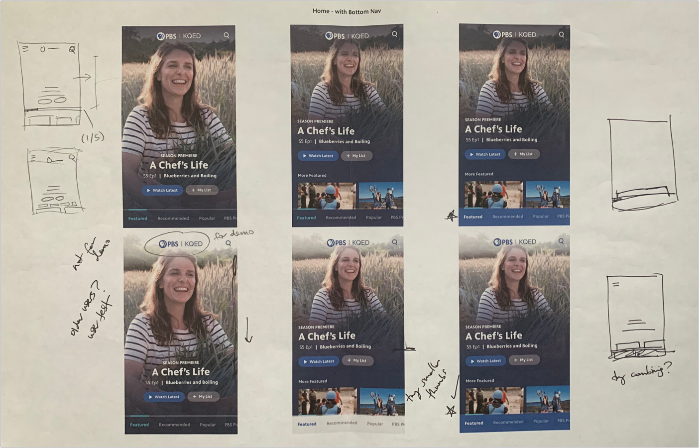
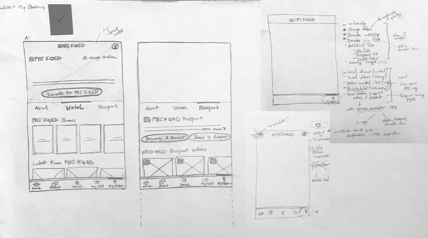
Sketches, Round 1
I started with a wide exploration of sketches around 4 key screens; the Home screen, an individual Show, an individual Video, and the Shows landing screen. I kept the exploration wide, sketching different variations of a bottom navigation and keeping a few side nav options.
Doing the early conceptual wireframes helped us understand that the Home screen needed to communicate the breadth and depth of our content offering. I sketched a lot of new patterns for the big featured area on the Home screen that were improved alternates to the previous app’s traditional (and underperforming) carousel. Overall, the sketches aimed to reduce friction and taps to get to Episodic content. I explored various ways we could use the circle crop and line-and-highlight in the UI.
Home


Show Detail


Show Detail and Video Detail
Shows Landing


Sketches, Round 2
I realized that my initial instinct to implement the circle crop pattern in our existing side navigation was too limiting and to truly improve wayfinding, we needed scrap the options that still relied on a side navigation. Since this was supported by user testing and was also a huge usability win, I focused on sketches utilizing the bottom navigation and fleshing out that IA. Overall, I aimed to solve one of the biggest pain points from users that it took just too many taps to get to something you wanted.
Home

Home, Big Feature “Drop-Ins”

Shows Landing

Show Detail

These sketches elevated the visibility of genres -- creating jumping-off points for our key personas. On the Show screen, utilizing a sub-navigation that put main Episodic content at the forefront meant a lot of the less important information and extra content could be tucked away. This sub-navigation framework for the Show screen could be re-utilized for the “My Station” screen, which gave users a lot more value in having a dedicated home for the local content coming from their station.
Looking at individual video screens at disposable sheets would speed up browsing throughout the app. I also created more places to feature local and Passport content, both on the Home screen, Shows screen, and Station screens.
Video Detail

Collection

My List

My Station
Wireframes
I focused several rounds of stakeholder reviews on the lo-fidelity sketches. Since this sped up the approval process and I was able to leverage my previous design explorations, once we were ready for this wireframe stage I was able to flesh out high-fidelity versions a lot more quickly. This was especially important for such an imagery-focused UI.
Home

Home, Big Feature “Drop-In”

Show Detail

Show Detail, Alt 1

Shows Landing, Featured Sub-Genre

Shows Landing, Featured Sub-Genre Alt

Show Detail, Alt 2

Show Detail, Alt 3

Search

My List

Video Detail

My Station

Visual Design Iterations
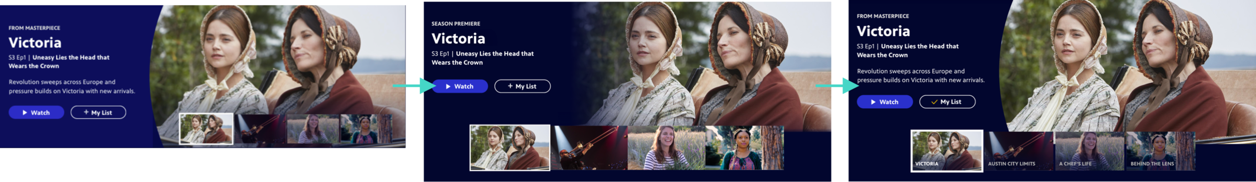
Once we had wireframes finalized, I iterated quickly through several options for visual designs, exploring a wide range of color use, button styles, focus states, and visual treatments to achieve the right hierarchy and balance.

User Testing Prototypes
In particular, the big Featured Videos pattern on the Home screen took several rounds of user testing and tweaking to get right and ensure that it was matching up to user expectations.

User Interface Design
The objective of the interface was to revitalize the app and integrate our new brand’s design principles: moving, welcoming, bright. This was accomplished through big beautiful imagery, friendly rounded buttons and iconography, and a playful, vibrant use of color for key accents and calls-to-action.
Home


At the top of the Home screen, users get a thumbnail preview of 4 featured videos, the 4th reserved for a Local video curated by the user’s localized station. Tapping a thumbnail refreshes the main area below to reveal video details. Users can also immediately jump back into an episode or show they were previously watching, or browse through a set of curated show and video collections.
Home, Big Feature “Drop In” and Genre Buttons


On the rest of the Home screen, users can browse through a set of curated show and video collections. They can also quickly jump to a specific genre they might be interested in using the Browse Shows buttons. The first button spot is reserved for Local, to boost discoverability of local station shows. A Special Feature area was also created, to promote big quarterly content campaigns like the premiere of Ken Burns’ Country Music and Summer of Space, which featured programming from multiple PBS shows.
Shows Landing

In the Shows section, users can swipe left-right to browse by genre. The local station shows are consistently in the 2nd spot, to highlight station visibility; shows in Passport are in the 3rd spot, to highlight back catalogs of shows users can get access to by becoming members of their station. The other genres appear in A-Z order.
Show Detail


The Show screen was focused on enabling users to jump right into episodic content as efficiently as possible. The previous version of the app required at least 1 extra tap to get to a separate seasons screen, so we wanted to solve that problem and provide episode information and ability to add to My List upfront. Other content like show description, clips, and similar shows was still easily accessible through a subnavigation.
Video Detail


We updated the behavior of the Video screen to feel like a disposable sheet, animating up from the bottom of the screen and enabling users to “X” out of a video quickly. This was especially useful because the Home screen relies much more on featuring individual video content rather than featuring shows, like other streaming apps (PBS has content constantly coming in and out of availability). This reduced friction and sped up browsing around the app.
My Station


We created a new section in the navigation called “My Station”, which serves as the home for content from your local PBS station. Users immediately feel a connection to their community with a powerful, localized image and Donate call-to-action. They can jump into watching local shows and videos, learn more about their station’s Passport offering, or contact their station.
Search


We placed Search at the center of the bottom navigation, enabling users to easily get to Search when needed. Episode information and the ability to add to My List are displayed upfront, so users can save videos to watch later without an extra tap.
Collection


In the previous version of the app, users were confused by our Collection pattern, which was too vague. We made key changes to display a video count, collection description, and a 4-up thumbnail upfront to provide a lot more clarity to users around what content to expect from these themed collections and how they related to their parent shows.
Flow Examples
Here are flow examples of opening up video details from the My Station section and viewing featured videos on a Franchise page.
High-Fidelity Prototype
High-fidelity prototypes were extremely useful in gathering valuable feedback. To boost station visibility and localized feel of the app, we implemented a co-branded splash screen that would display the user’s localized station on app launch. See the rest of the prototype at the link.
User Testing
User testing results indicated an overwhelmingly positive response to the new app design.
88%
100%
87%
80%
of wayfinding tasks were successfully completed and rated very easy by 100% of users tested
of users tested rated wayfinding to local shows or videos from their local station as very easy
of users tested rated the app design as tying into the PBS brand extremely well
of users tested rated the app design as very visually appealing
“PBS is very friendly, very approachable, teaches us so many wonderful things about the world. This app does that really well. Everyone can find something to relate to. It’s clear, understandable to most people, inviting, appealing, encouraging. PBS stands for all those good things and that’s what this Home screen does, too.
“I like a lot about this…including its welcoming tone and simple format; its easy-to-understand and easy-to-use navigation flows and filtering options; and its wonderful use of not only clear and relatable text but also colorful and corresponding photos, videos, images, and icons.”
“It ties in extremely well with what I want PBS to be, but hasn’t been for the last 10 years. I think this is a great step forward, I and a lot of people have been waiting for that. It’s a great surprise from me for PBS to see watching viewable content be made top priority.”
Feedback and Response
The app was well received within the organization, as well as with local stations and show producers. It became a rallying point for strengthening station visibility and setting the product up for success when it came to future updates like local livestreaming. It also helped set the course for streamlining PBS video streaming experiences to be consistent as possible across mobile, web, and TV.

More work