Redesigning PBS.org
I was part of the core team that redesigned the PBS.org site to enhance the user experience and reflect a refreshed PBS brand. We worked closely with stakeholders to design a revamped experience highlighting hyper-local content that’s unique to PBS.
View Desktop Prototype | View Mobile Prototype | View Live Site (Navigation, Homepage Hero, Shows Landing are live)

Discovery & Exploration
The initial exploratory phases were led by a former colleague (Kathleen Kenney) who left PBS shortly after completing sketches and initial wireframes. After her departure, I collaborated closely with our Director of UX (Chris Koth) and Production Designer (Laura King) to take over the project. Our job with this redesign was to bring the site into the modern age, elevate the experience to be up to par with other streaming sites and revitalize the entire look-and-feel. We focused on taking the insights learned from the previous version of the site and resolving key pain points.


Design Process
Kathleen had performed stakeholder interviews and laid the ground work for the key content requirements on the site’s major pages, seen in her sketches above. She also completed initial wireframes of the site that were focused on MVP updates close to the previous site’s framework, seen below.


Once Chris, Laura and I took over the project, the team transition put us on an accelerated timeline to complete the design process. Since I had led the redesign of the PBS Video App for mobile and TV a few months prior, and our team was directly involved in finalizing the brand’s visual system, at this point we had a very clear vision for what PBS.org should accomplish. With all these learnings in mind, we knew we could push the site even further and jumped into rapid iterations of hi-fidelity visual designs for the 2 of the most important elements: the Navigation and the Homepage Hero.
We experimented with finding ways to leverage elements - like the circle crop and line-and-highlight - that were signature to the new brand’s look. This helped solidify our design direction, gain alignment and set us on a good path for the rest of the pages.


Doing quick high-fidelity mockups of our early ideas helped us strike an important visual balance between the navigation and Hero areas. Although there was a dense amount of information, our iterations helped us nail down a pattern that allowed for a clear layout and hierarchy that users could quickly scan.
For the rest of the major pages, we had to move fast with a waterfall-like design process; as the rest of the Home page was being finalized, we were sketching the other major pages simultaneously to get feedback as quickly as possible. Below is an example of the design process from sketch to initial visual iterations of a Show page. The previous version was cluttered with too much information and the show branding got lost. We attempted to solve for that by focusing the top area into clear sections: the bread-and-butter show information and Featured Videos led the visual hierarchy, while less important information like funder text and sponsor logos were clearly delineated underneath.


Below are examples of design iterations on some other important pages in the site — the Video page and the Shows landing page. We quickly found that on both pages, we needed to solve for users feeling like they had to scroll too far up or down see video information or to turn a filter on or off.


User Interface Design
View Prototype
The objective of the interface was to revitalize the site and integrate our new brand’s design principles: moving, welcoming, bright. This was accomplished through big beautiful imagery and footage, friendly rounded buttons and iconography, and a playful, vibrant use of color for key accents and calls-to-action.
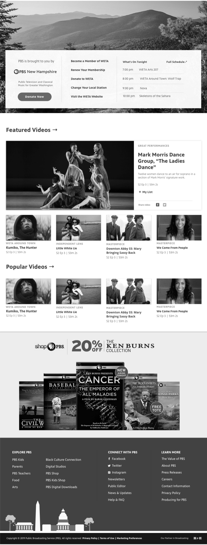
Home Page
We prioritized users’ key pain points; Hunting users wanted quicker pathways to get to the Episodic content of their favorite shows and saved content, and casual browsing users wanted easier ways to discover new shows they might like. The underlying aim was enabling users to consume our video content as quickly and easily as possible. We balanced this with high-priority business goals: 1) to boost local station visibility and hyperlocal content, and 2) to drive conversions of Passport, an on-demand video service that gave users access to archival content for becoming donating members of their local station.

At the top of the Home screen, users get a thumbnail preview of 5 featured videos. Selecting a thumbnail refreshes the main area to the left to reveal video details. Users can also immediately jump back into an episode or show they were previously watching, or browse through a set of curated show and video collections. They can also quickly jump to a specific genre they might be interested in using the Browse Shows buttons, or browse through a set of curated show, video, and news collections. Throughout the page, we incoporate local content from the user’s home station throughout key areas of the page in order to boost station visibility and local content discovery. We also created a dedicated home for Passport content in order to drive conversions and membership donations to local stations.
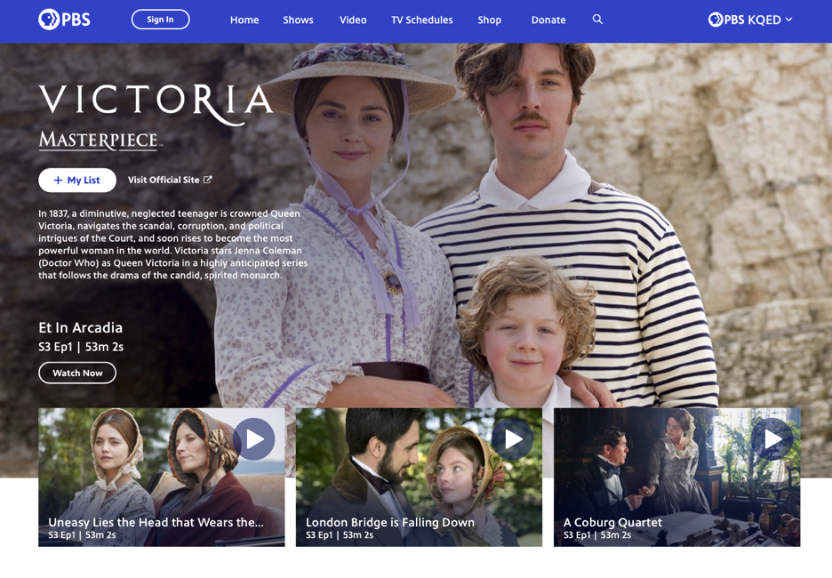
Show and Video Pages
We wanted the Show and Video pages to take advantage of the beautiful show imagery that PBS has, and provide an immersive, atmospheric feeling of the show or video’s content.

The new Show page design focused on enabling users to jump right into episodic content as efficiently as possible. Users can see the most important show information and can add the show to My List upfront. Browsing additional content like extras, themed collections is made easier with an “all seasons” view, enabling users to swipe through through seasons without an extra dropdown. Web exclusives and similar show recommendations boost content discoverability.
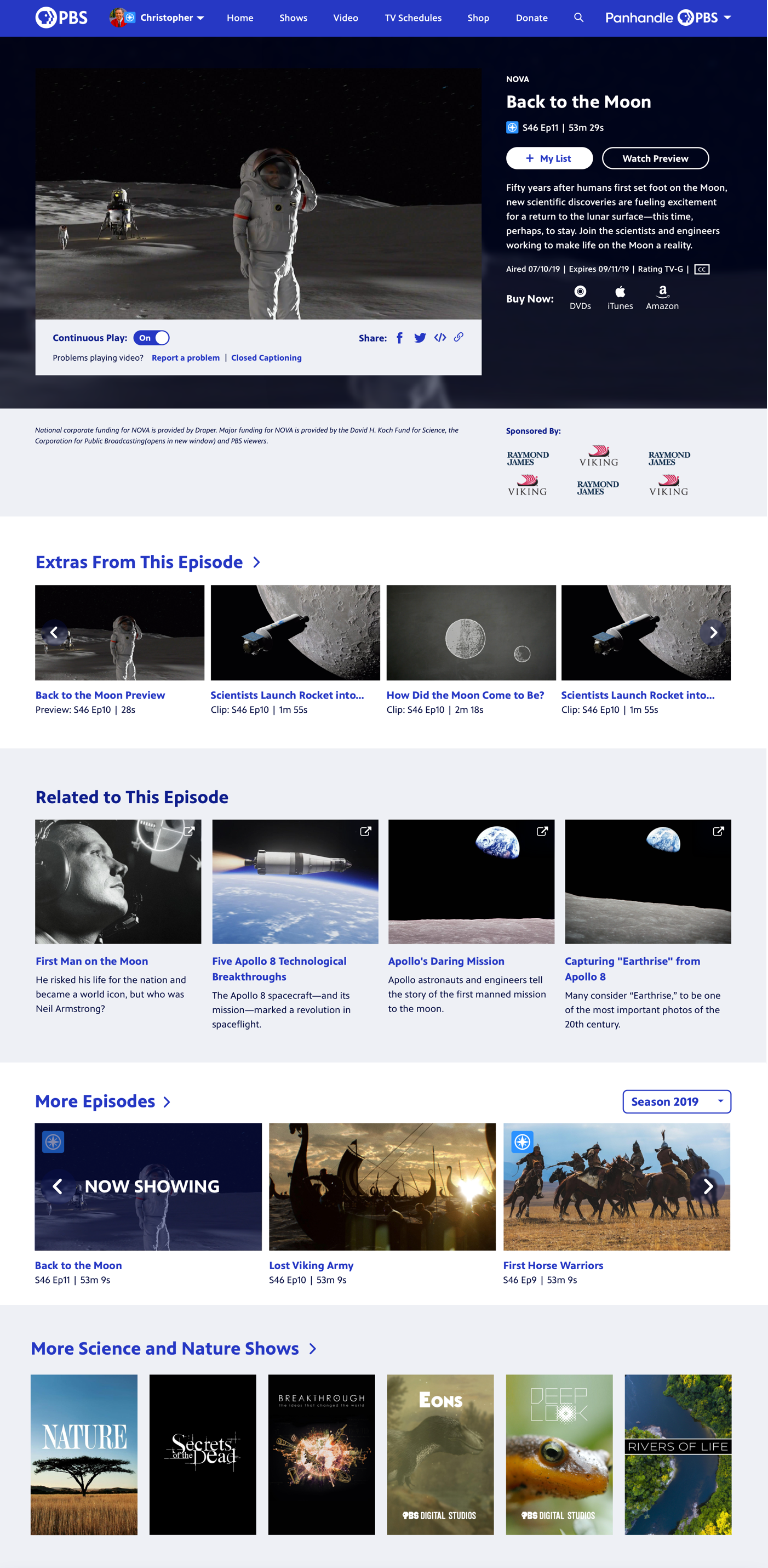
For the Video page, an update to a side-by-side presentation of the video on the left and video information on the right was much more space-efficient than the previous version of the site, which housed the information below the video and forced users to scroll down to see more details. Video-specific functions like Continuous Play controls and share links were now tied directly to the video instead of buried in the video information. Users can also see all Extras and bonus content related to this specific video right away.
Shows Landing and Search
For the Shows landing and Search pages, moving any filters to a left-side panel allowed for consistency between the pages and enabled a streamlining of components from a development perspective.

Moving the filters to the left allowed for more show posters to be in the page’s initial view. Users can easily filter by genre, title, Passport, or local shows, and also sort by Popular vs A-Z. A popover appears on hover to reveal more details or quickly add to My List and continue browsing.
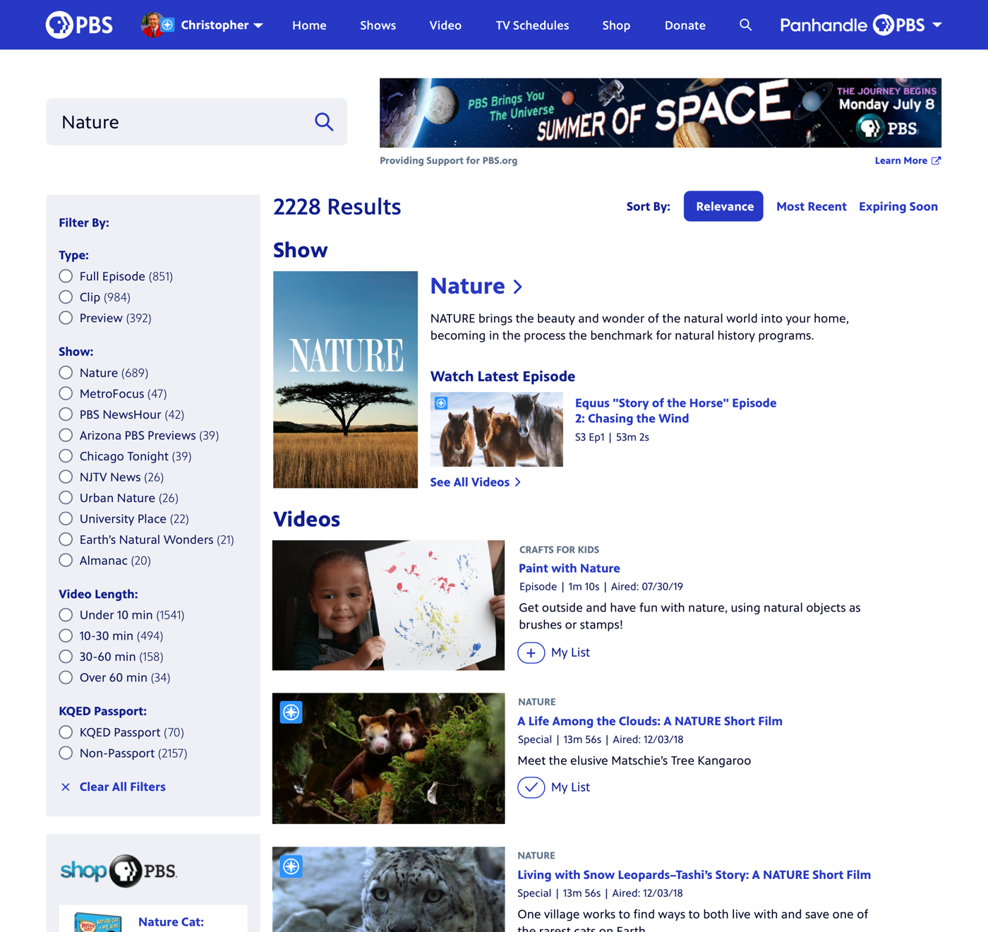
In the site’s previous version, all filters were hidden behind a collapsed menu, and most users didn’t realize they were even there. Users now have all the filtering and sorting mechanisms exposed by default, and can easily filter by video type, show, length, or Passport. An exact match for a Show name will expose that show’s description and latest episode, and every Video Result has the ability to add to My List upfront.
Navigation Megamenus
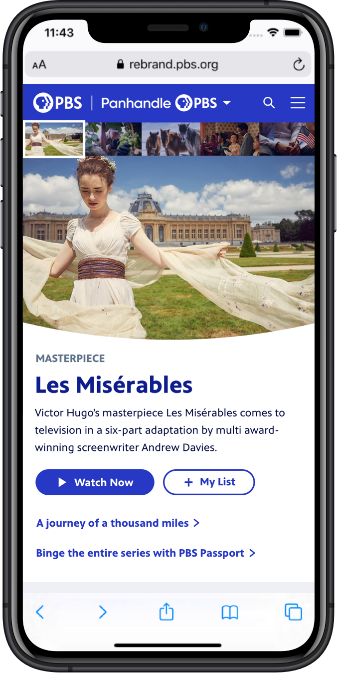
We made key updates to the main navigation to move the local station dropdown from its former position (next to PBS) to its new position (the rightmost side of the menu). This decision was made to avoid branding confusion around stations that were now incorporating PBS into in their name, like the Panhandle PBS example below. User testing confirmed that users understood the relationship that this navigation was setting up between PBS national and their local station.

In the user megamenu, signed-in users can jump back into episodes that they were previously watching, or quickly access their viewing history, My List, or profile settings.

The Shows megamenu is especially useful for users casually browsing for something new to watch, enabling them to see a list of popular shows, curated local shows from their station, or featured shows within Passport or otherwise.

The Video Megamenu is especially useful because of PBS’ unique content windowing; content is constantly coming in and out of availability, so being able to feature video-specific content is really important. Users can also jump quickly to a genre they’re interested in or see featured Passport content.

The TV Schedules megamenu enables users to quickly see what’s on their local station in primetime tonight or tomorrow.

Users can browse the main PBS or PBS KIDS shops for gifts, or get quick links to PBS distribution channels on digital platforms. These revenue streams account for 25% of the PBS budget, so it was important that we highlight them in a prominent way withini the navigation to drive those user conversions.

The station megamenu is an important driver of that local connection for the user. Users can donate to their local station, see what’s going on in their local community, and stay updated on their station’s TV schedule.
Mobile
The previous version of the mobile site had 2 separate menus animating in from the left and right sides. We sought to simplify the browsing structure greatly on places like the main navigation and the Shows landing page to focus on the most important pieces. We completely simplified the above structure in the mobile navigation, focusing on the main navigation items and user dropdown in the main mobile menu and retaining only the station subnavigation within a separate dropdown. We pulled search out separately to make it easily accessible on any screen.


High-Fidelity Prototype
Although the full breadth of the site updates are not yet fully developed, we found high-fidelity prototypes to be extremely useful in gathering valuable feedback. The full set of updates is set to be completed by May 2020.

Outcome
The site was well received within the organization, as well as with local stations and show producers. While the full set of updates is still in development, user testing and feedback so far has indicated an overwhelmingly positive response. The site was key in streamlining PBS video streaming experiences to be consistent as possible across mobile, web, and TV.