Redesigning the PBS Video App for TV
I led the redesign of the PBS Video app for TV to enhance the user experience and reflect the new PBS brand. I worked closely with stakeholders to design an experience that brought the app up-to-par with streaming competitors while highlighting hyper-local video content that’s unique to PBS.

Discovery & Exploration
When this project began, PBS’ various TV streaming apps had relied heavily on out-of-the-box components (limited resources were a big factor). As a result, the UIs were inconsistent across these platforms. My job with this project was to design the ideal tvOS experience for PBS that would become our north star of consistency for all TV apps moving forward, bringing the experience up to par with other streaming apps and revamping the entire look-and-feel. In the exploratory phase, I focused on taking insights learned from our existing apps to resolve key pain points.


Design Process
The timing for this project ended up happening simultaneously with the design process for fleshing out the visual system of the new PBS brand. (I was lucky enough to be heavily involved in both.) My design exploration for the TV product started with the question, “how do we incorporate the brand’s signature visual elements, such as the circle crop and line-and-highlight, into an interactive UI?” I quickly iterated on a large range of ideas through lo-fidelity wireframes, as imagery and footage was at the heart of the new brand.


I explored leverage the circle crop element and circular forms to hold video information, in card patterns, and as a transitional element. We also quickly realized as a team that the line-and-highlight element from the new brand was perfectly suited for a navigational element, especially when paired with motion and to move the user’s eye through content. In several options, I explored using the line either horizontally or vertically as the app’s main menu system, as well as for subnavigations for internal screens like an individual Show.
Because this exploratory work was key to informing the brand’s foundational visual system itself, as well as influencing the concurrent exploration of the on-air motion package, we had to iterate on full-color visual concepts early on, to quickly get feedback on what was and wasn’t working.


We eliminated any concepts in which the design elements felt they were overtaking the content, and eliminated options that were based on cards, as that fought against the open and airy feel of the new brand. We also ruled out options that were using a large circle crop; because PBS has content constantly coming in and out of availability, the Home screen had to rely much more on featuring individual video content, and that design pattern was better suited to feature show posters. For the Show screen, the season pattern had to be able to scale to include up to dozens of seasons, for legacy shows like Antiques Roadshow and Nature.
User testing results also told us that our current tvOS and Roku navigation patterns were frustrating for users because they weren’t accessible on internal pages deep in the UI. With these learnings in mind, I went back to the drawing board and focused on several iterations of sketches utilizing a consistent menu.


I prioritized users’ key pain points, the foremost being making the navigation more intuitive. User feedback told us that users were having a hard time finding their favorite shows and thought search should be more easily accessible. I balanced this with high-priority business goals: 1) to boost local station visibility and hyperlocal content, and 2) to drive conversions of Passport, an on-demand video service that gave users access to archival content for becoming donating members of their local PBS station. I constructed the information architecture to reduce friction in finding the main tools to solve for these goals — My List, Search, and Shows by genre, reducing the number of clicks it took to complete these essential user flows.


Flow Examples
Here are flow examples of a few key moments in the app. The first is from initial launch to first landing on the Home screen, the second is navigating from the Shows by Genre screen to an individual Show page itself.
Although we ultimately tweaked some of the placement and details of this Home screen featured videos pattern based on user testing feedback, this video gives a good sense of the behavior: users get a thumbnail preview of 4 featured videos, and selecting a thumbnail refreshes the main area above to reveal video details.
We wanted the Show screen to take advantage of the beautiful show footage and imagery that PBS has. After holding on still key art for 1-2 seconds, a silent preview of the show begins playing in the background, providing an immersive, atmospheric feeling of the show’s content.
User Interface Design
The objective of the interface was to revitalize the app and integrate our new brand’s design principles: moving, welcoming, bright. This was accomplished through delightful motion, big beautiful imagery and footage, friendly rounded buttons and iconography, and a playful, vibrant use of color for key accents and calls-to-action.

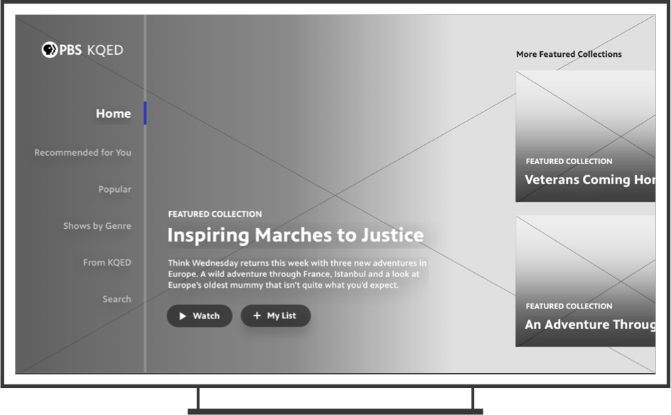
At the top of the Home screen, users get a thumbnail preview of 4 featured videos, the 4th reserved for a Local video curated by the user’s localized station. Selecting a thumbnail refreshes the main area above to reveal video details. Users can also immediately jump back into an episode or show they were previously watching as the first list on the screen.

On the rest of the Home screen, users can browse through a set of curated show and video collections. They can also quickly jump to a specific genre they might be interested in using the Browse Shows buttons. The first button spot is reserved for Local, to boost discoverability of local station shows.
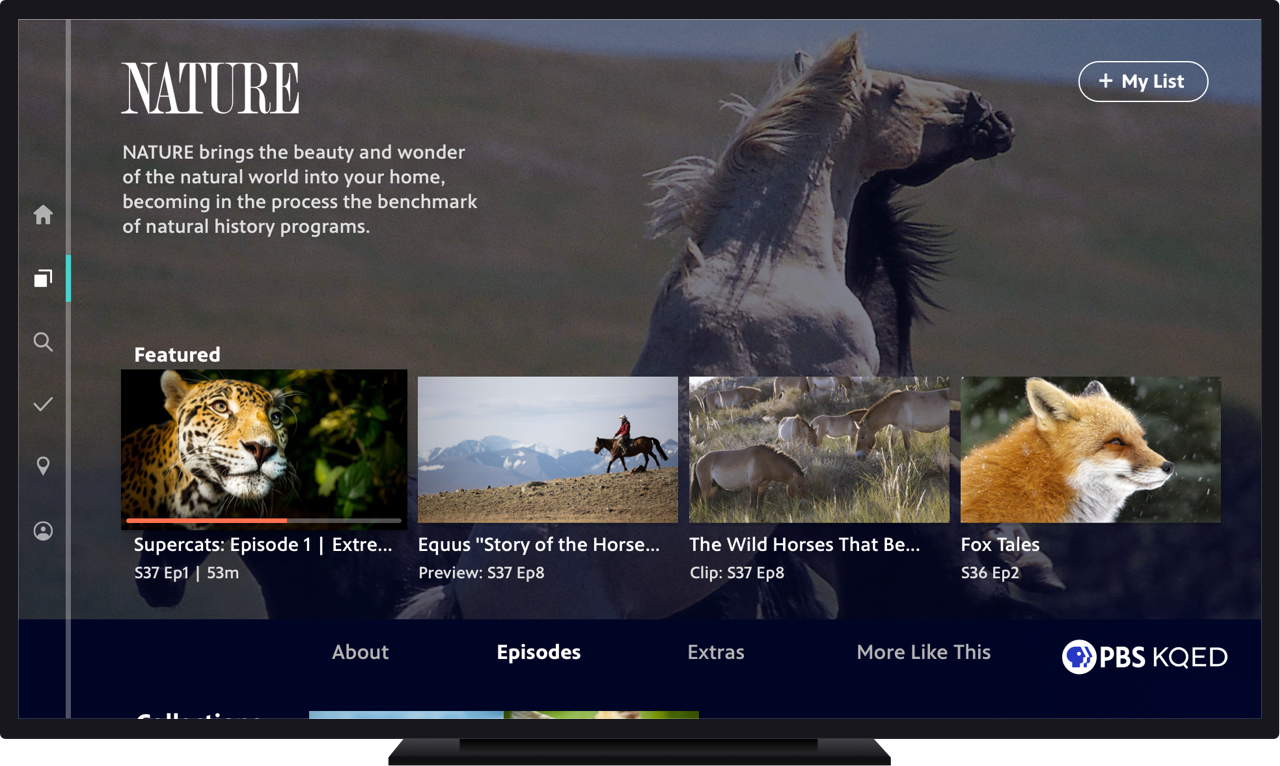
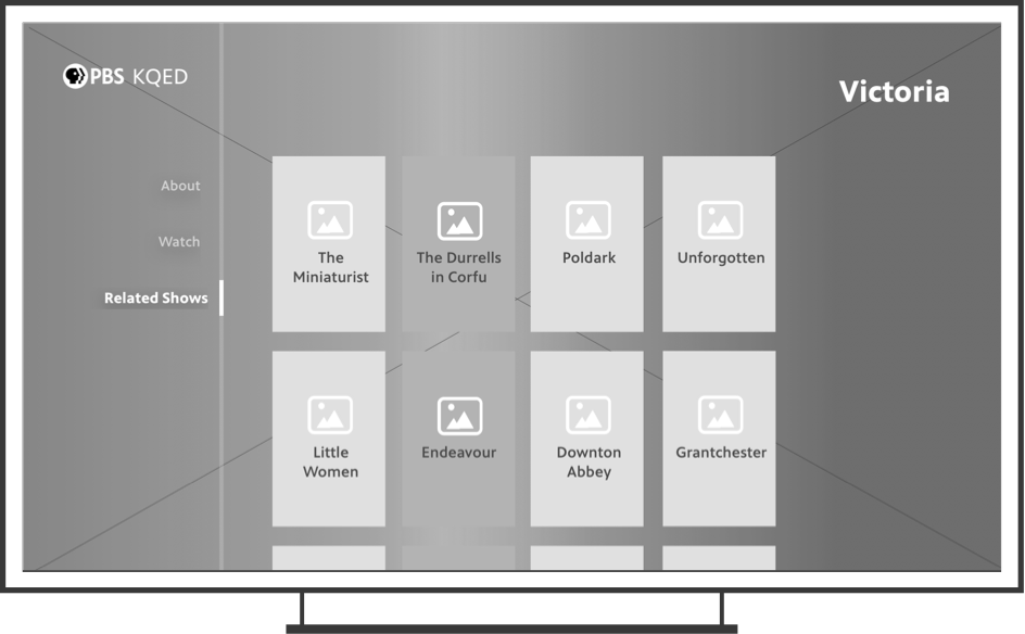
The new design focused on enabling users to jump right into episodic content as efficiently as possible. The previous version of the app required at least 1 extra click to get to a separate seasons screen, so we wanted to solve that problem and provide episode information and ability to add to My List upfront. Other content like show description, clips, and similar shows was still easily accessible through a subnavigation.

In the Shows section, users can swipe left-right to browse by genre, and within each genre can further sort the grid by Popularity vs A-Z. The local station shows are consistently in the 2nd spot, to highlight station visibility; shows in Passport are in the 3rd spot, to highlight back catalogs of shows users can get access to by becoming members of their station. The other genres appear in A-Z order.

We updated the individual Video screen with a utilitarian approach, focusing the top area on the main Video’s information and creating a clear button hierarchy that elevated the 2 most important functions, to Play/Resume or add the video to My List. Other content like more details, clips and previews, and more episodes from the same show was still easily accessible through a subnavigation.

We created a new section in the navigation called “My Station”, which serves as the home for content from your local PBS station. Users immediately feel a connection to their community with a powerful, localized image and Donate call-to-action. They can jump into watching local shows and videos, learn more about their station’s Passport offering, or contact their station.

We placed Search at the center of the bottom navigation, enabling users to easily get to Search when needed. Episode information and the ability to add to My List are displayed upfront, so users can save videos to watch later without an extra tap.

My List was now always accessible from the consistent side navigation, taking one of the center spots and allowing users to easily get back to the videos and shows that they’ve saved.
High-Fidelity Prototype
Although the full extent of the app updates have not yet been developed, we found high-fidelity prototypes to be extremely useful in gathering valuable feedback. See the full prototype at the link.

User Feedback
So far, user testing results indicate an overwhelmingly positive response to the new app.
“This is very visually appealing. It looks clean, very simple, easy to navigate and find what you’re looking for, doesn’t look too crazy cluttered or overwhelming. Just the right amount of information. The filters are great.”
“When I think PBS, I think learning, history, science -- that was reflected really well in this app and what PBS stands for.”
“Overall I really liked it, it was really well organized, easy to use, I like that you can go back to watching a show at any time. It gave me a lot of content I probably wouldn’t have found on my own if it hadn’t been featured on the Home screen.”
“The layout is great - this is what I’m looking for. It’s a content-centric view that’s geared toward finding and watching something, and also discovering new things.”
Outcome
The app was well received within the organization, as well as with local stations and show producers. While it has not yet been released, it has become a rallying point for strengthening station visibility and setting the product up for success when it comes to future updates like local livestreaming. It also helped set the course for streamlining PBS video streaming experiences to be consistent as possible across mobile, web, and TV.