
Select Identity & Branding Projects

Digital Voltage
Overview
I worked with the PBS Digital Studios team to develop the branding and identity of Digital Voltage, a series of 8 on-site regional workshops that engaged station personnel in digital-first video production.
The Digital Studios team had a very specific visual direction they wanted to go for the branding. Inspired by the workshop’s mission to “amp up skills for digital-first series programming and amplify audience growth,” their creative brief included inspiration from Industrial Revolution Propaganda Posters, Hatch Show Prints, and Russian Constructivism in color scheme and typography. They really wanted the empowerment of stations - and taking brave digital risks - to come across in a strong and bold way.
Design Process
The project’s name was undecided when we began design exploration, so we used “Digital Revolt” as the test name during the initial sketches and first round.

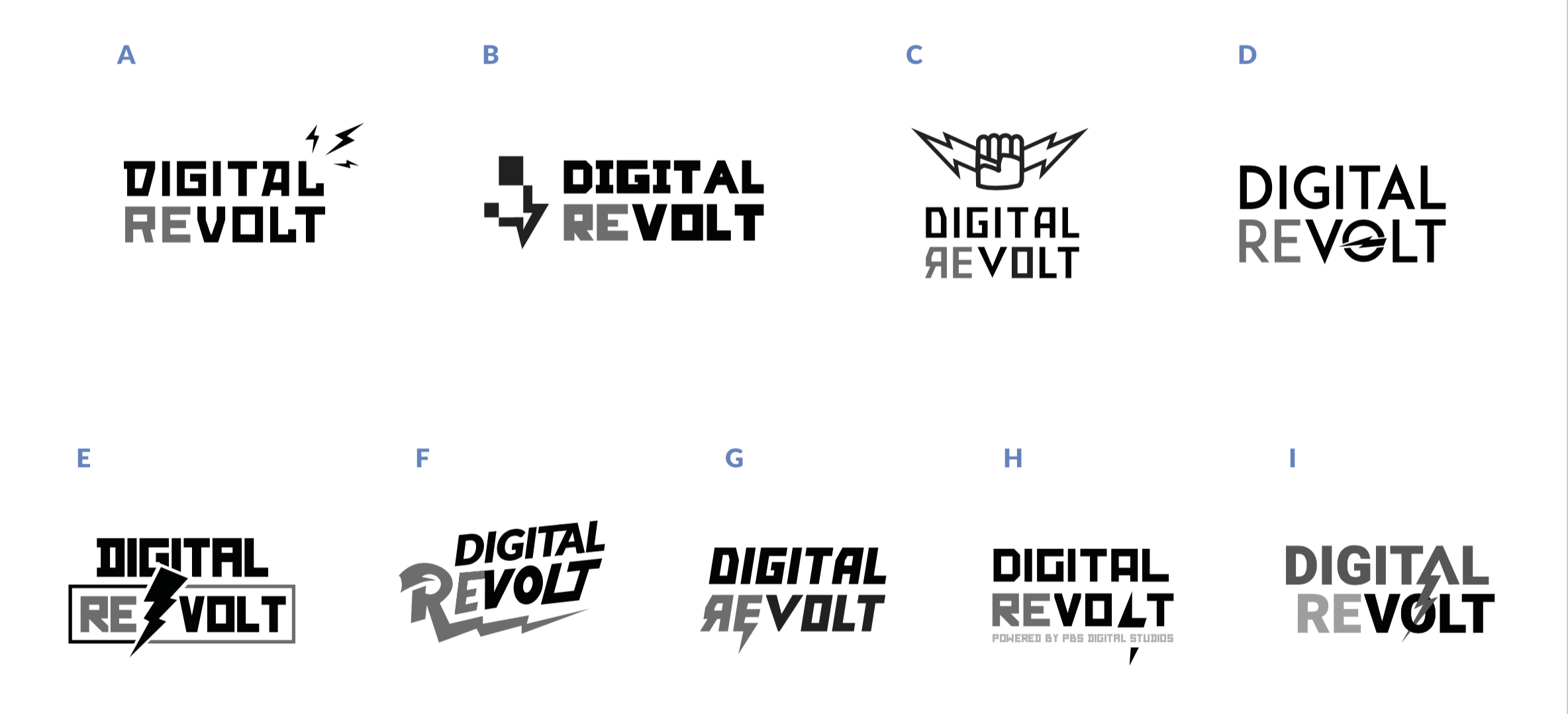
Honing In
Ultimately, design reviews with the team led us away from any first imagery that read too powerful or too much like propaganda or protest, as that was not the tone we wanted to strike with the audience for an educational workshop series that was supposed to benefit their station.
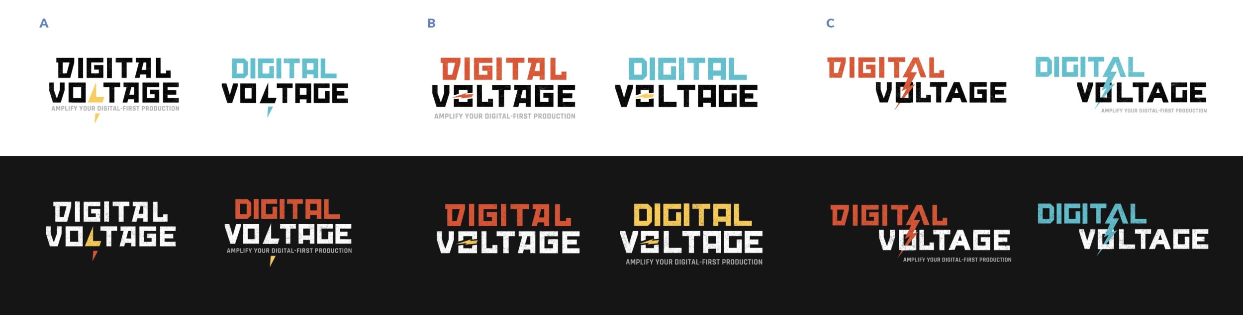
After the first round of black and white higher-fidelity exploration, the name got finalized as “Digital Voltage.” With that in mind, we narrowed in on a red, yellow, and white color palette, and strong typographic treatment paired with striking iconography — leveraging a granulated, worn-in color effect to emulate screen printing:

Deliverables
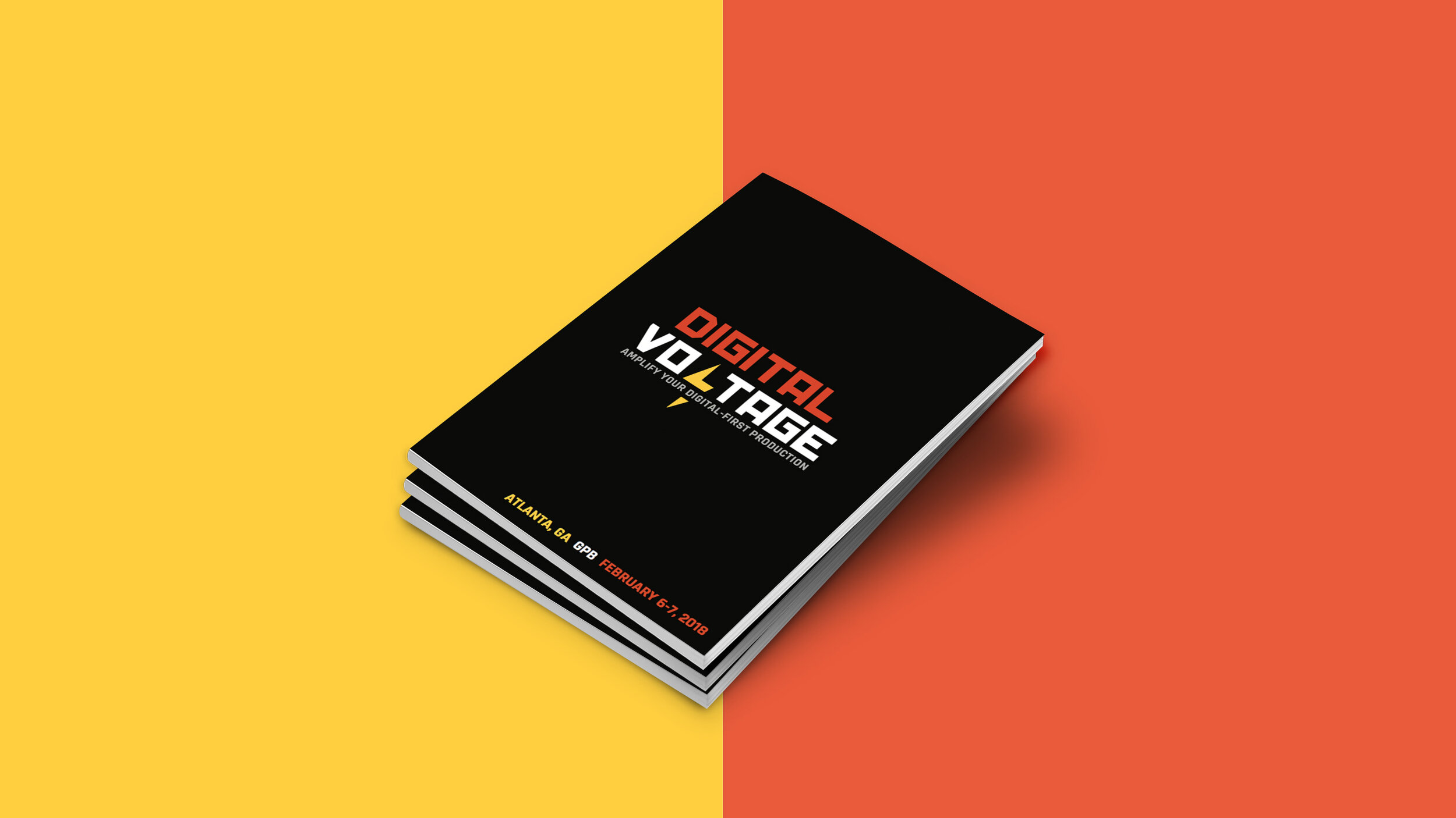
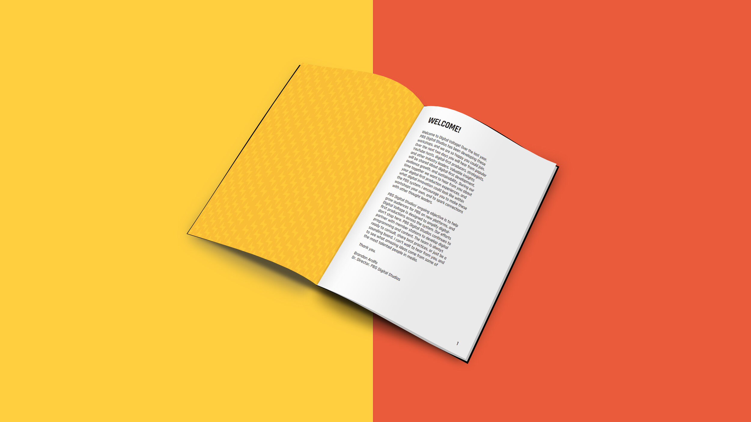
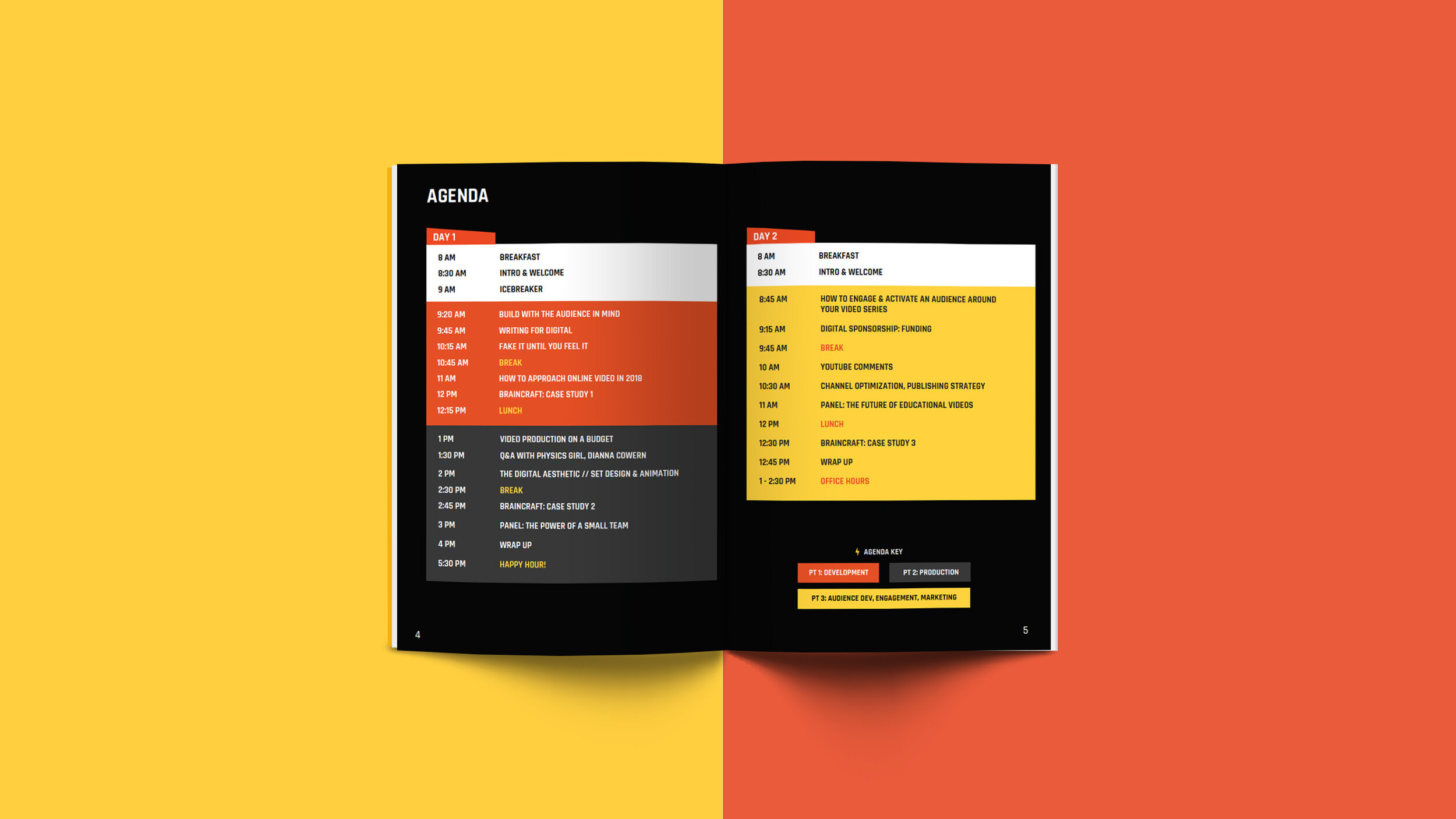
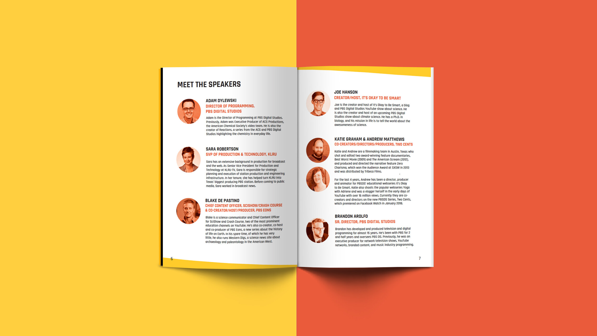
With the visual foundation in place, I created an entire suite of digital and print materials for the project, from digital graphics and a promotional website to work booklets, name badges, notebooks, stamps, and buttons.


Shoutout to the Digital Studios and Station, Products and Innovation teams: Dan Levy, Brandon Arolfo, Jess Kasza, and Leif Brostrom
YoPro
Overview
I worked with the YoPro team to strategize a digital-first rebrand, defining their brand personality, culture, and what they provide to their cohort. A few key goals emerged through our discovery phase — the new brand needed:
To be evergreen and universal, but also able to be individualized to suit sub-branded and localized events.
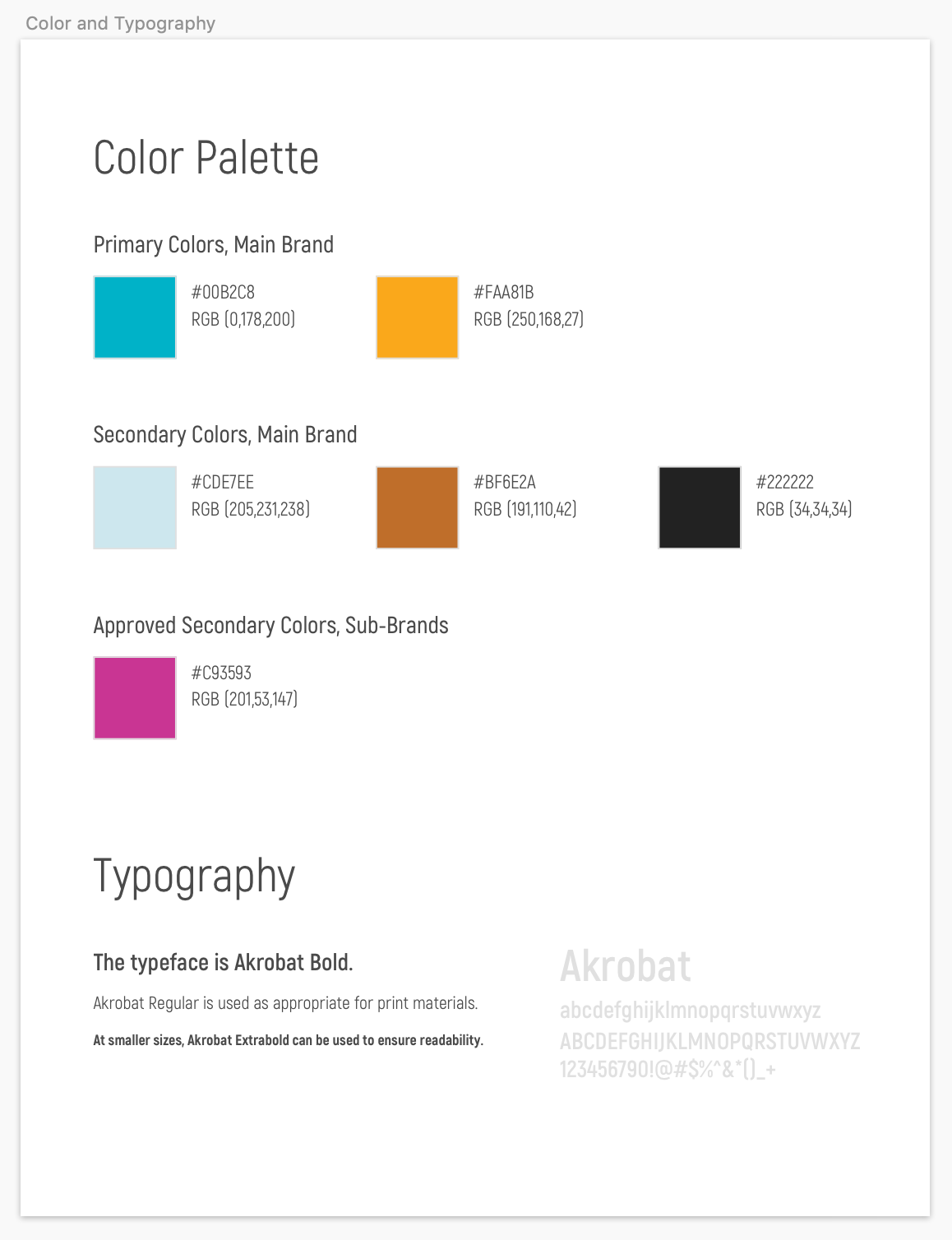
Unique colors that give it energy and felt distinct from the rest of the PBS brand.
To be fresh, fun, and young.
To reflect YoPro’s mission to be a forum and intersection for growth. The team wanted to focus on YoPro as a place to collaborate, connect with colleagues, and expose yourself to new ideas.
Design Process
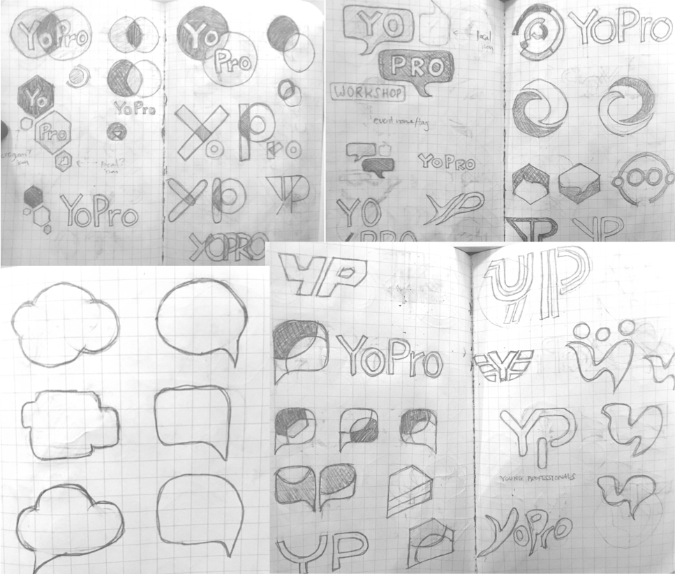
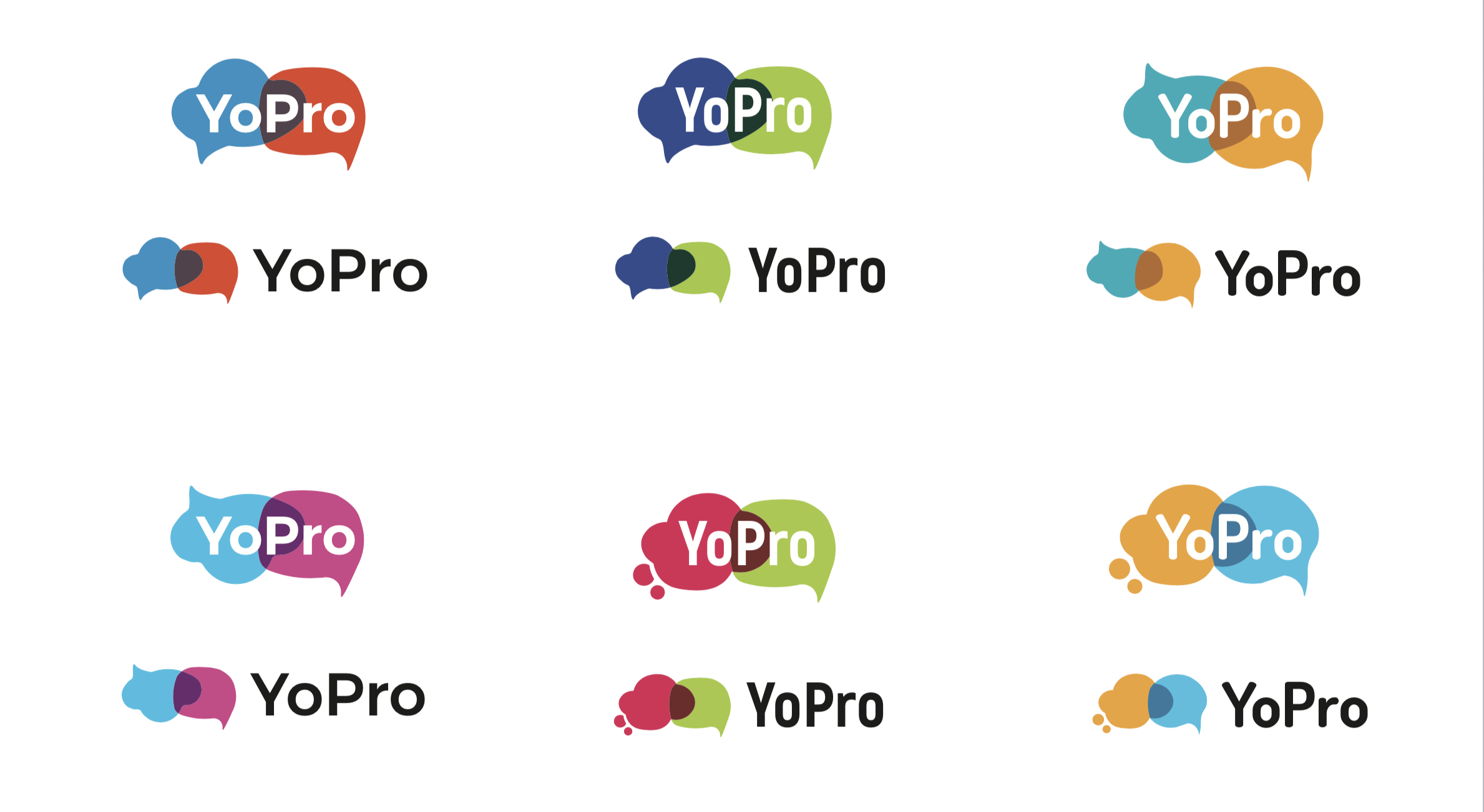
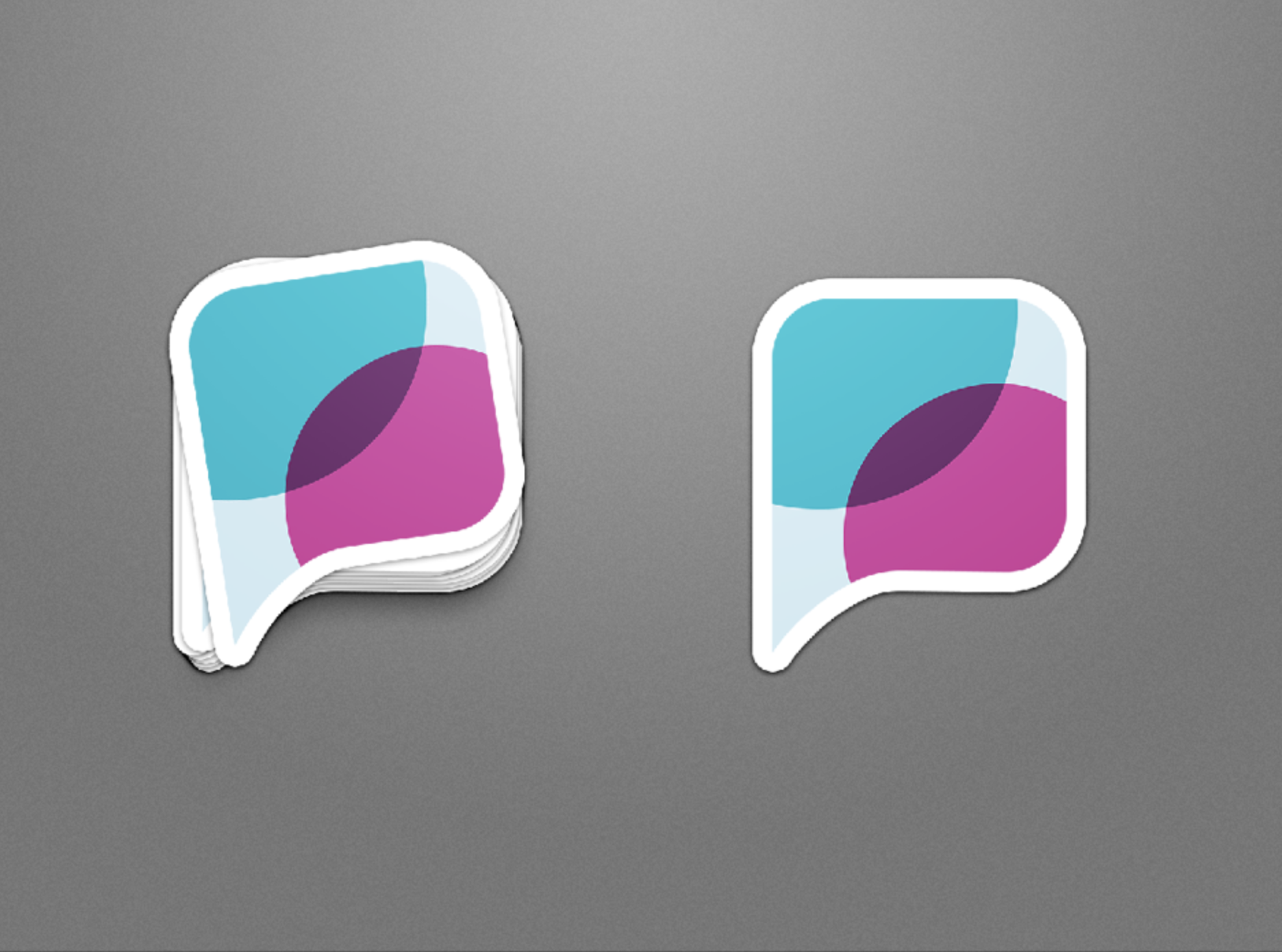
I did a wide range of explorations during the sketch phase, and refined them to what I thought was the strongest set of 3 options. The first was taking the existing logo and simplifying it in key ways. The second was taking the conceptual idea of a place of conversation and intersection and making that into a single mark that could be broken down into overlapping pieces. The third was a line style that was based on the exchanging of new thoughts and ideas.
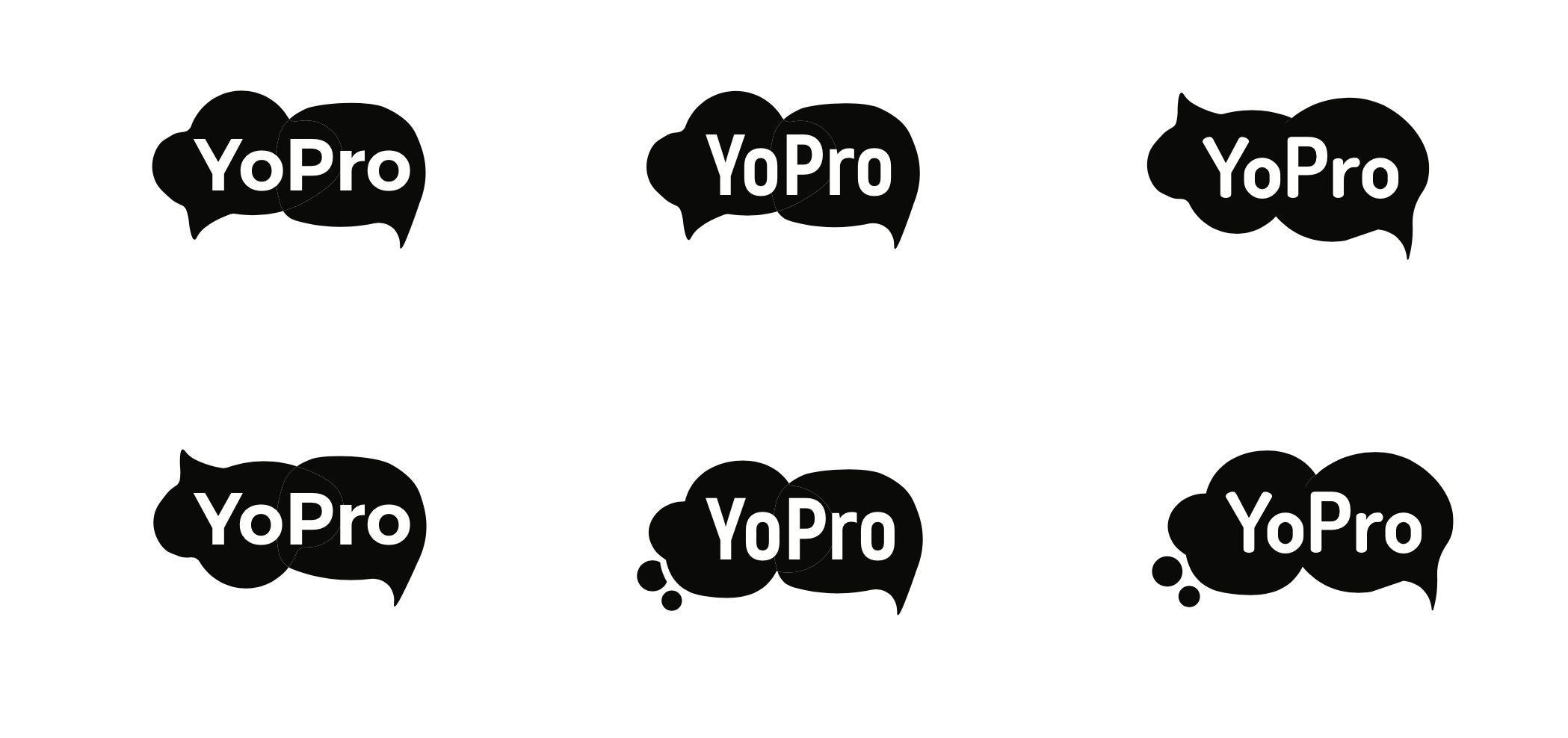


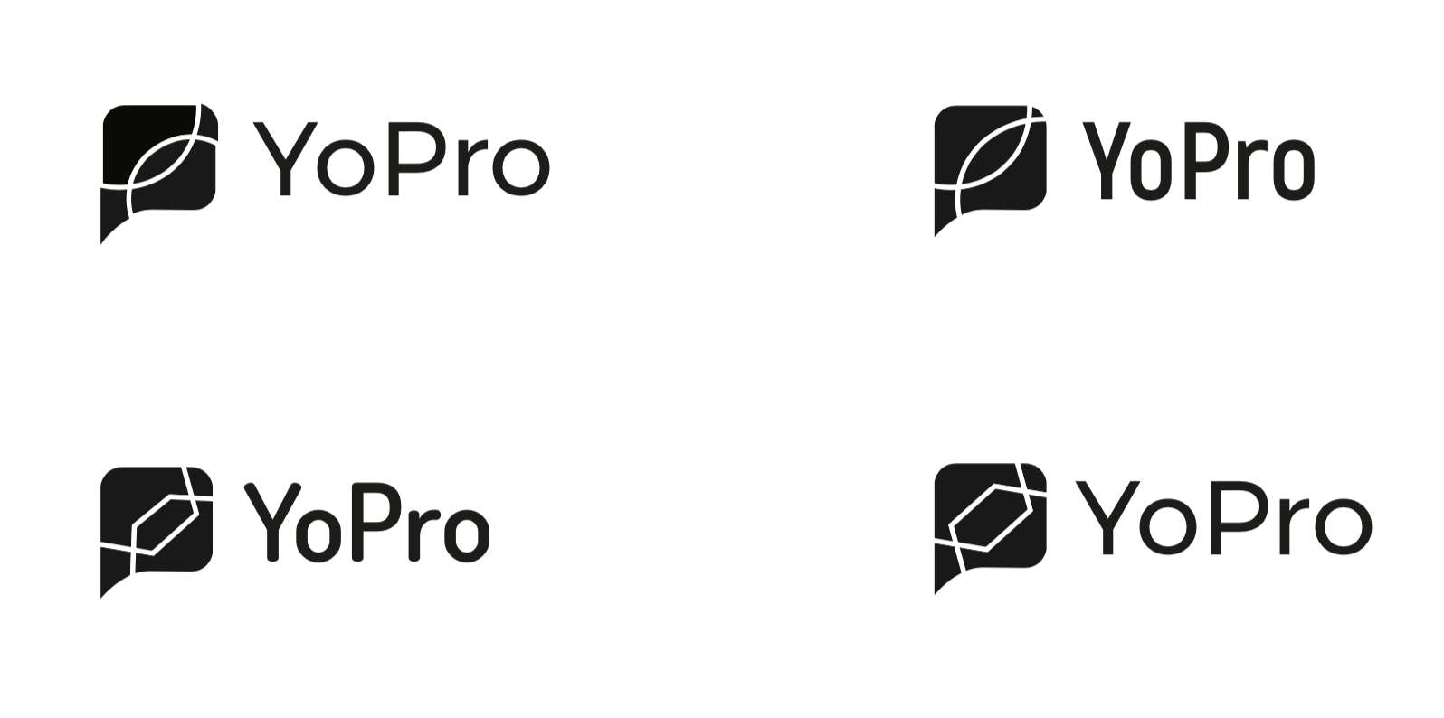


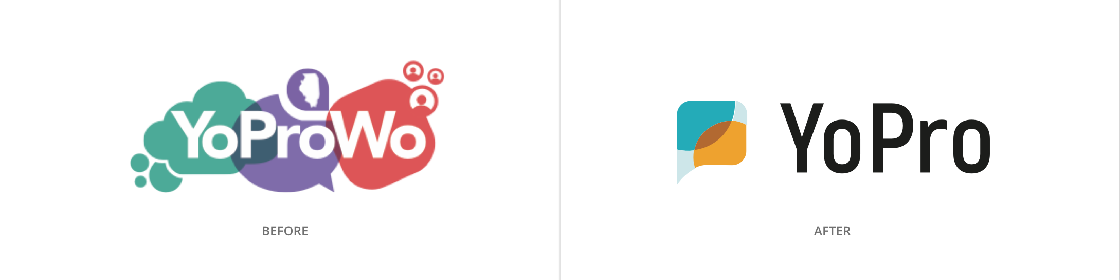
Before and After
Ultimately, we went with the second option and refined the shapes and colors until we were happy with it. One of the biggest issues with the old logo was that it was difficult to sub-brand since it was so long. The new logo needed to be more easily transferrable, so as YoPro grows, so could its branded events.
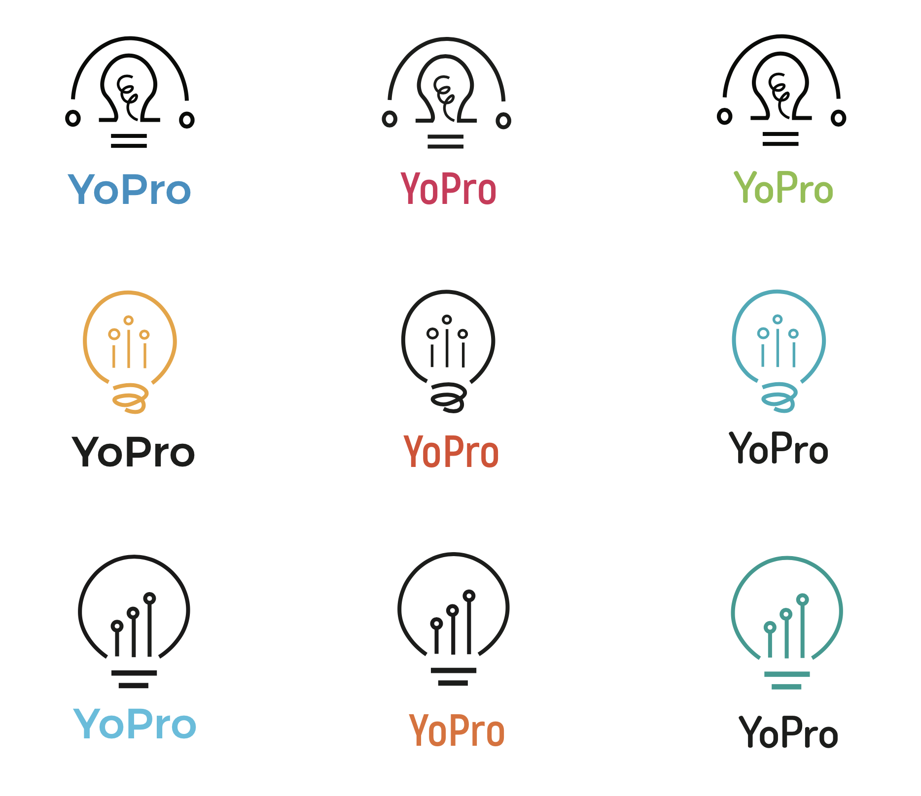
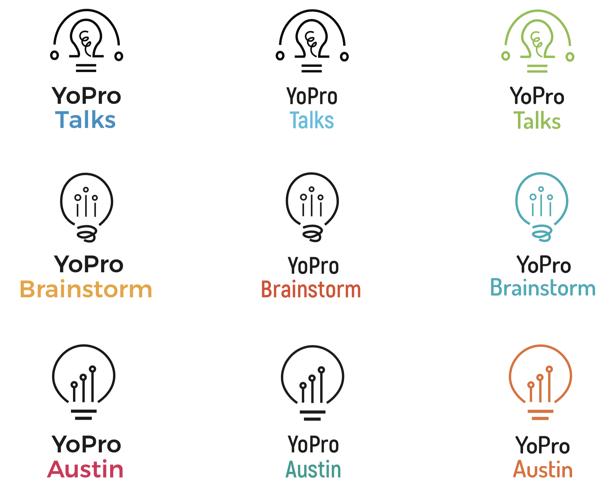
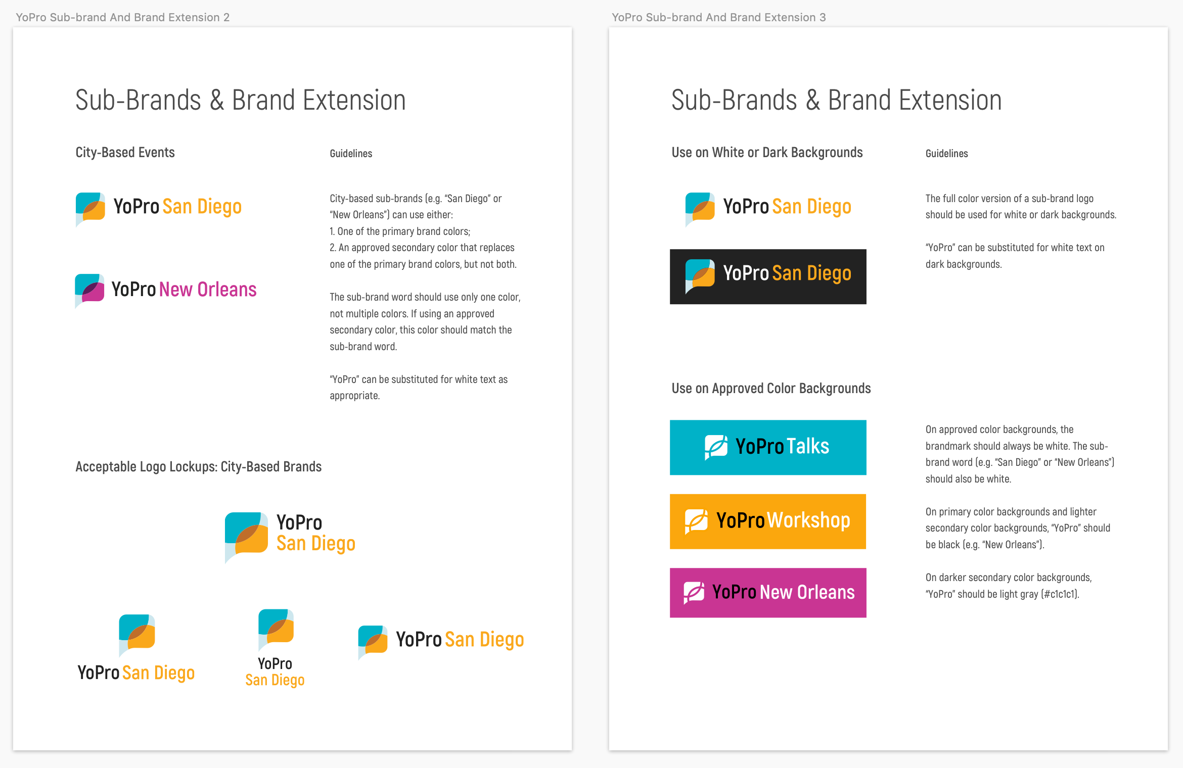
Creating a Flexible System
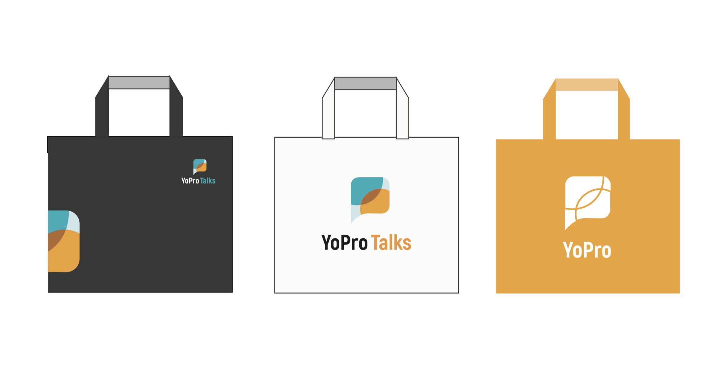
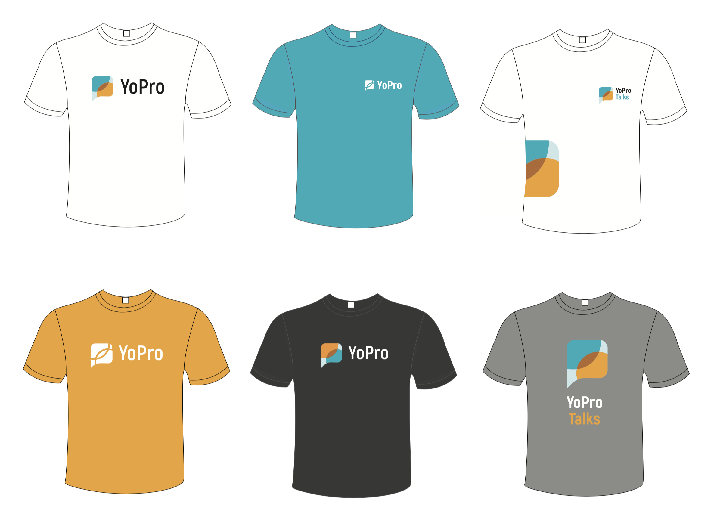
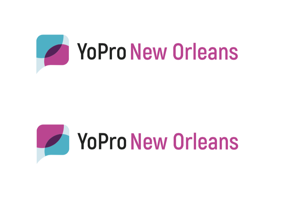
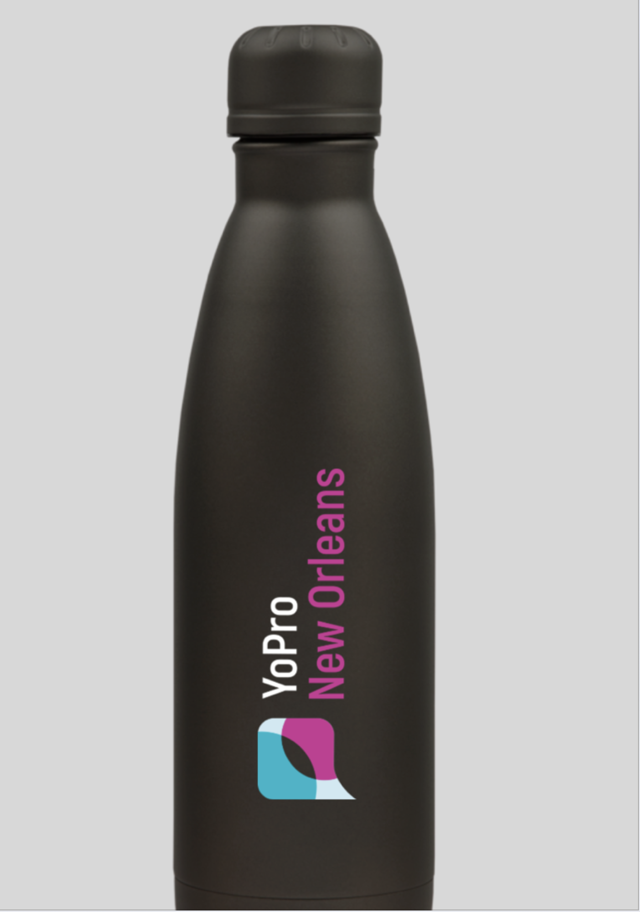
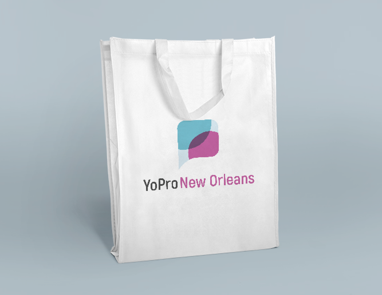
This need for flexibility was top-of-mind. We created a visual system that easily locked up with evergreen sub-brands, and also left room to expand the color palette with secondary accent colors for localized events.
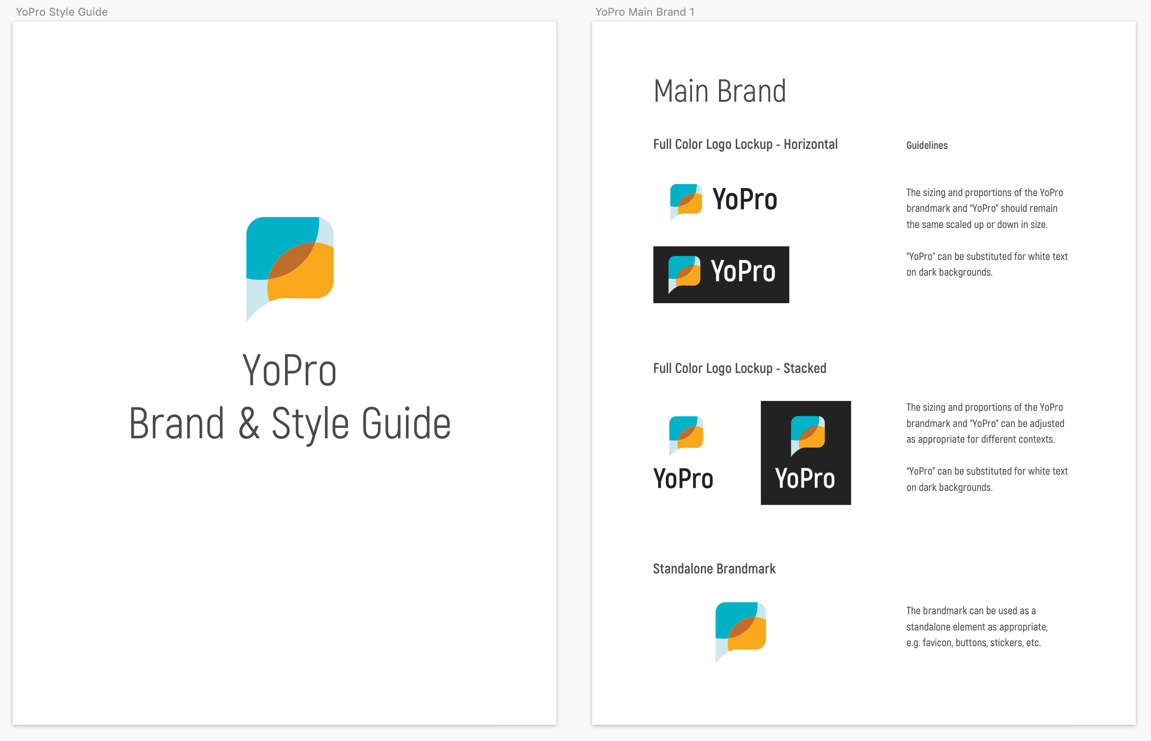
I created a full Brand Style Guide for YoPro, outlining the system’s primary brand and secondary sub-brands.

Deliverables
We utilized this visual system to create a variety of print materials and “swag” items utilizing the new brand, including a companion booklet for a conference workshop, tote bags, water bottles, handouts, pens, and stickers.


Shoutout to the YoPro team: Jen Hinders and Amy Lust