Launching Learners
Helping parents and teachers of 3-5 year olds incorporate educational resources into their daily lives to foster their children’s social-emotional development.
The Ounce of Prevention and PBS KIDS developed resources for low-income communities that link families’ experiences in the classroom with parent-child learning interactions at home. The two organizations partnered to design Launching Learners, a program to foster parents’ engagement in young children’s social-emotional development to aid school readiness and lifelong achievement.

Background
The program combined 2 approaches, high-tech and high-touch, to help parents and their child’s preschool staff work together to foster children’s social-emotional learning using a strategic set of tools. Parents would get texts and emails twice a week that linked them to a digital platform and various videos, games, activities and articles. Staff would facilitate monthly in-person meetings at their schools to help parents through the program’s curriculum and provide insight, tips, and take-home activities. This aimed to facilitate ongoing connections between the classroom and at-home to support the child’s learning.


Users and Audience
Our target audience was busy parents/caregivers and early education program staff of kids ages 3-5 in low-income communities.
The overarching goal was to support and empower parents, in communities with the highest need, to take an active role in their children’s learning and development. Our challenge: How do we make the Launching Learners experience easy for busy parents and teachers to fit into their day-to-day interactions with children, at home and at school?


The UX Challenge
Our team was tasked to deliver an MVP website and messaging platform that helped achieve two objectives: to create convenient accessibility to engaging, high-quality digital content, even when parents’ and teachers’ time and resources are limited; and to support staff and parents in partnering together to more effectively prepare children for success in school. The website had to be ready for an 8-week pilot of the program at 3 early childhood center sites in Chicago.
My role was User Research/Testing, Wireframes, User Flows, Visual Design, and Project Management.
Design Process
Site Objectives


Tactical goals:
Connect parents to what is happening in schools, allowing them to continue the social-emotional development journey
Act as a repository/archive of all content and services
Drive schedule of how content will be released over time
Digital sign-up should be easy
Site characteristics:
Scalable and flexible to different school infrastructures
Trusted
Should be more visual, explanatory, short with easy/digestible language
Should NOT be too academic, preachy, or robotic
Wireframes
The project was underway for a few months when I took over for a different designer, who had already started initial wireframes of the homepage. Using those wireframes as a base, I fleshed out wireframes of the Parents and Staff versions of the site for Desktop and Mobile and the Sign Up flow for tablet.
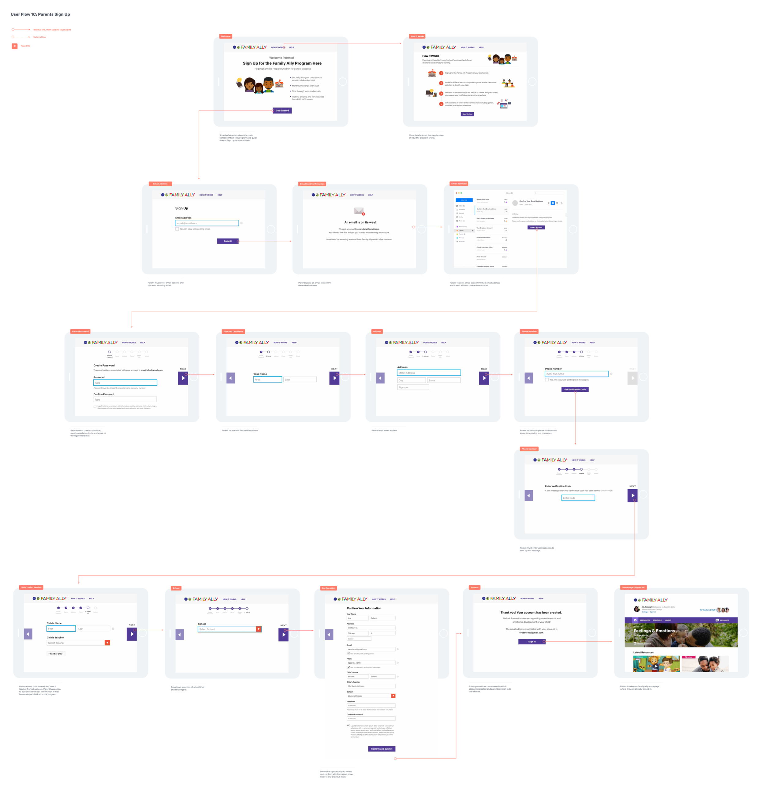
Sign Up Flow


Parents Site, Desktop


Staff Site, Desktop


Mobile


Refinements
I iterated through several versions of the Parent and Staff versions of the site, refining based on internal rounds of feedback from the PBS and Ounce of Prevention teams.


User Testing an Initial Prototype
We tested the visual designs with 8 users in-person at the Educare Chicago site. The participants were a mix of management, family support specialists, teachers and parents. User were asked to interact with prototypes of the Parents sign-up flow on tablet and the Parents site on mobile. Staff were additionally asked to interact with a prototype of the Staff site on a laptop.


Incorporating Findings
6 out of 8 users stumbled with getting back to the homepage of the site, with half of those users not recognizing the menu/hamburger icon.
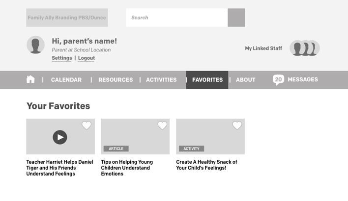
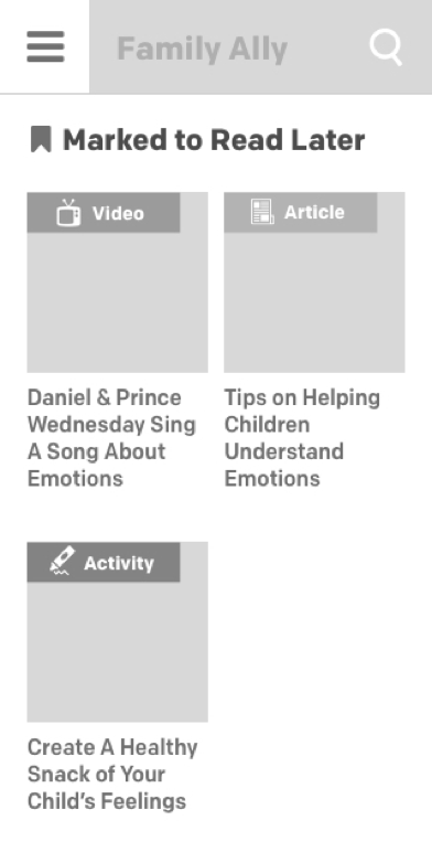
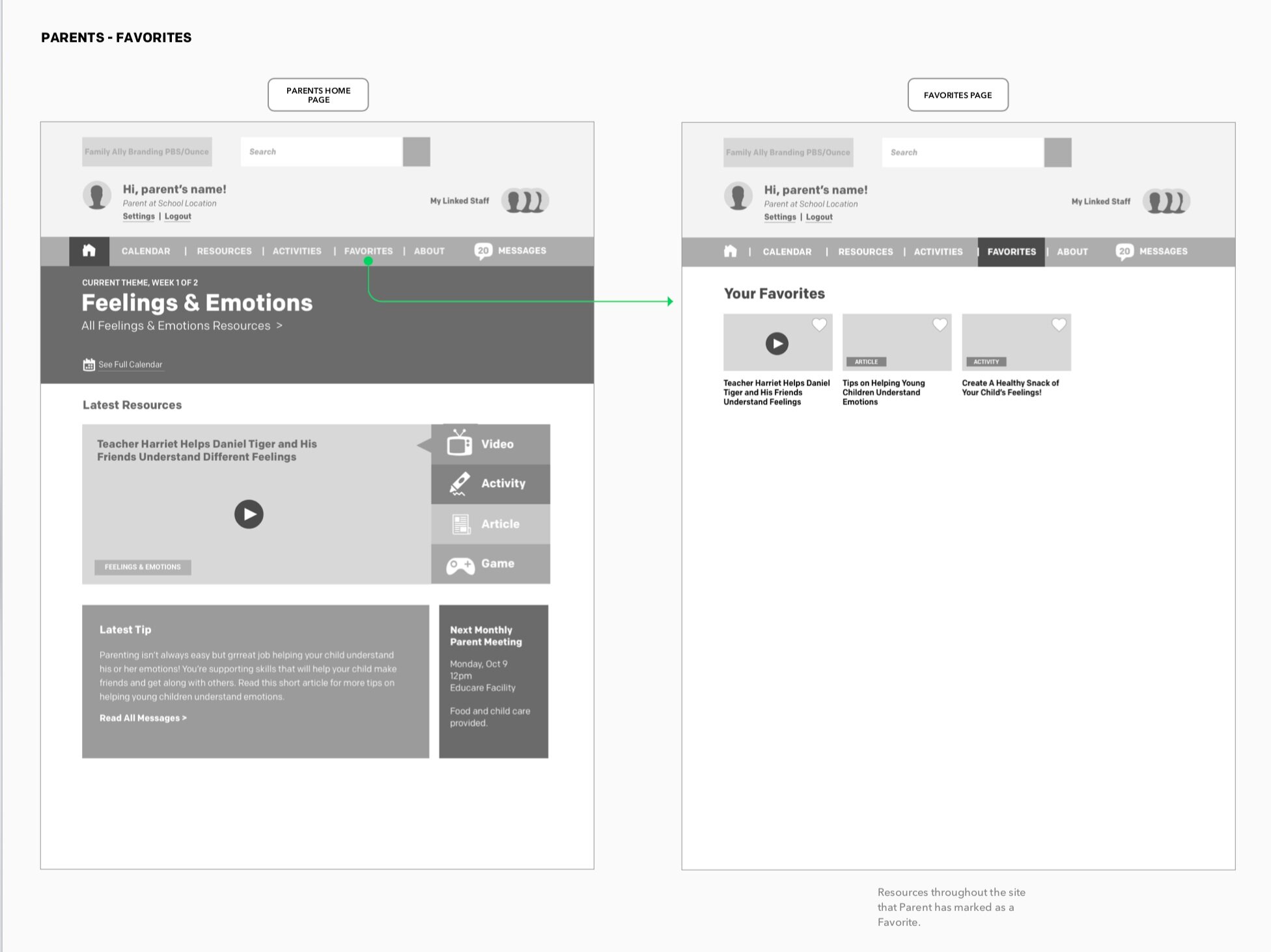
Other pain points for parents: users were confused or unclear about what to expect from the Calendar and Messages feature, and the Save for Later buttons were easily missed. Pain point for staff: they preferred the Staff homepage to be the same as the Parents homepage, so they can be familiar with the resources parents were seeing.

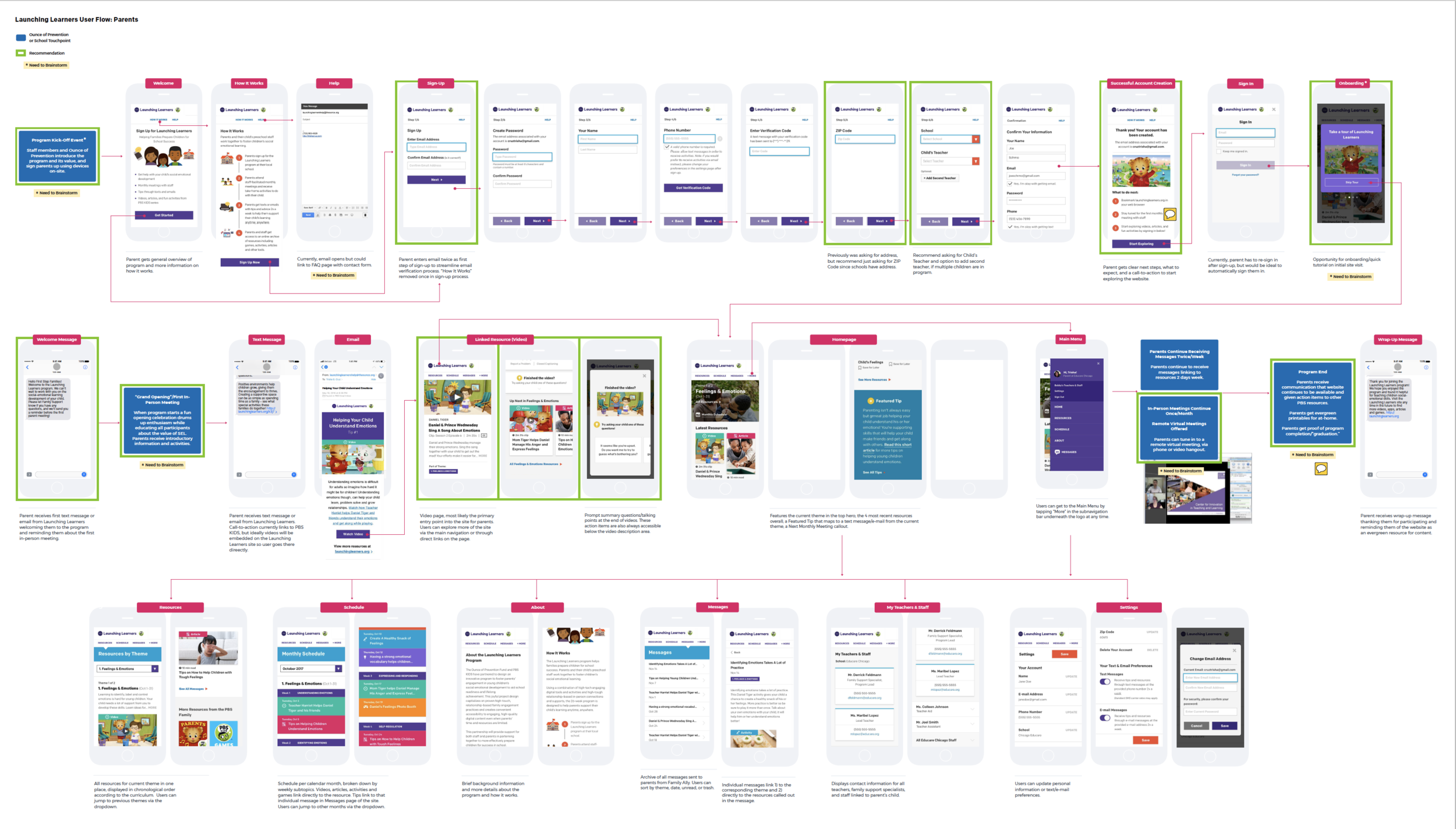
User Flows
Along with addressing the findings from in-person user testing, I fleshed out the 3 main user flows: the Parents Mobile flow, the Staff Desktop flow, and the Sign-Up flow.
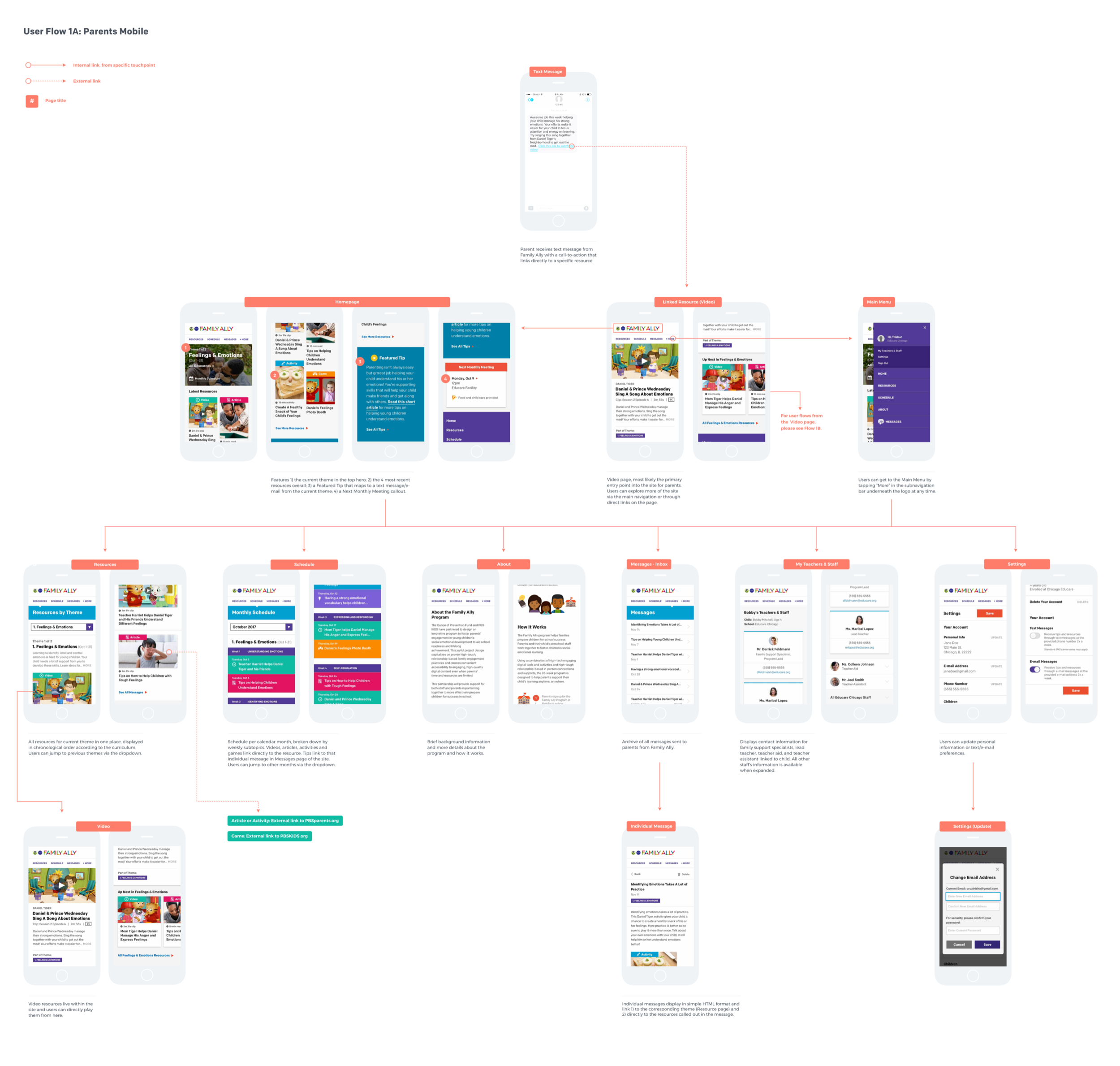
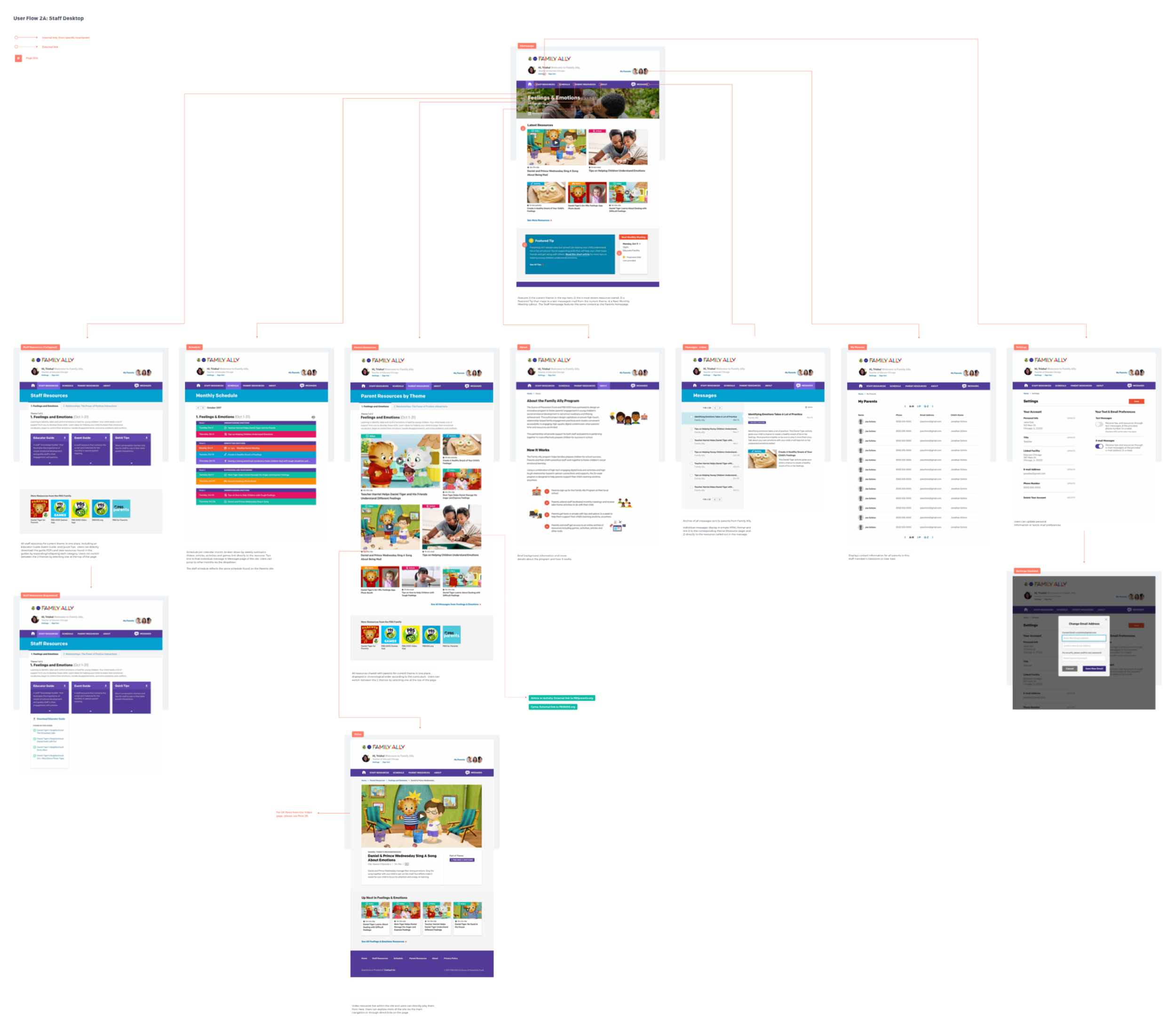
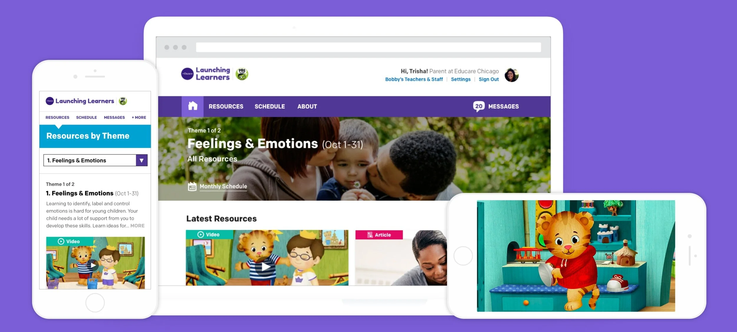
User Interface Design Launched for the Pilot
Below was the design that we launched with for the 8-week pilot, Parents Mobile on the left and Staff Desktop on the right.
Sign Up Flow
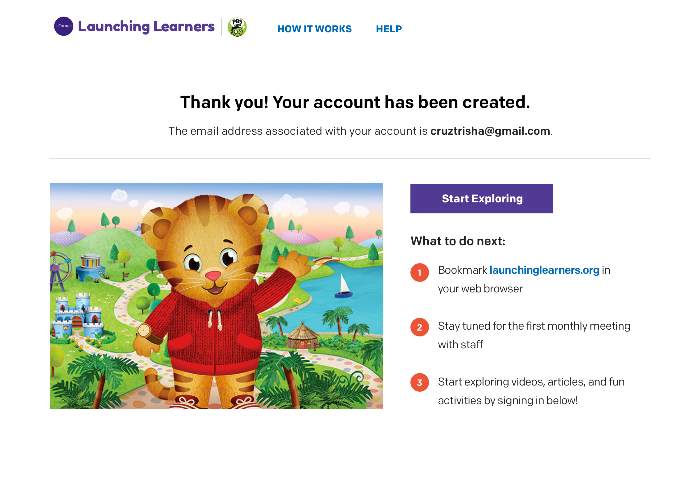
Users needed to verify their email addresses, so the first step of sign-up was to enter their email address. Once it was verified, we changed the previous long form, broke down the rest of the sign-up step-by-step with large form fields to make it more digestible.


Parents and Staff Website
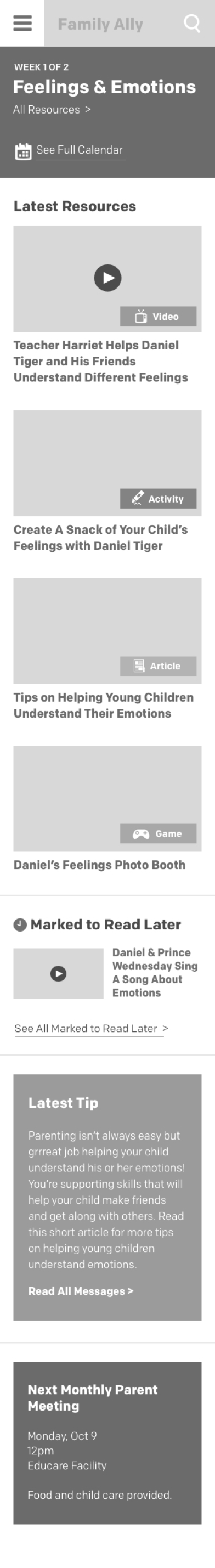
Our findings from user testing helped inform some underlying changes: we organized the site’s content in a way that made the curriculum themes of the program easier and more relevant to follow in real-time.
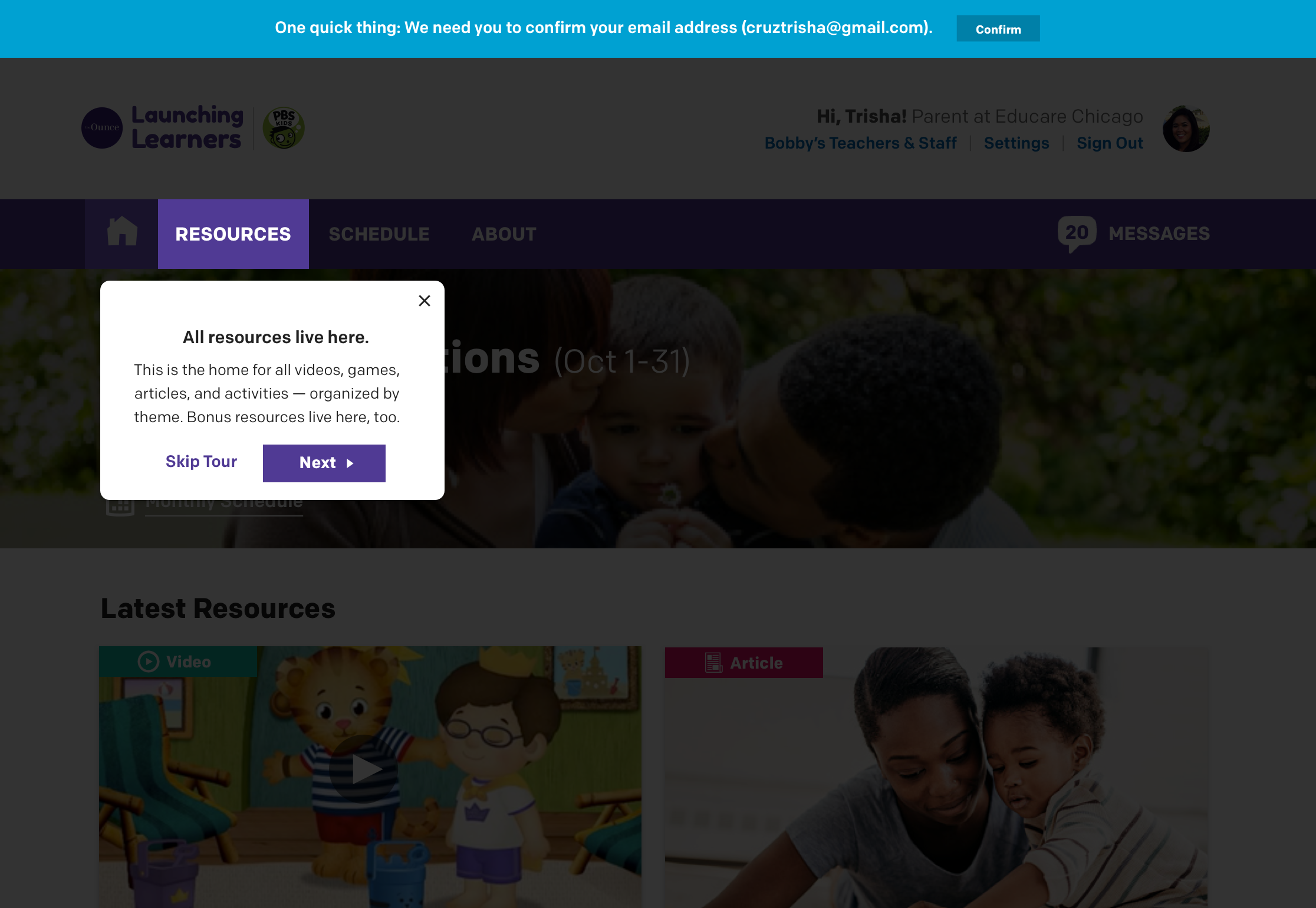
One of the most important usability impacts from user testing was moving from a hamburger icon to an exposed menu at Mobile.
If you’re on a mobile device, access the prototype here:
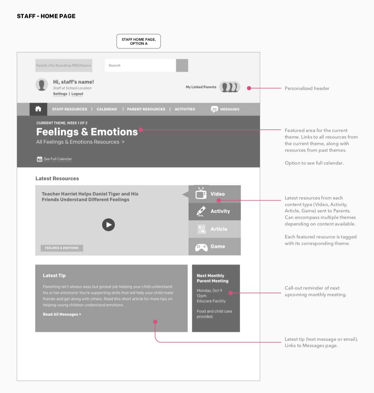
Home (Staff Version)
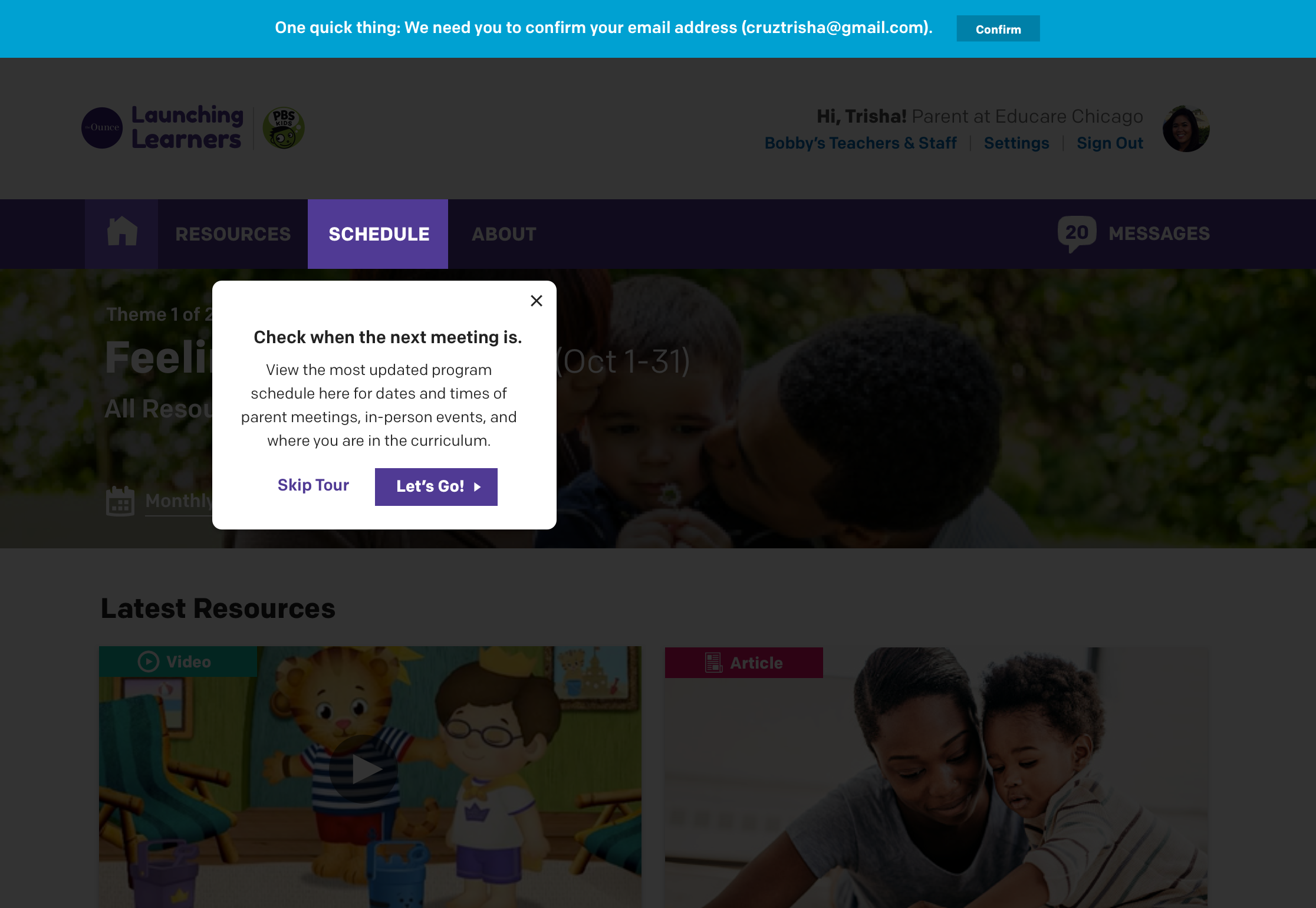
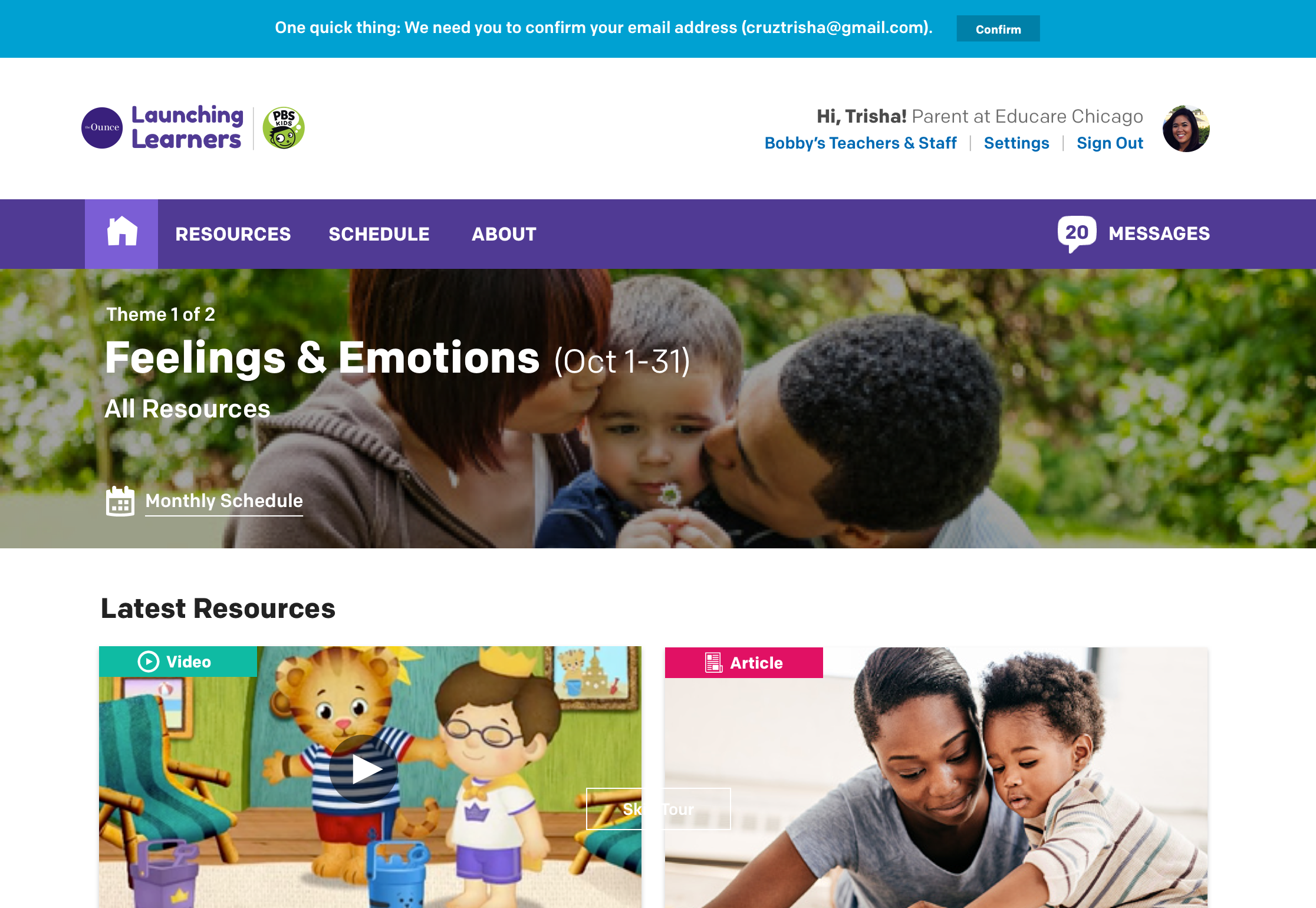
Schedule

We made the Staff homepage the same as the Parents’ one, realizing that the Staff site only needed to be different in key administrative functions, like staff-facing resources and class lists.

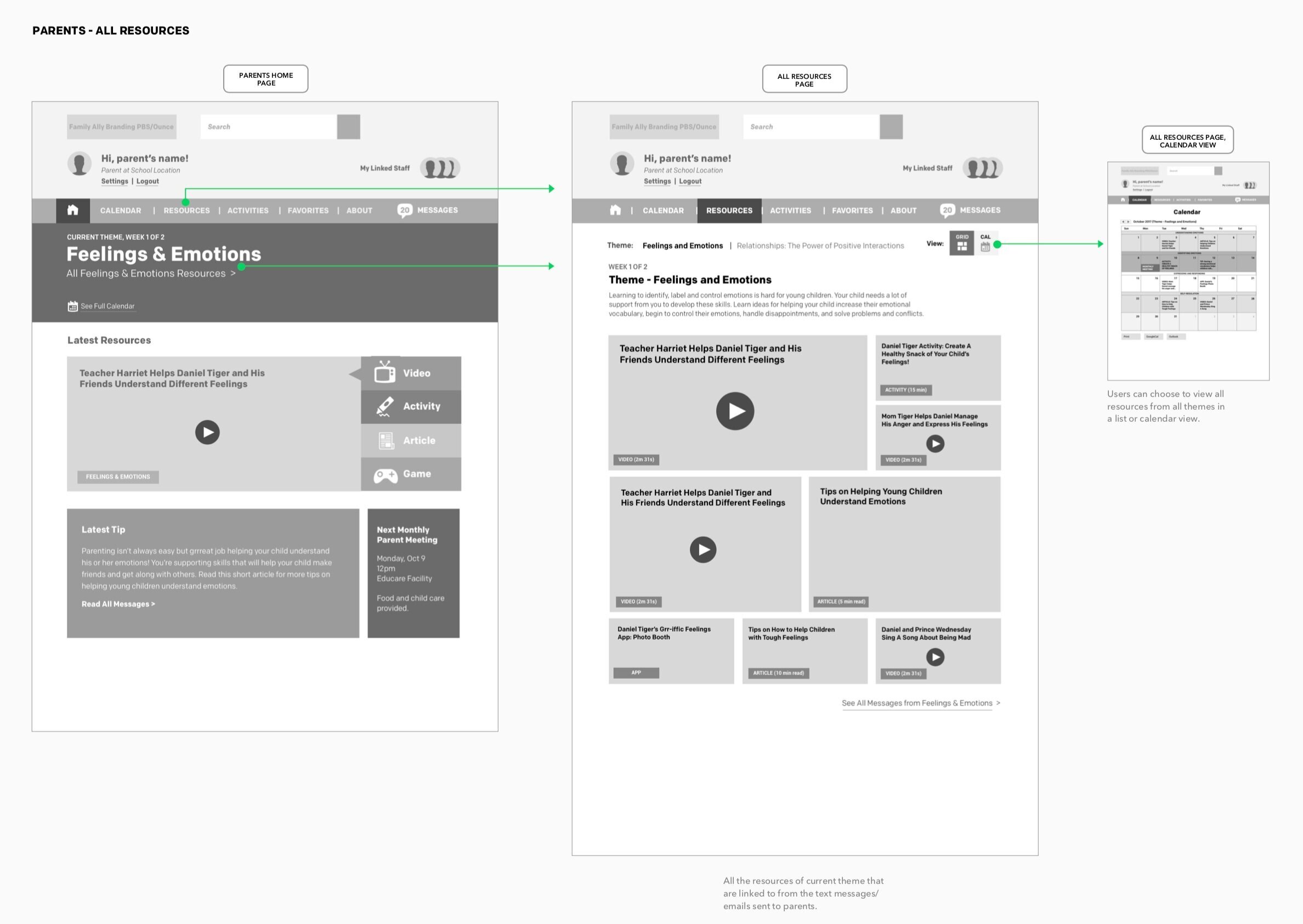
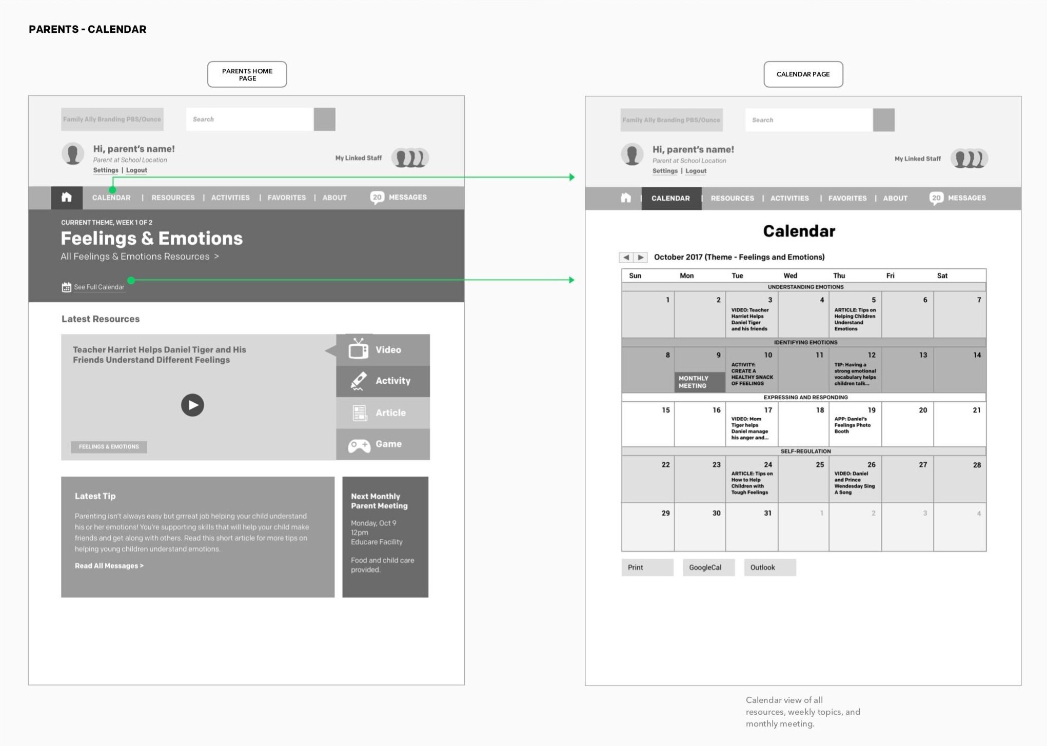
We shifted the previous Calendar view into a more relevant Curriculum schedule with weekly subtopics and important milestones.
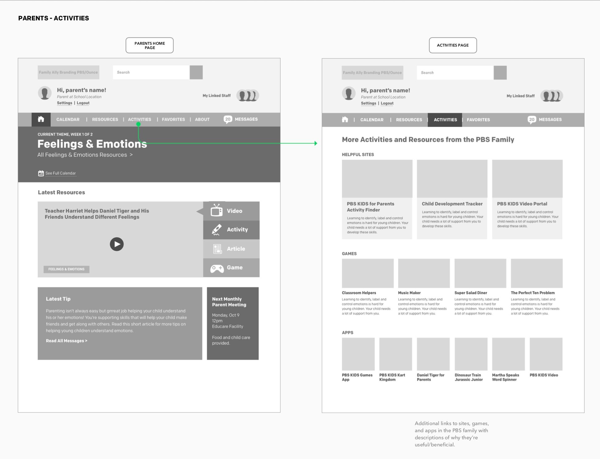
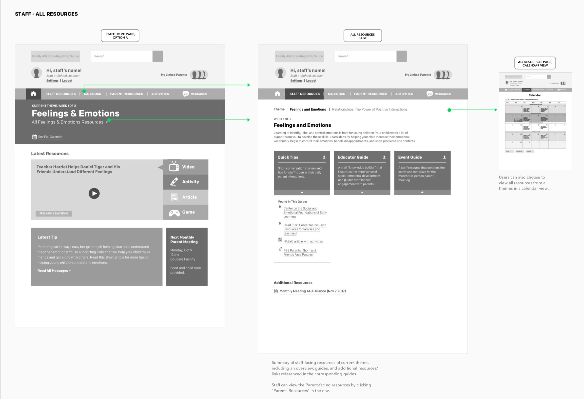
Parent Resources

We added key contextual pieces that told parents about the real-life value of each subtopic and how it would help their child succeed, and made the selected theme more clear.
Staff Resources

We simplified the Staff Resources page to focus on the 3 key guides that they would receive per theme. Since the main functionality was a direct download of a PDF, we incorporated a helpful “Found in This Guide” that linked to specific resources they could quickly reference for in-person meetings.
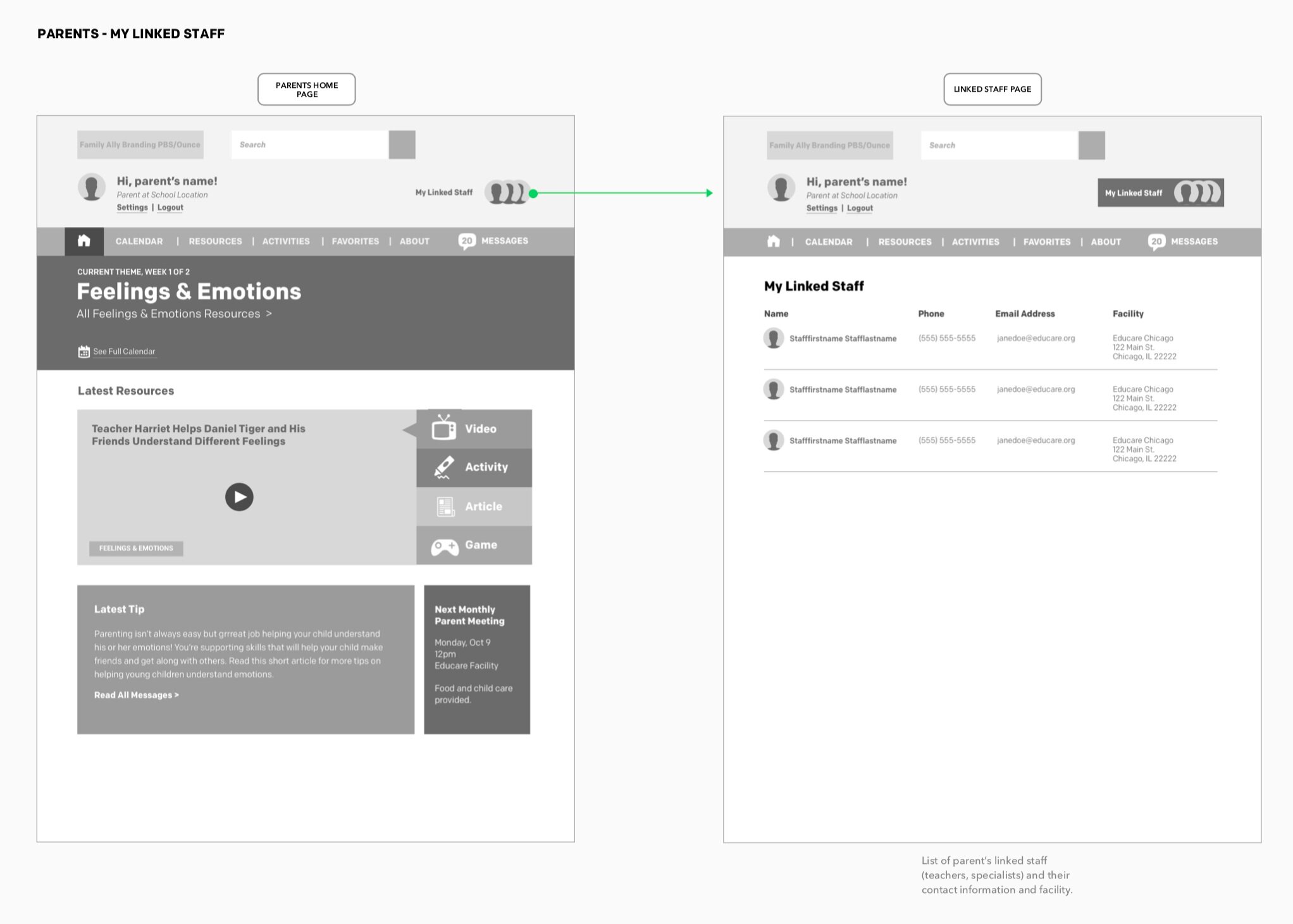
My Staff

For parents, we created a visual hierarchy of Staff Members they would likely be interacting with, exposing the contact information of their child’s designated Program Lead and Lead Teacher.
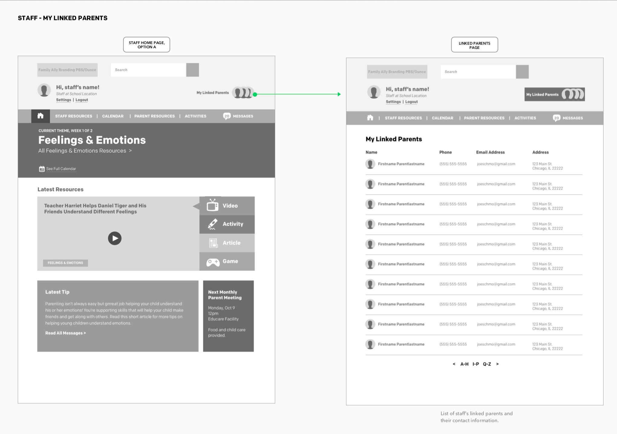
My Parents

For staff, a scannable list in Alpha order would let them quickly scan the information of parents who had signed up to participate in the program.
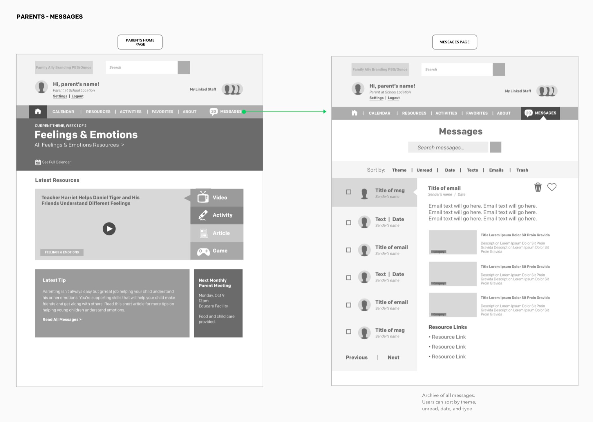
Messages

We simplified the messages area, stripping out the Sort by functionality which wasn’t needed for the amount of resources scoped within the pilot period. Theme badges were added that parents and staff could quickly reference.
Settings

The user settings area got updated by adding the user’s linked school, as well as title if they were a staff member.
Focus Groups
As the pilot period was coming to a close, we sat in on 2 focus groups at 2 of the schools, one with staff and one with parents. A researcher from the Ounce led each focus group. We also informally interviewed 2 family support specialists at the 3rd school.
Website Performance During the Pilot
The vast majority of users came to the site directly. However, the users that did visit the site via text message were more highly engaged, averaging twice as many sessions per user. The most visited page was the Homepage, followed by Member login, Member registration, and Schedule. The site was most visited during the early afternoon into early evening,
70%
2.7
4.9
6 min
75%
return rate for 174 visitors and 448 sessions
average number of sessions/user
average pages/session
average session duration
users came to the site directly
Evaluation
Parents and staff found value in the program and saw real, impactful results with children. Teachers were finding ways to integrate the program in their classroom, whether regularly incorporating resources into lesson plans and activities or pulling up videos on-the-spot as needed. Parents were seeing improved behavior from their kids in just 8 weeks.
What Worked Well
Most parents and staff surveyed believe the website to be a valuable resource for families.
More than 50% of parents surveyed took multiple opportunities to use and interact with the website.
Most staff who were interviewed had visited the website though may not have used it extensively.
Staff described the website as easy to use, visually appealing and well-designed for both adults and children.
Staff reported visiting the website to: Play games and activities with young children in their lives, et resources for the in-person meeting, and access the site to show parents content
Lessons Learned
In focus groups and interviews, parents shared that accessing the website wasn’t convenient and just another thing to do; direct links to content were most useful.
Some parents didn’t remember the website, or only visited the website after registration.
While parents and staff expressed delight/interest in the site’s capabilities and resources, the user journey of the program itself prevented users from truly discovering all the site had to offer.
Because of technical and time constraints that prevented us from housing all the content on the site itself, text messages and emails linked users directly to either the PBS KIDS Video Player or the PBS Parents sites. Other than the initial text message that encouraged users to sign into the site, participants would only use direct links.
Phase 2
With lots of lessons learned from the pilot, our team was tasked with recommendations on how to refine both the user journey and the site experience in key ways for Phase 2.

Improving the User Journey
Because many participants in the pilot weren’t aware they could continue to access all the resources even after the program was over, we prioritized how to improve the user journey. At the end of the sign-up process, direct parents to the website and quick tutorial to show them where things are; point to website itself as a specific resource within the message curriculum; have resources live on the website instead of externally; and treat the website as the continuing, evergreen source of content when the formal program ends.
If you’re on a mobile device, access the prototype here:

Areas of Expansion
Parents and staff also wanted more action items at the end of resources like follow-up questions and talking points. Parents also wanted more customization specific to their child and more content coverage like sibling engagement and how to deal with tough things like divorce, so these are key areas to leverage expanding in Phase 2 of this project.
Team Members
Kathleen Kenney (Discovery, Project Management, Design Direction), Krista Fuentes (Site Development), Aaron Berkowitz (Tech Lead), Abby Jenkins and Mary Hope Garcia (Content), Jessica Teng (Content + Ounce of Prevention Lead), Alexandra Scott (End of Phase 1 Project Manager)