
PBS for tvOS
Creating an easily-browsable experience for viewers to find and stream the PBS content they want on tvOS.

Overview
When this project initially got underway, the PBS Video App was on a number of mobile and OTT platforms, including legacy Apple TV. However, we were very constrained on the legacy Apple TV codebase, which required a lot more hacking to get any sort of meaningful customization.
When tvOS was introduced, we had the opportunity to create a more robust, easily-browsable experience for viewers to stream the PBS content they wanted on tvOS. We wanted to make it efficient for users to find the content they wanted, and promote the breadth and depth of PBS content to drive content discoverability.
My role involved Wireframes, User Flows, Visual Design, and User Testing.
Users and Audience
This project’s users overlapped with that of the Core Data Model project.
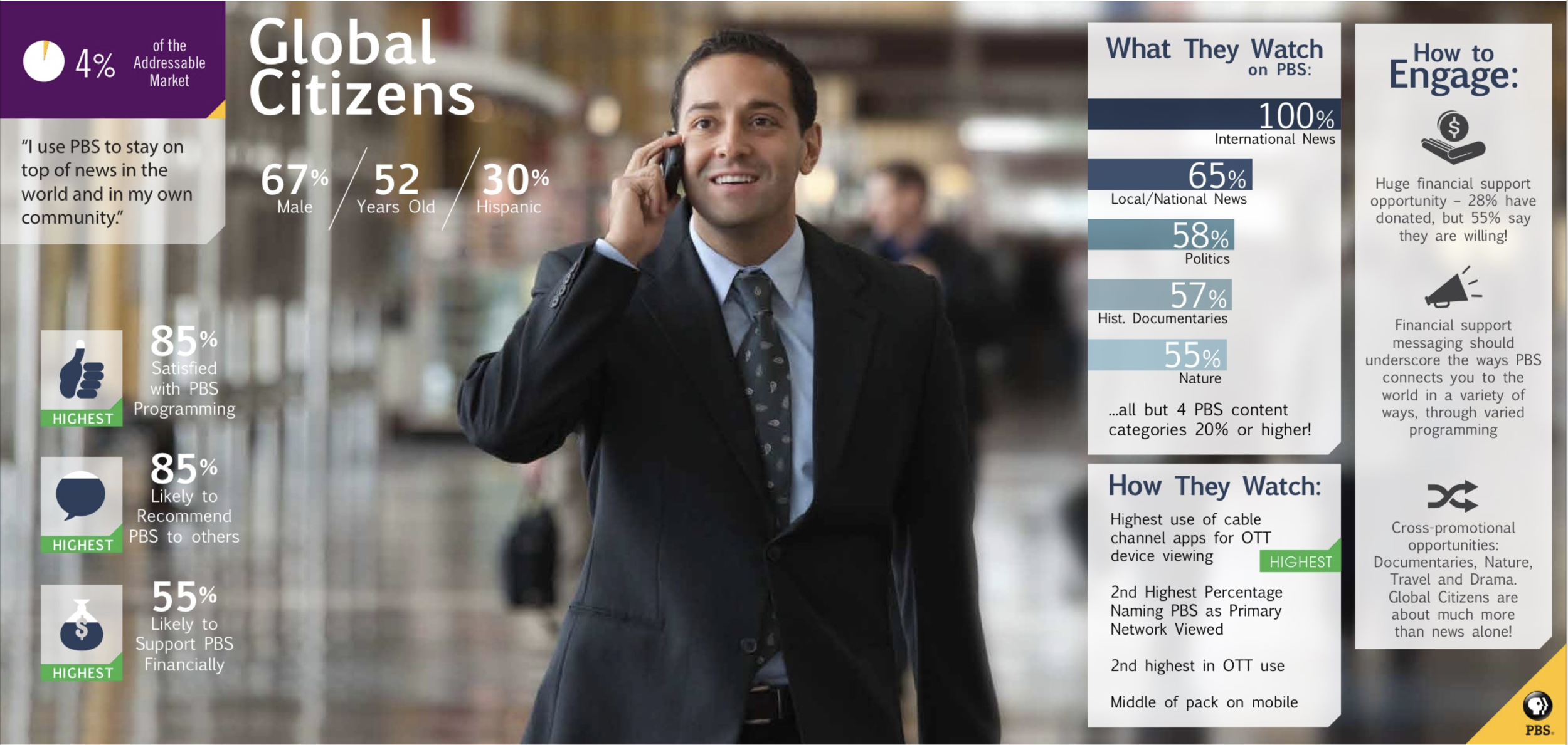
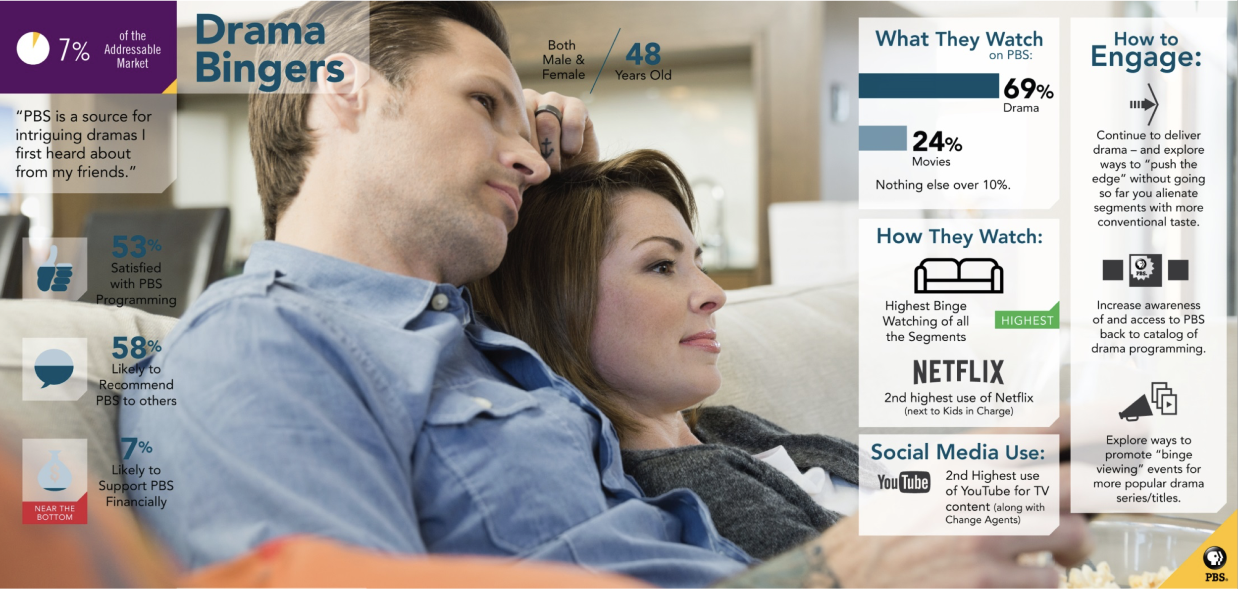
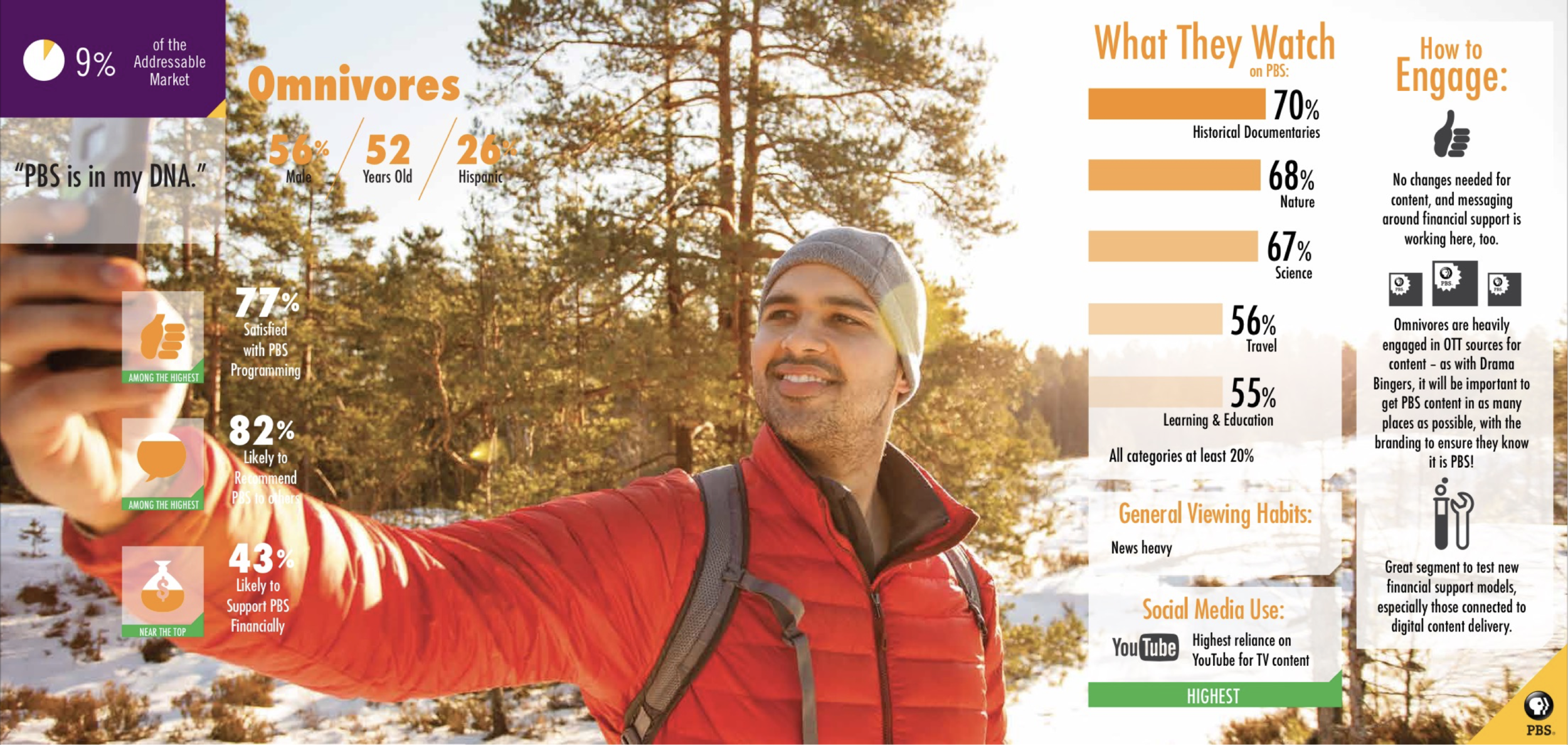
An audience segmentation study of 3000 TV and video consumers age 18-74 in PBS’ addressable market helped inform our work for this project. We identified 3 personas that had the highest OTT (over-the-top) usage: the Global Citizen, the Drama Binger, and the Omnivore, and focused on their motivations and viewing goals.
We saw the Global Citizens and Drama Bingers as “hunters”, as they typically seek out news or drama content specifically. We saw Omnivores more as “browsers”, as they have the highest engagement across the most categories, jumping between historical documentaries, science and nature.
Design Process
We had 2 main UX goals for an improved OTT experience: 1) Can we help “hunters” more efficiently find what they’re looking for?; and 2) Can we help “browsers” discover new content they’re interested in? OTT was our largest audience for shows like Frontline and PBS NewsHour, so we focused on these content areas especially as benchmarks and pressure tests for the design of the experience.
Wireframes Rd 1
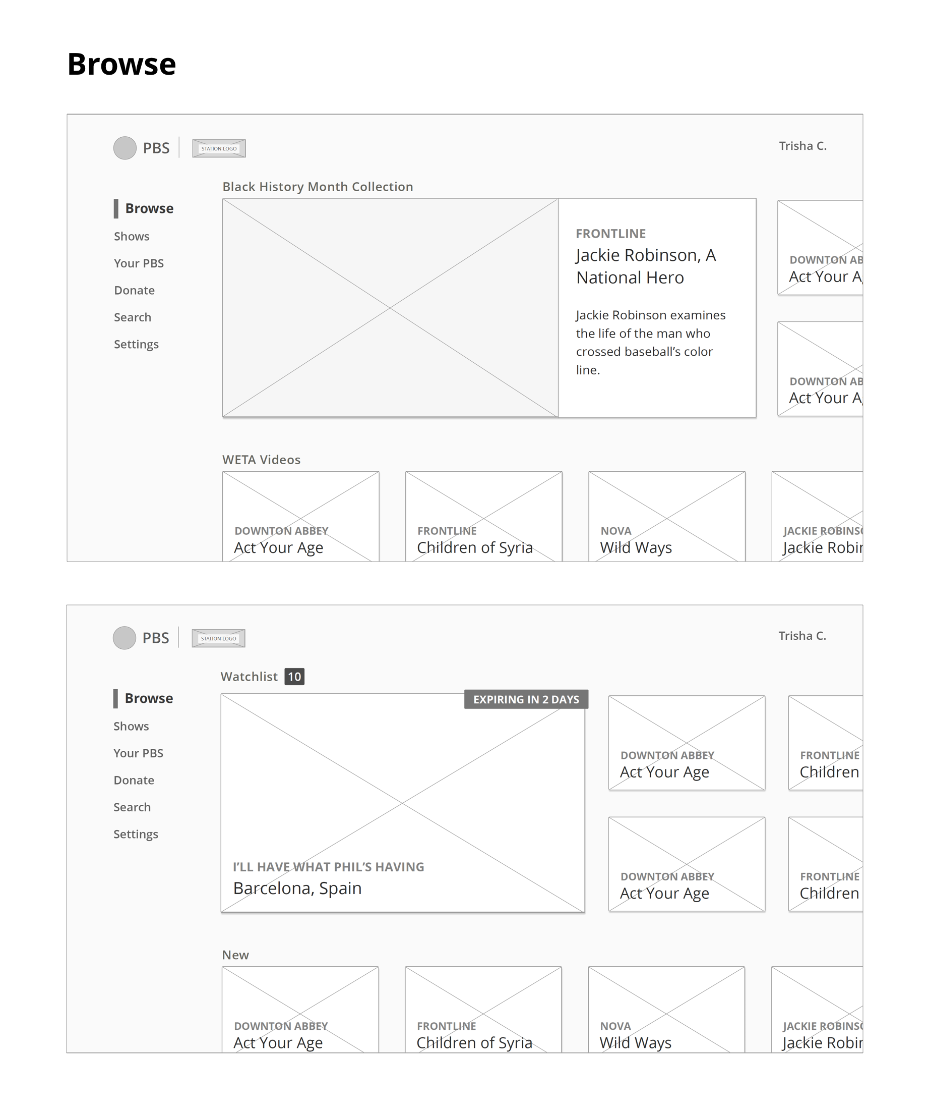
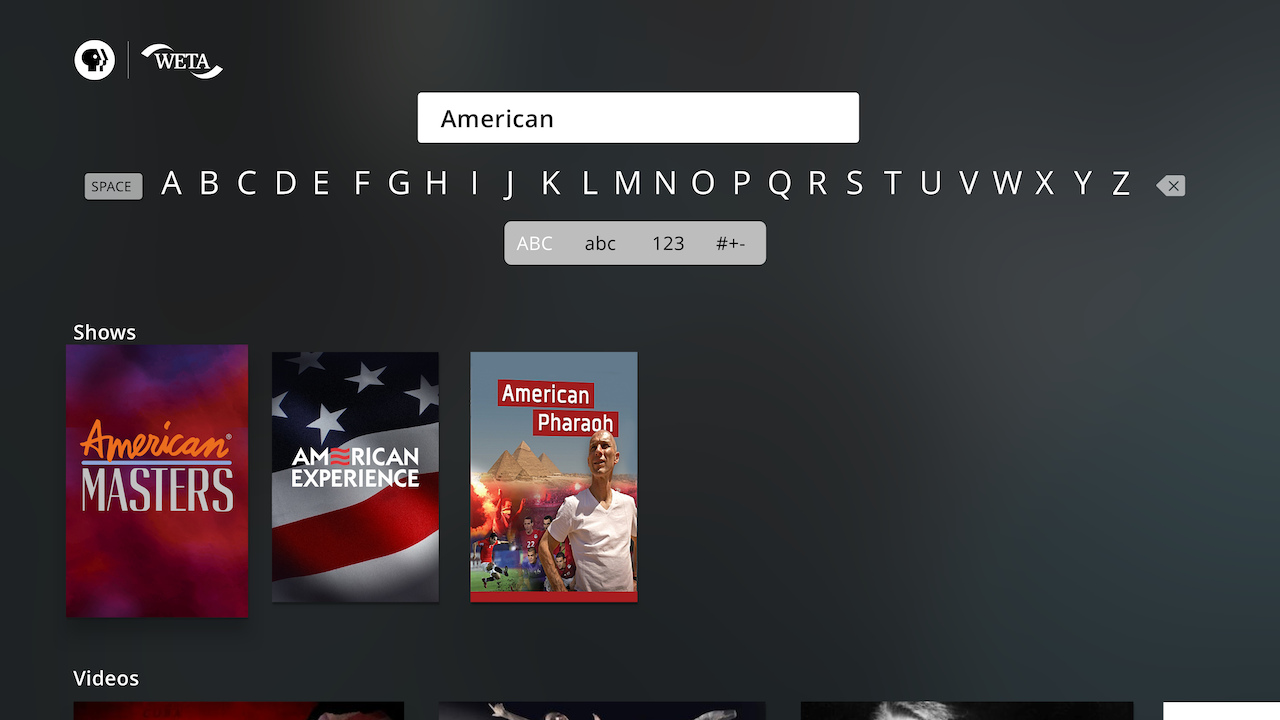
I spent several weeks on the project in the lo-fidelity wireframe phase, which allowed me iterate through the user flows, get feedback, and course correct quickly. I focused on wireframing screen views within the limitations of the 1920x1080 TV frame to carefully consider the sizing and placement of UI elements on each screen, making sure key “peeks” of content were visible to users at the right times.
The first round of wireframes began with a wide range of explorations:
Wireframes Rd 2
Internal design team and stakeholder reviews helped inform some key underlying changes for round 2 of the wires.
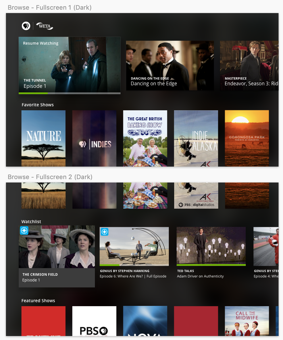
For the Home screen, what was originally a more complex interface that had unique “cards” and double-stacked row patterns for content like Special Collections and the user’s Watchlist proved to be problematic: with 8+ horizontal rows of featured content on the Home screen already, adding an additional vertical axis and grid within a single grouping of content was overcomplicating users’ directional pathways around the Home screen.
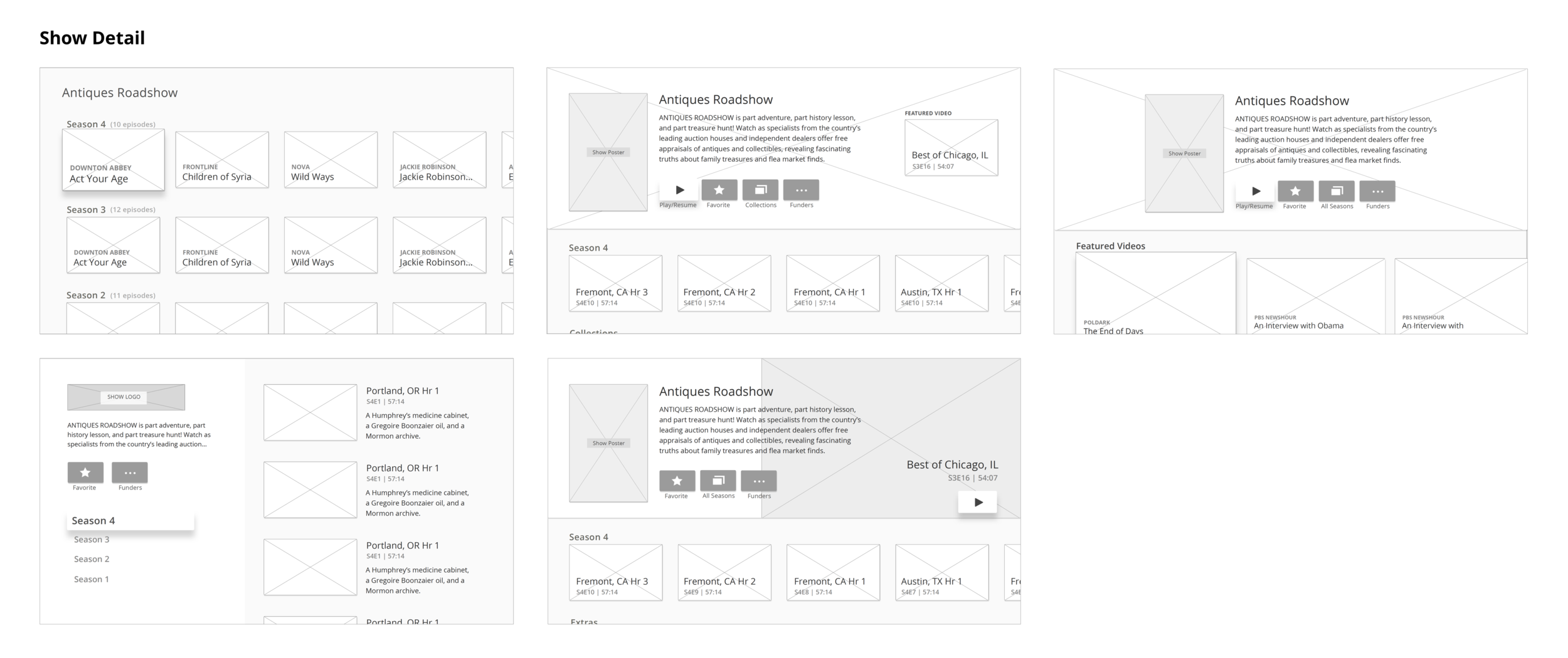
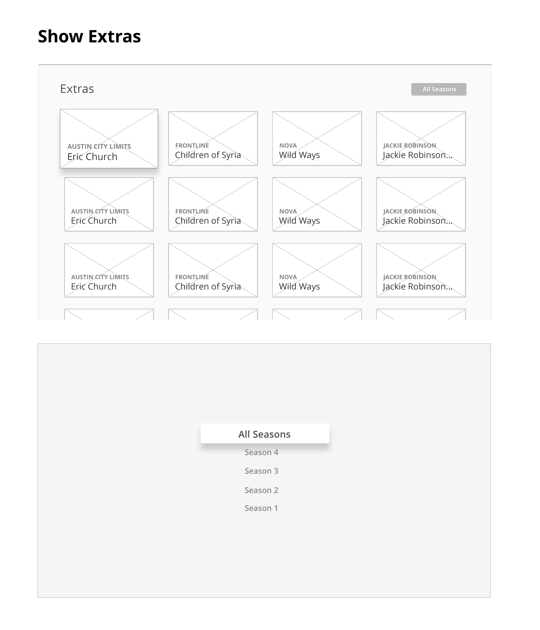
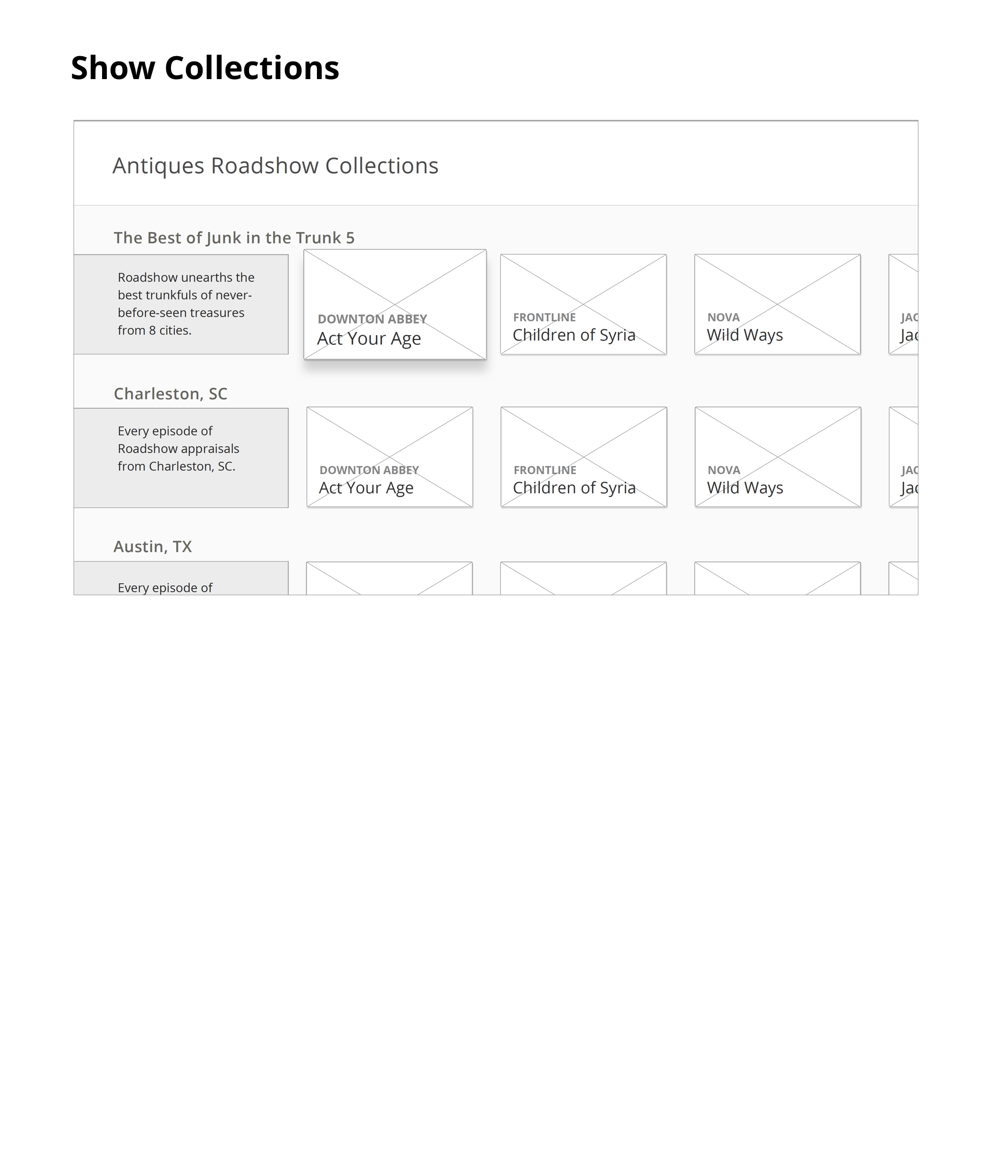
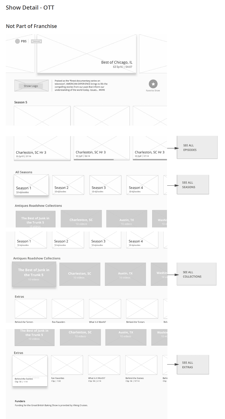
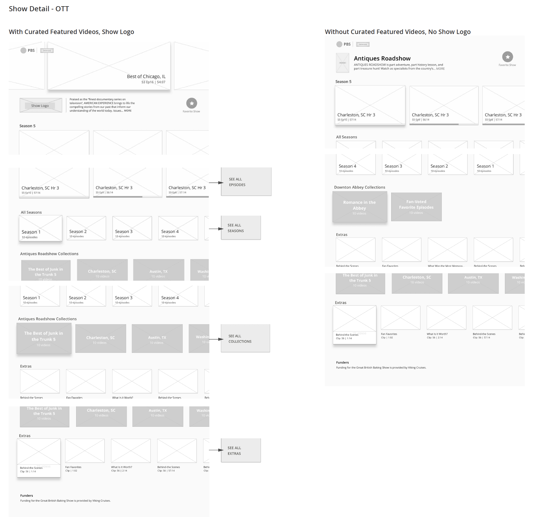
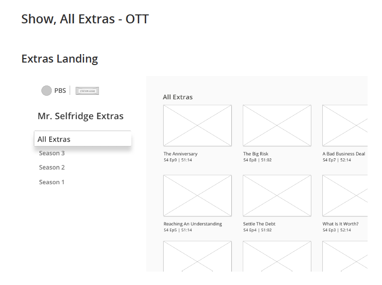
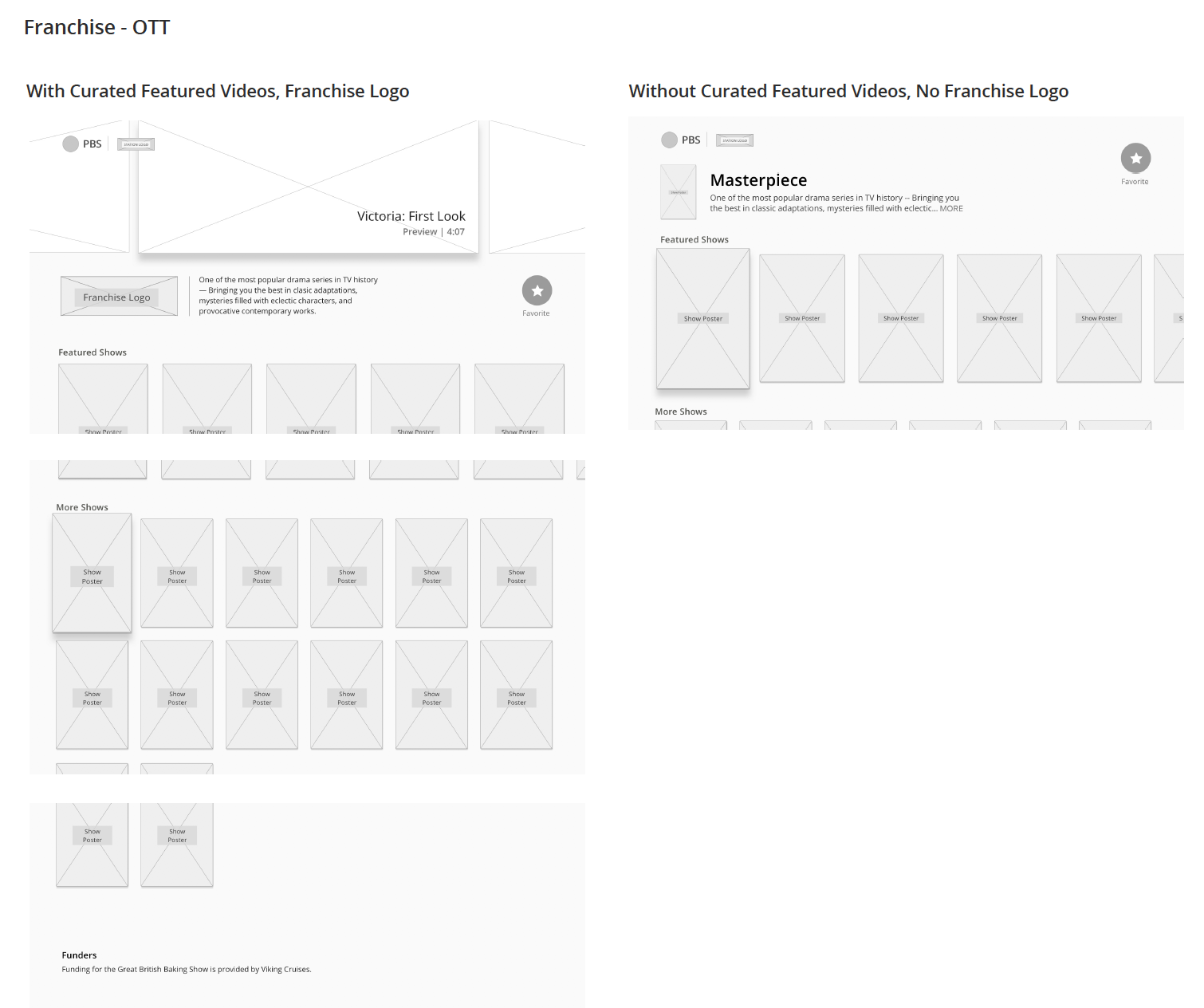
For the Show Detail screen, in round 1 we had ambitious hopes for streamlining and compressing all of the content that was required for this screen: solutions like hiding show funder text and show Collections behind a button weren’t enough to satisfy our stakeholder requirements for having these pieces accessible outright. Additionally, some of the round 1 wireframes didn’t solve for producers wanting to have an area for Featured content within their shows; because of PBS’ unique availability windows, content was continually coming in and out of availability — so this Featured Videos area was necessary.
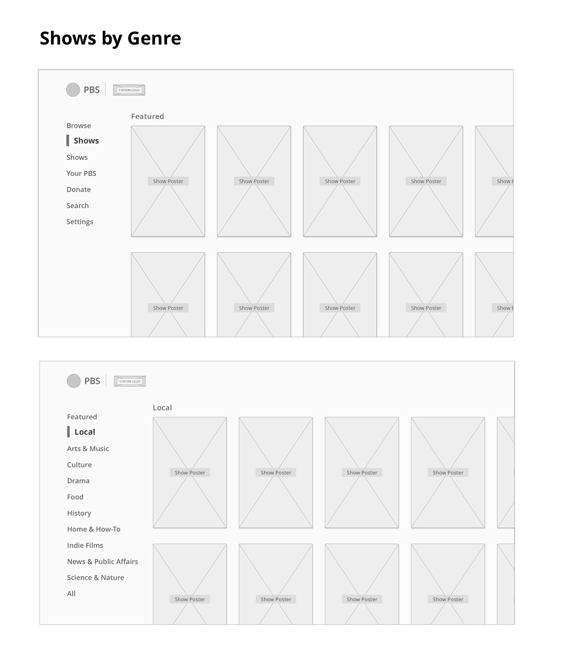
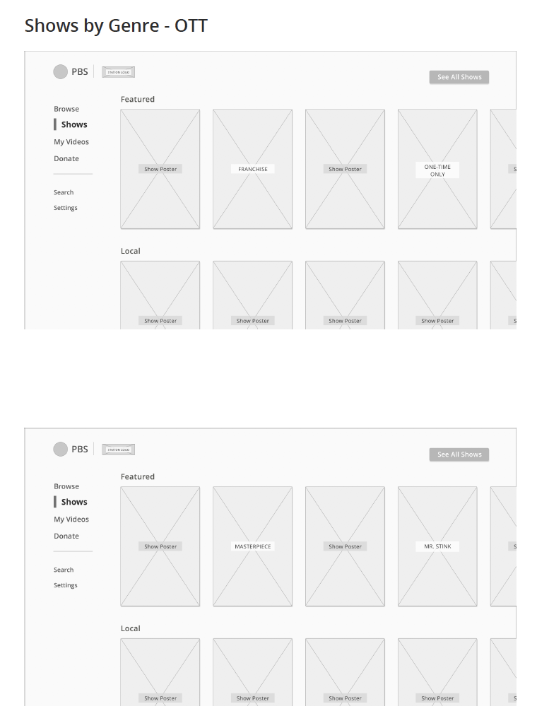
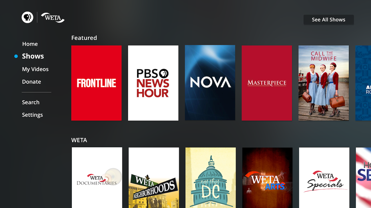
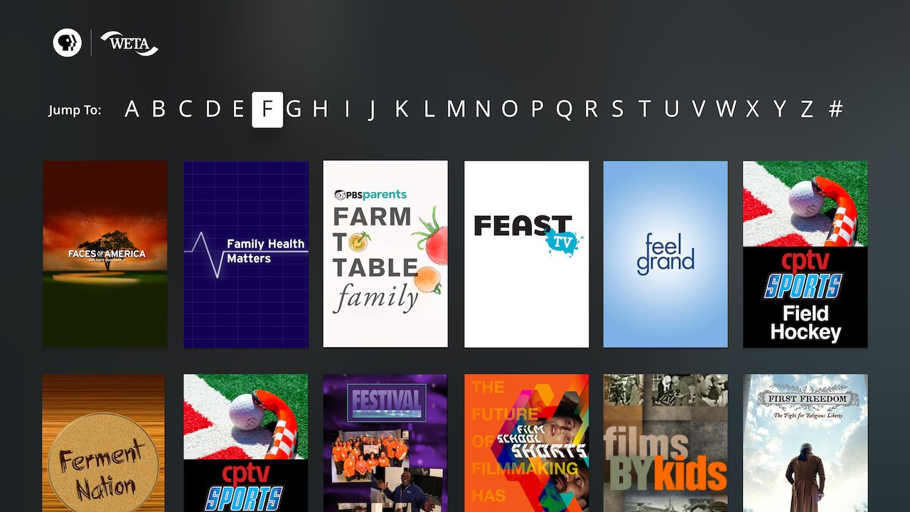
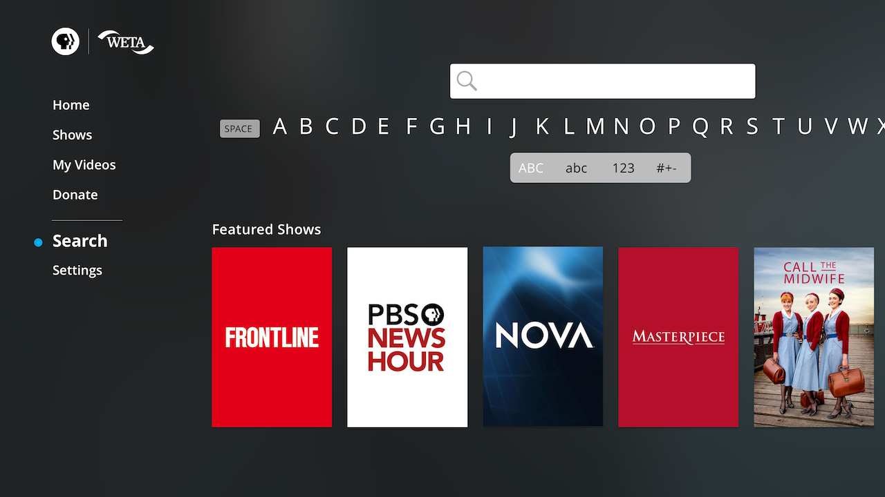
For the Shows screen, the ideas of a genre sub-navigation within the “Shows” menu item necessitated an extra click; and with our user base skewing older, we didn’t want to hide the genres behind a click and risk the chance that users could never get to them.
Key Improvements
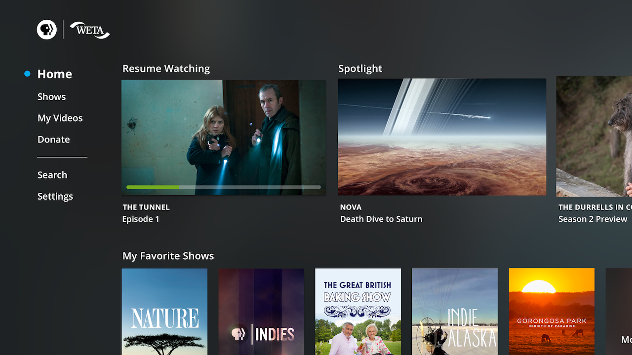
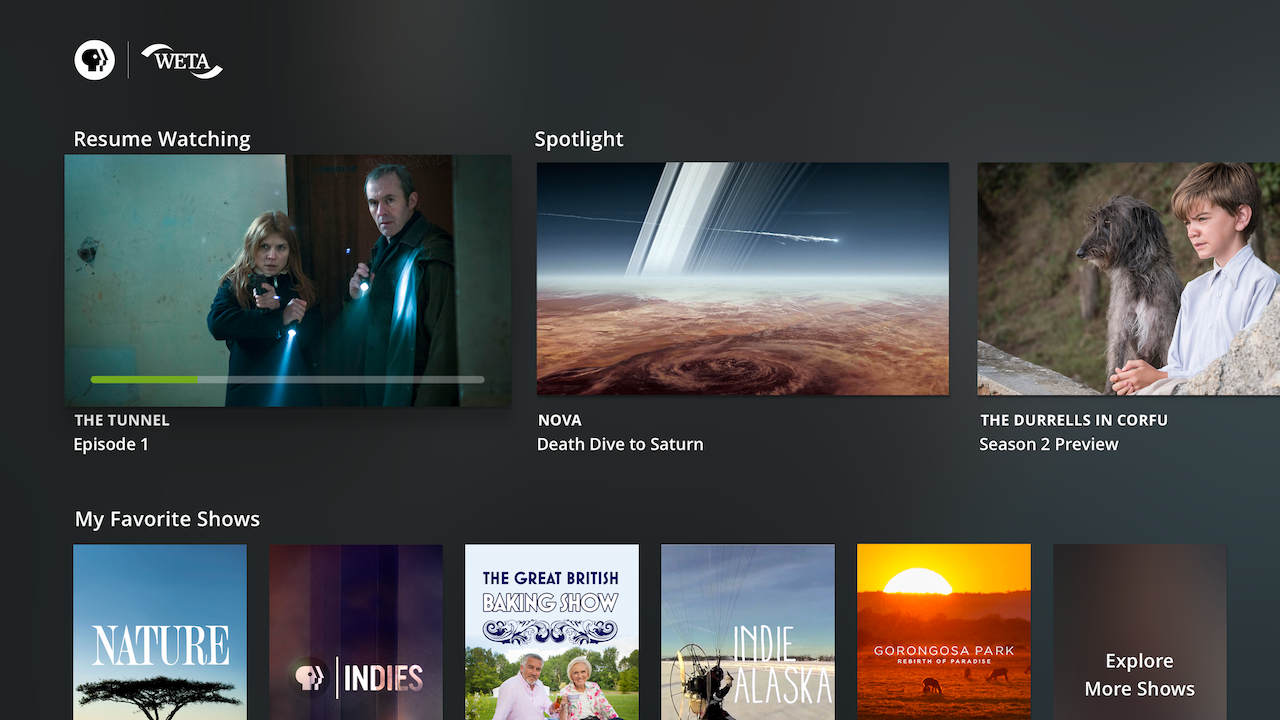
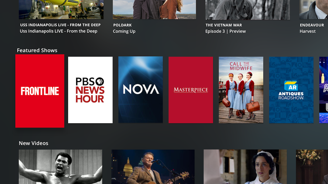
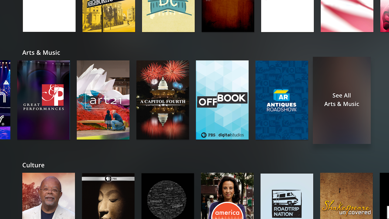
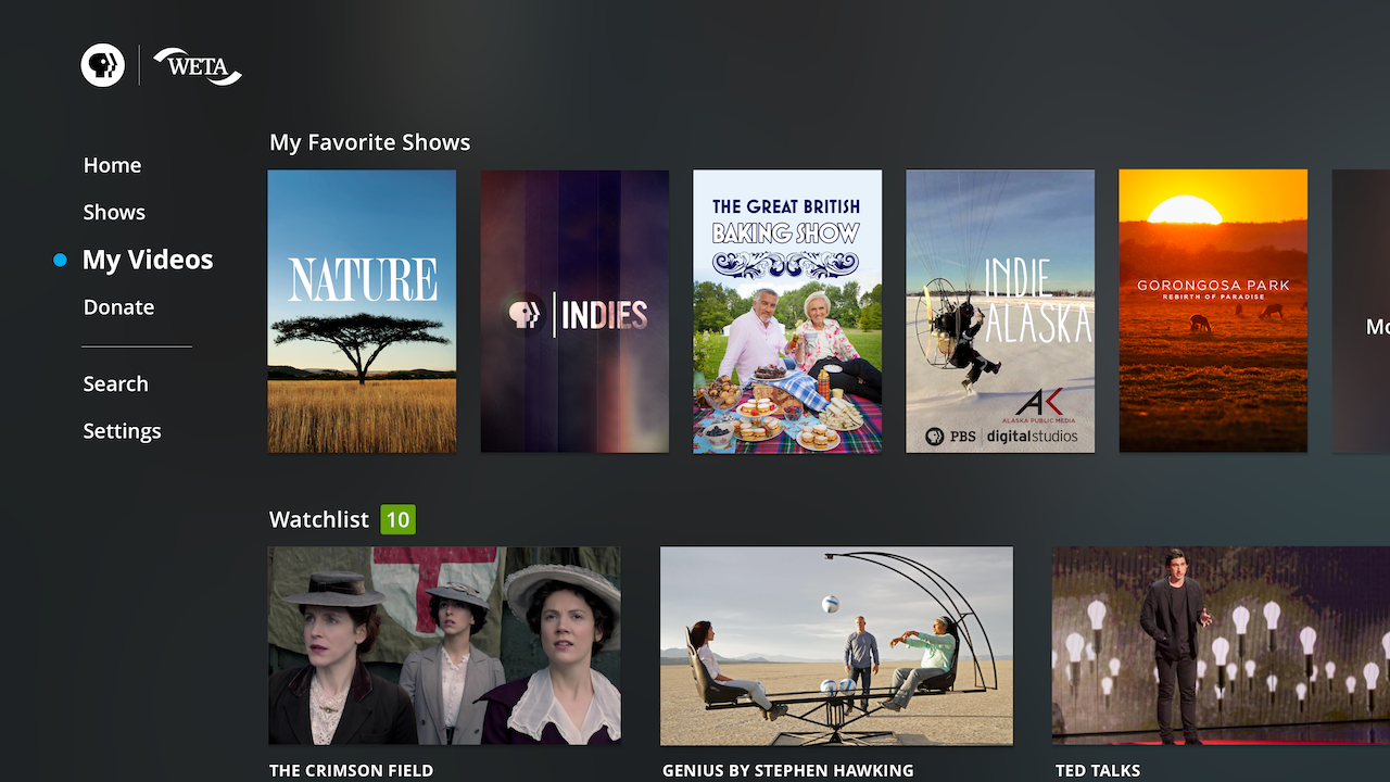
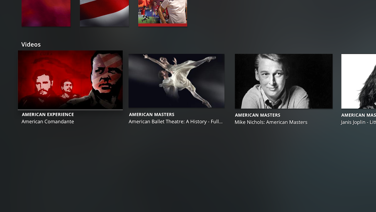
The revised wireframes simplified the Home screen to be all horizontal rows; and hierarchy wise, now the only the biggest feature area “Spotlight” was visually weightier. For the Shows screen, we exposed every genre in its own row to conserve a click and hint at the breadth of genres outright.
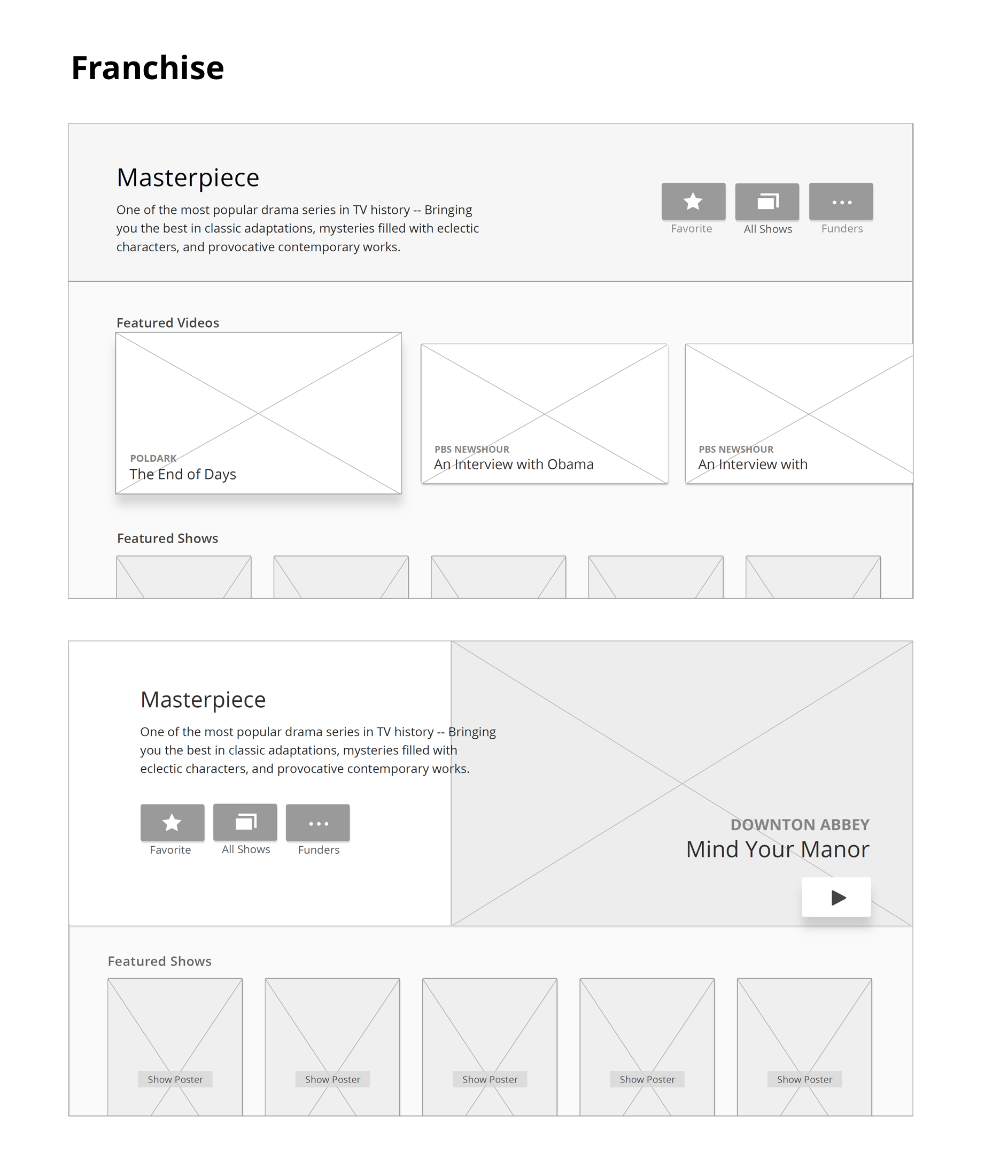
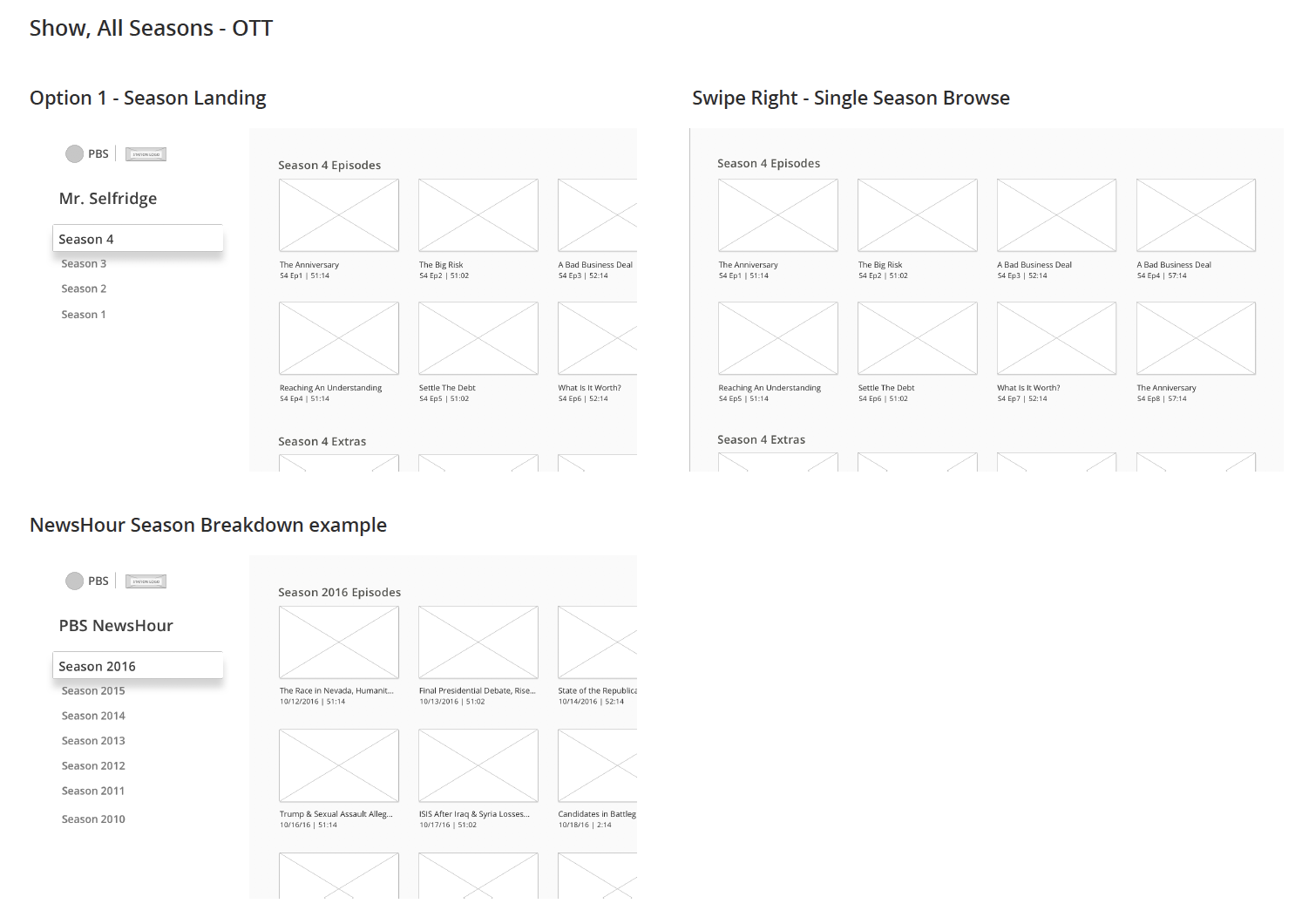
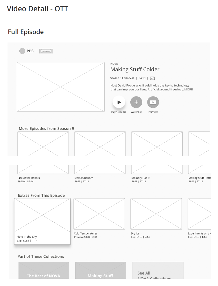
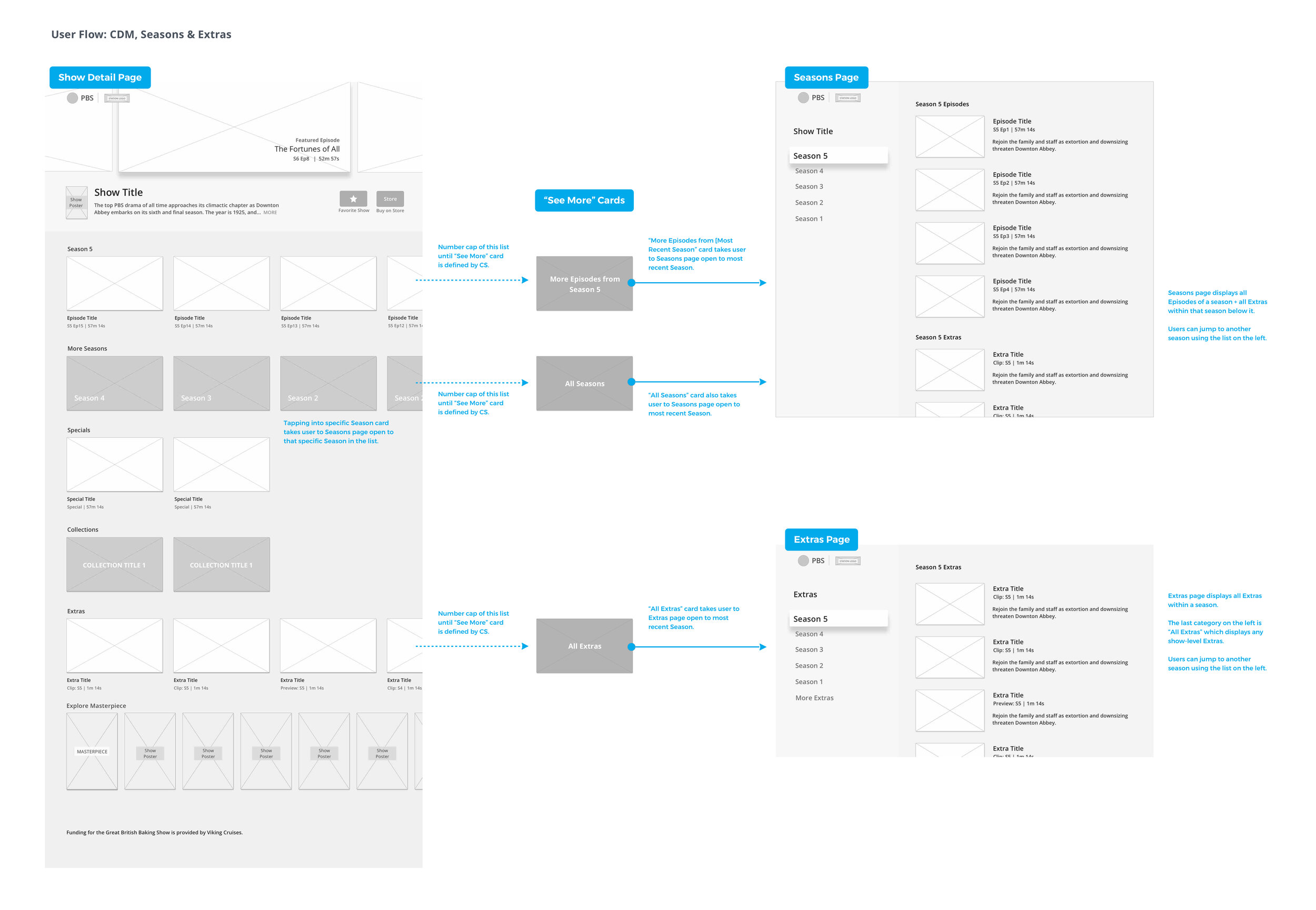
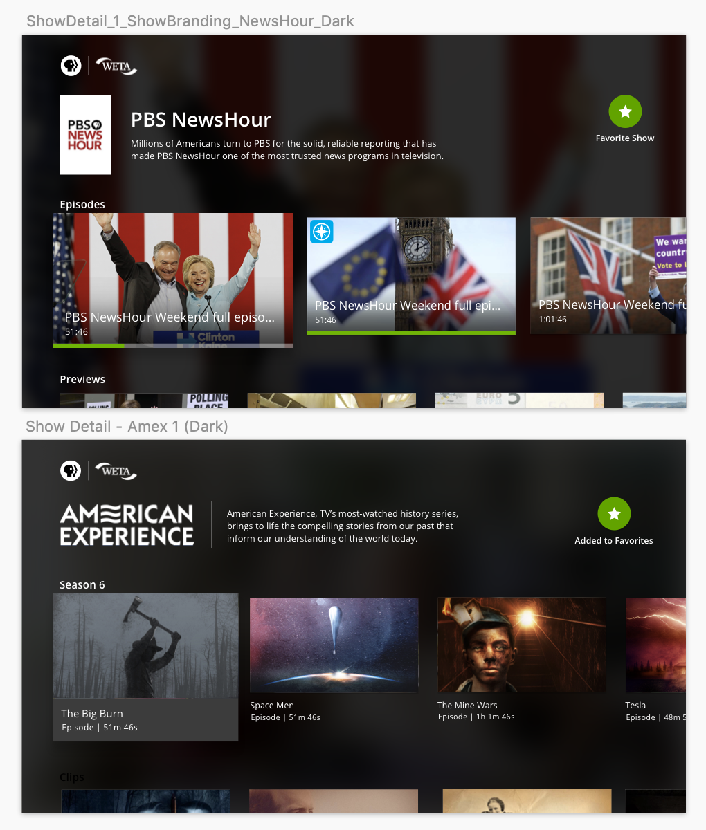
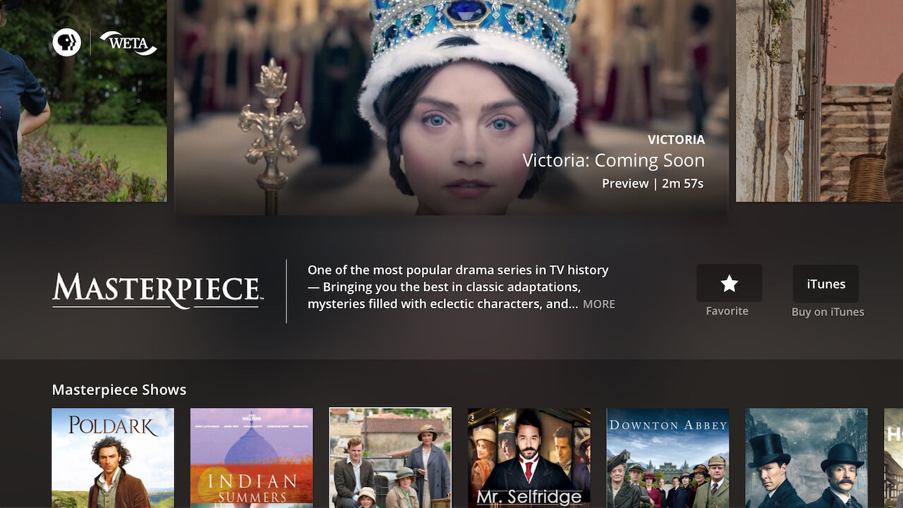
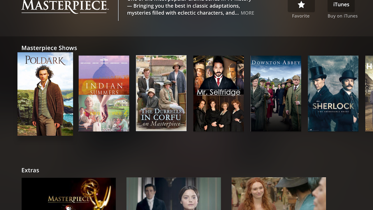
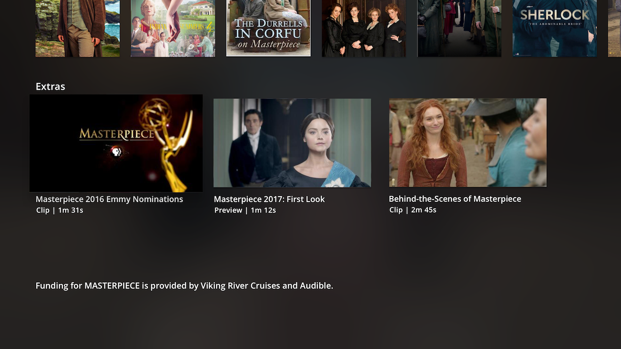
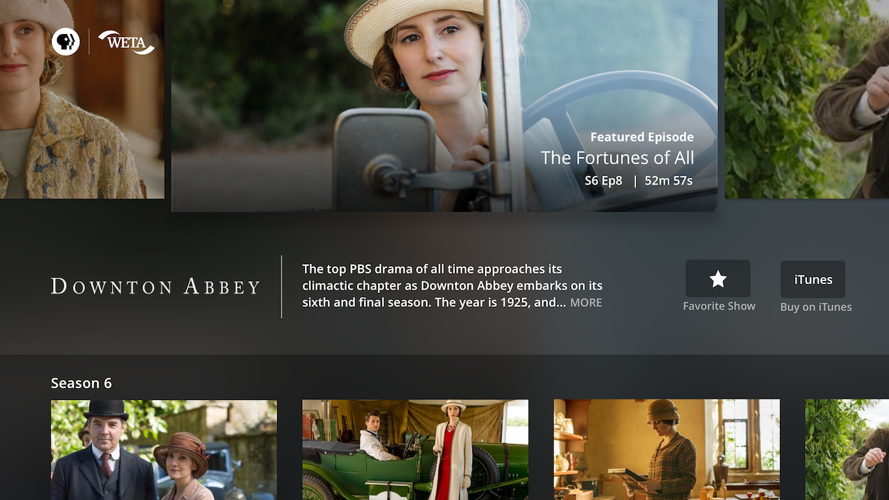
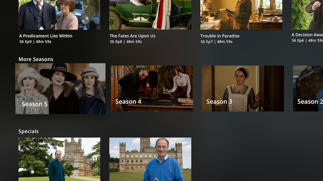
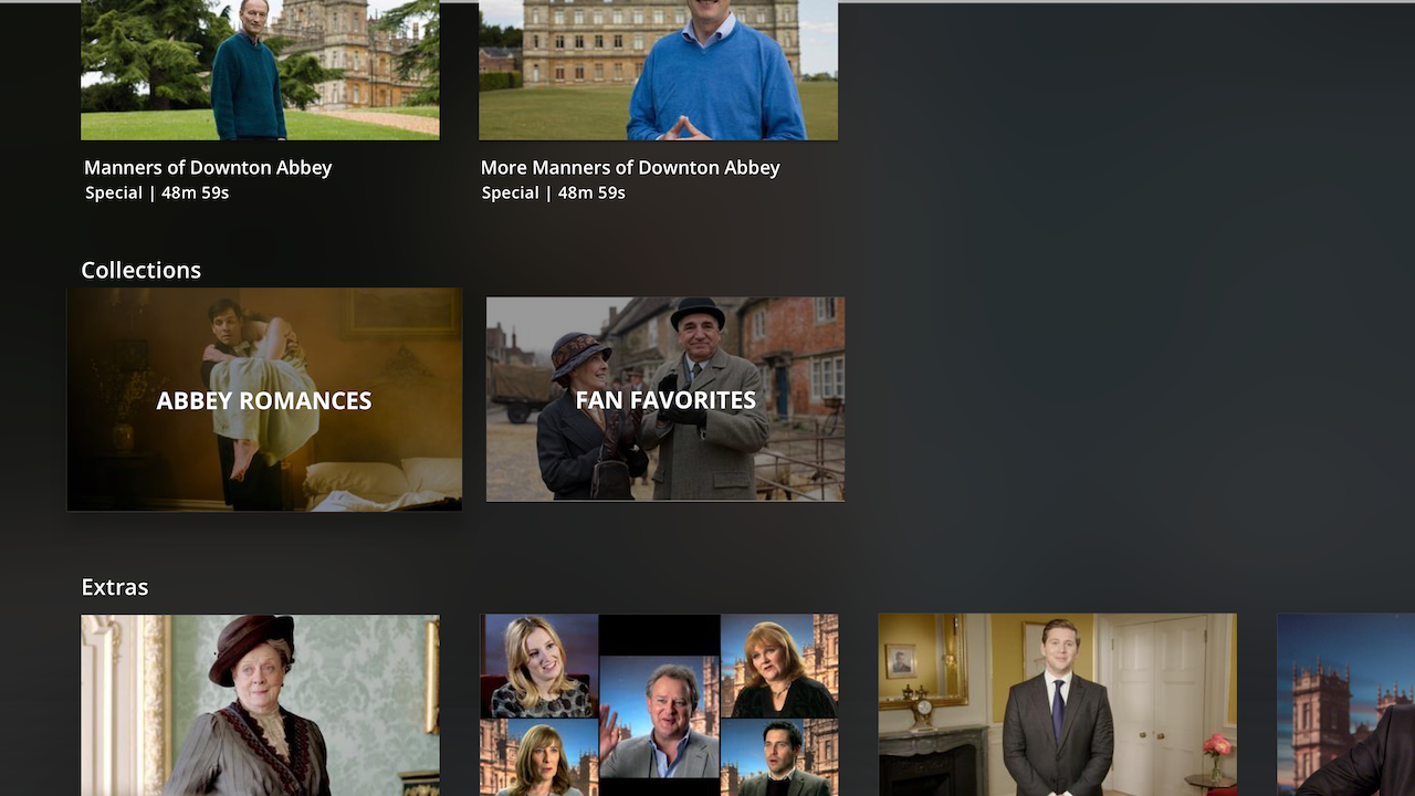
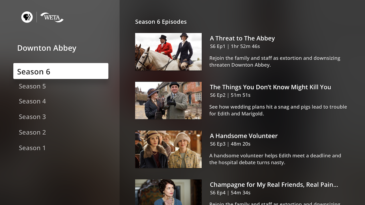
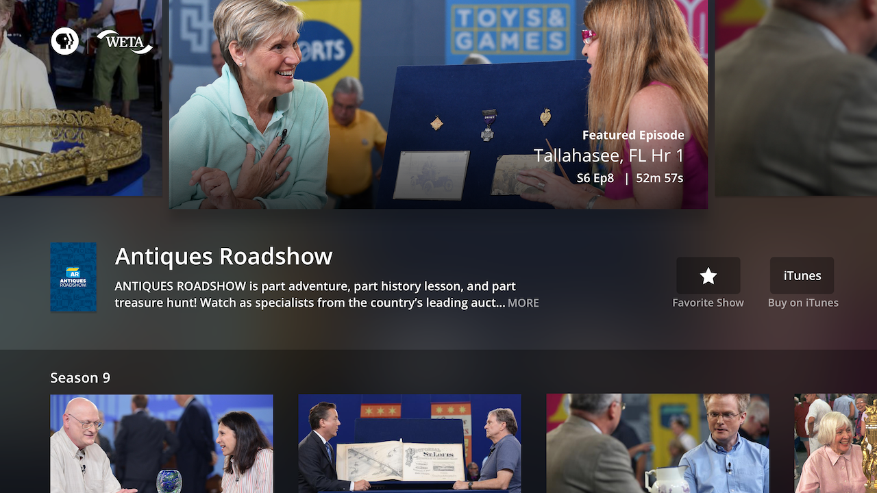
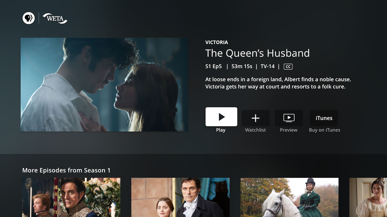
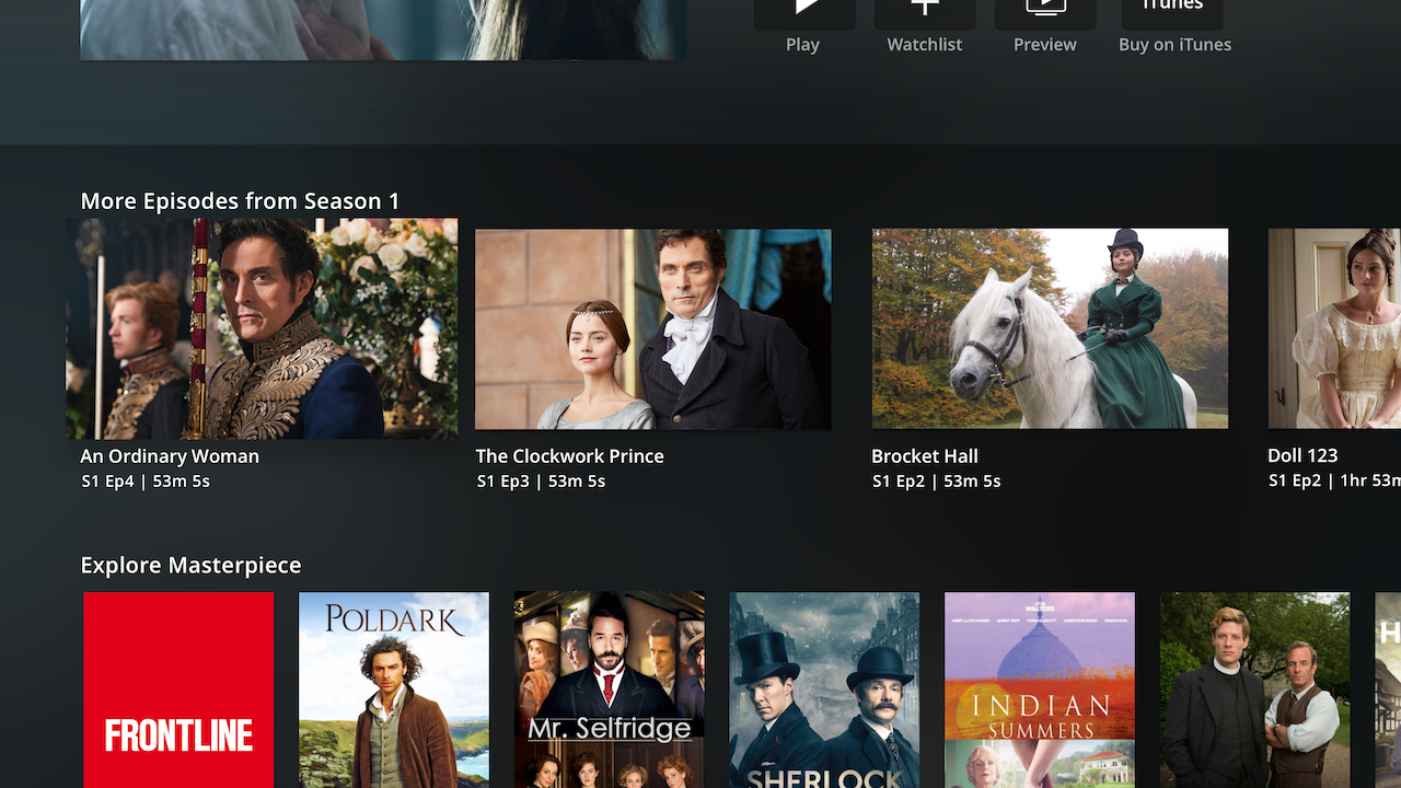
The Show Detail screen now solved for the Featured Videos area to be the topmost view of the screen, along with key show description info, favoriting functionality, and a peek of the most recent season. This way, hunters could easily get to what they were likely looking for in the Show’s initial screen view, while browsers had the option to browse through additional content like Collections and Extras. For Frontline and PBS NewsHour, that means the most relevant (aka today’s news) was likely the first video in the Featured Videos, which was in focus by default when users landed here. The split-screen view I had originally envisioned for a streamlined version of the Show Detail screen was re-purposed for a “See All” seasons view that users could access by selecting any of the show’s Season cards.
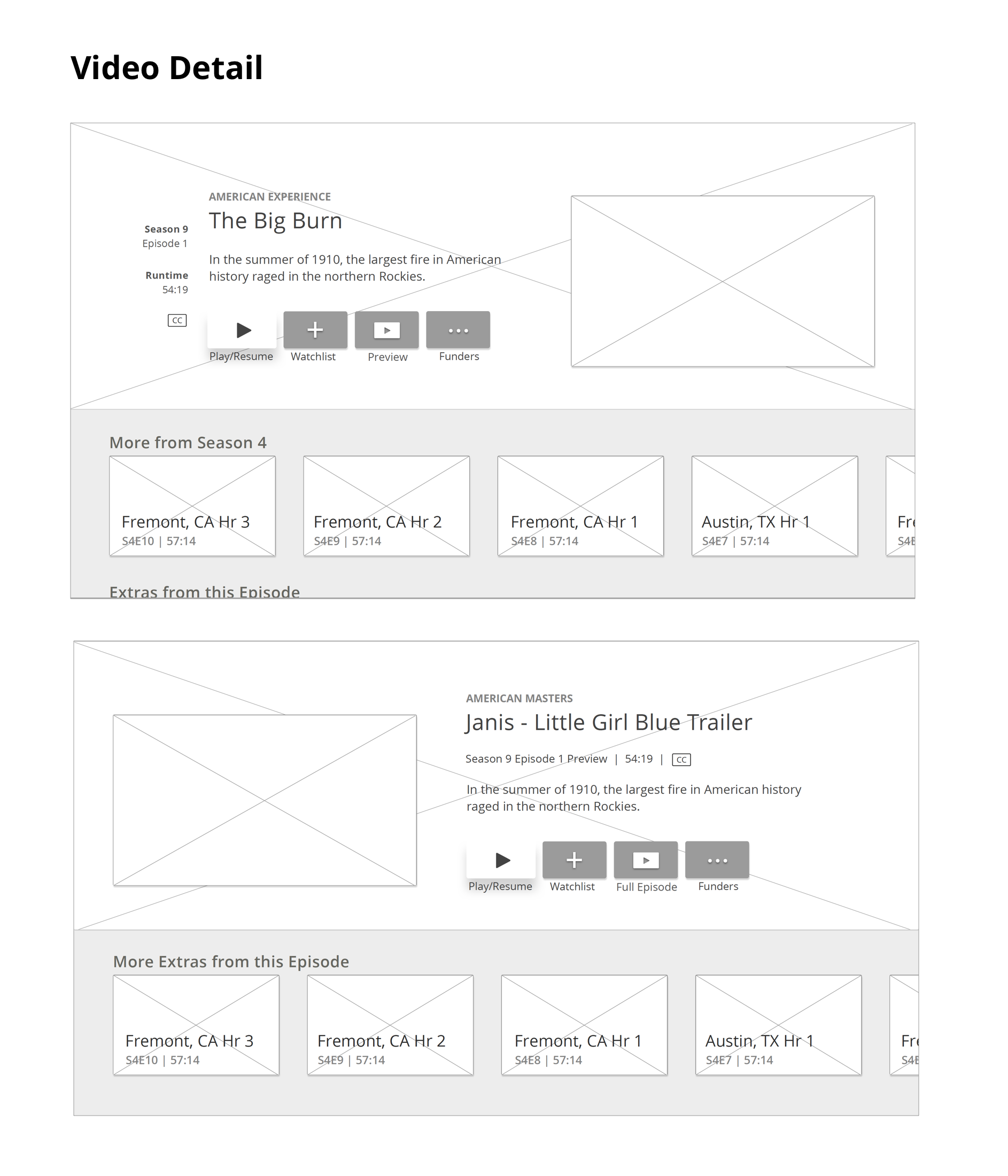
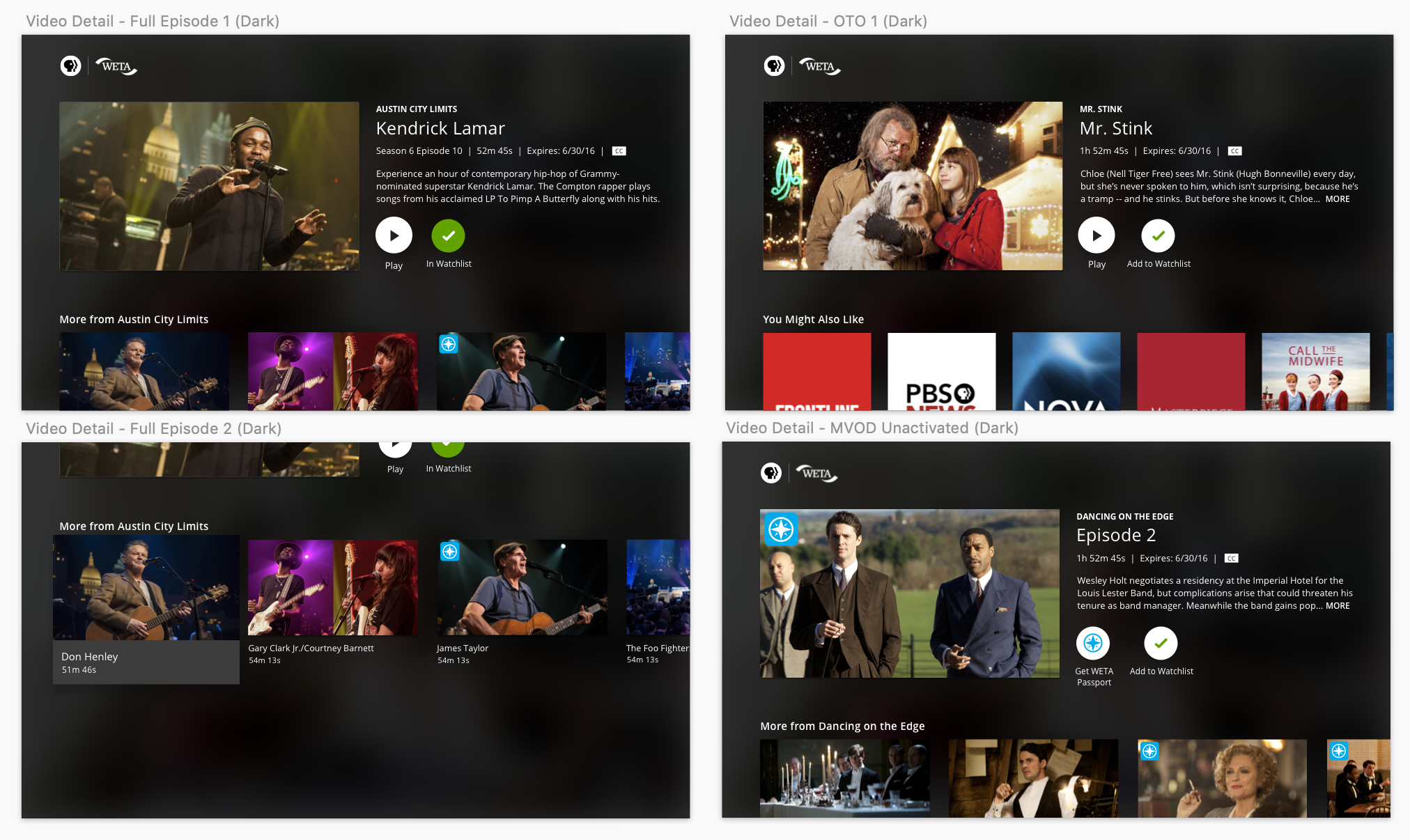
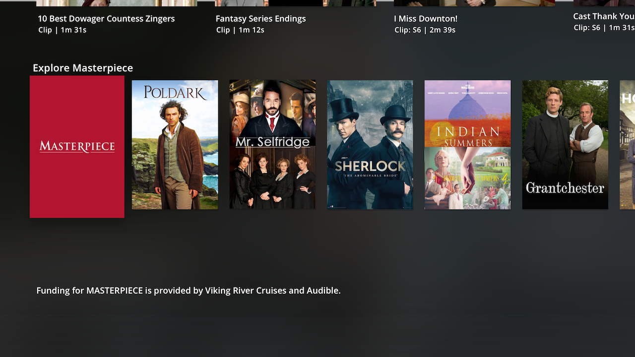
For the Video Detail screen, we decided that it was best to keep the components of our video pattern here (show name on top, then Video Title, then Video Metadata) consistent with the rest of the app, instead of breaking them up in a unique way just for this view. For the Franchise screen, through user testing we learned that users saw Franchise posters as synonymous with regular show posters — so we made the top of the Show Detail and Franchise experiences consistent.
User Flows
I mapped out key user flows, tasked with designing multiple platforms simultaneously for the large-scale Core Data Model update. Although challenging, I had to ensure that patterns would work across handset, tablet, and TV.
Visual Designs Rd 1
When we began visual design, I explored a range of treatments for global styles like buttons, focused and non-focused states, and how to represent show branding:
Final Visual Designs
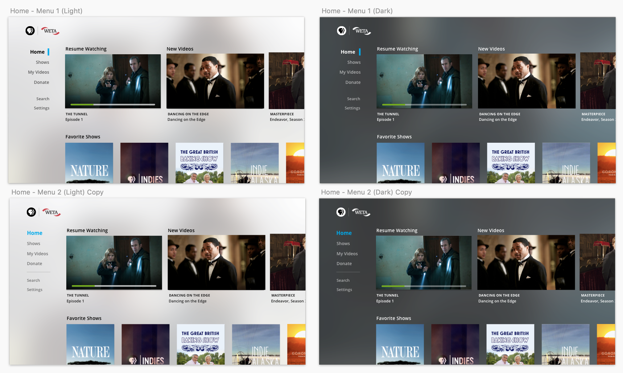
Ultimately, we landed on a visual design that striked the right balance for us, between feeling friendly and approachable as PBS, while also feeling like a sleek experience. I reserved circular forms for the main selected state of the main navigation, went with a sleeker and more polished button style for call-to-action buttons, and moved away from a “card” focus state to one that relied on drop-shadow and increasing size of the selected item by 10%.
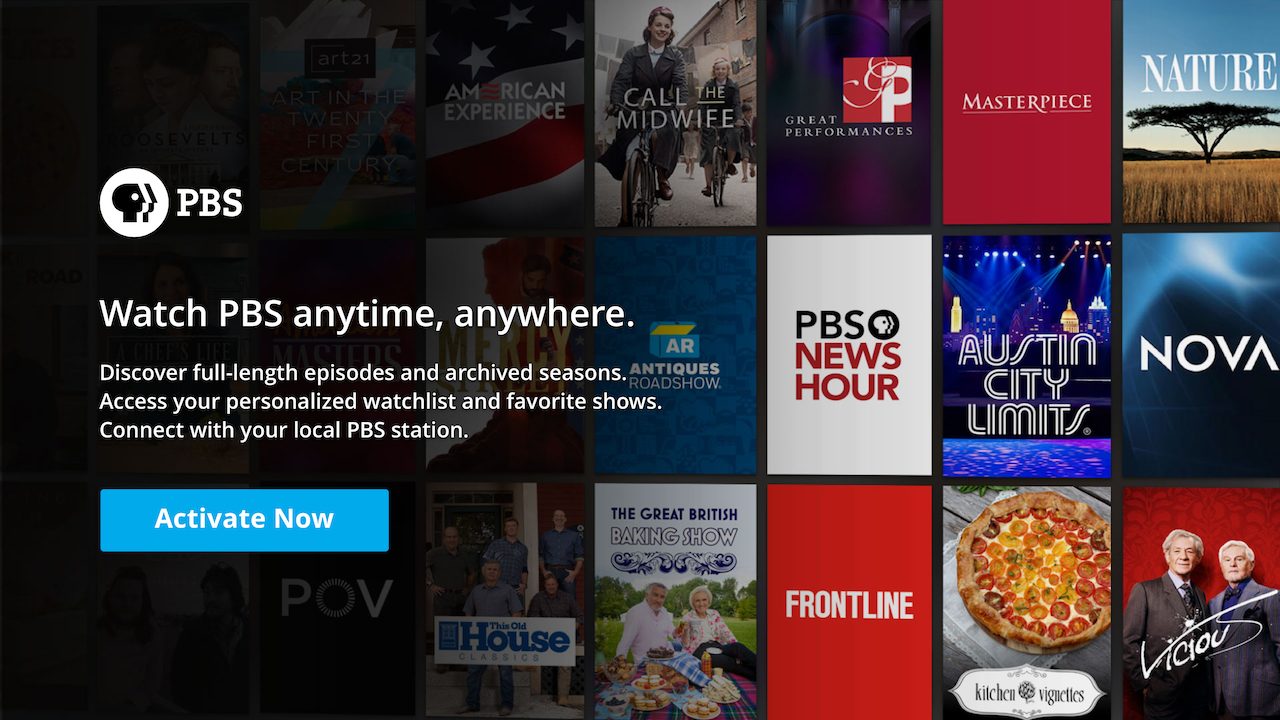
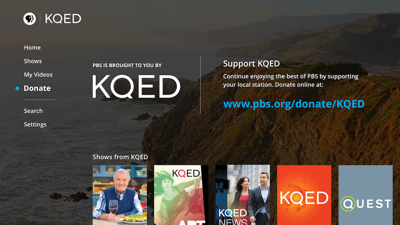
We carefully tweaked the main backgrounds (designed for both Light and Dark themes) until the contrast passed accessibility and they provided a good level of dimension and depth to the app. On Show and Video pages, we dynamically pulled from the Episode’s thumbnail and paired it with a gaussian blur to get an atmospheric feeling of the show or episode’s colors and mood.
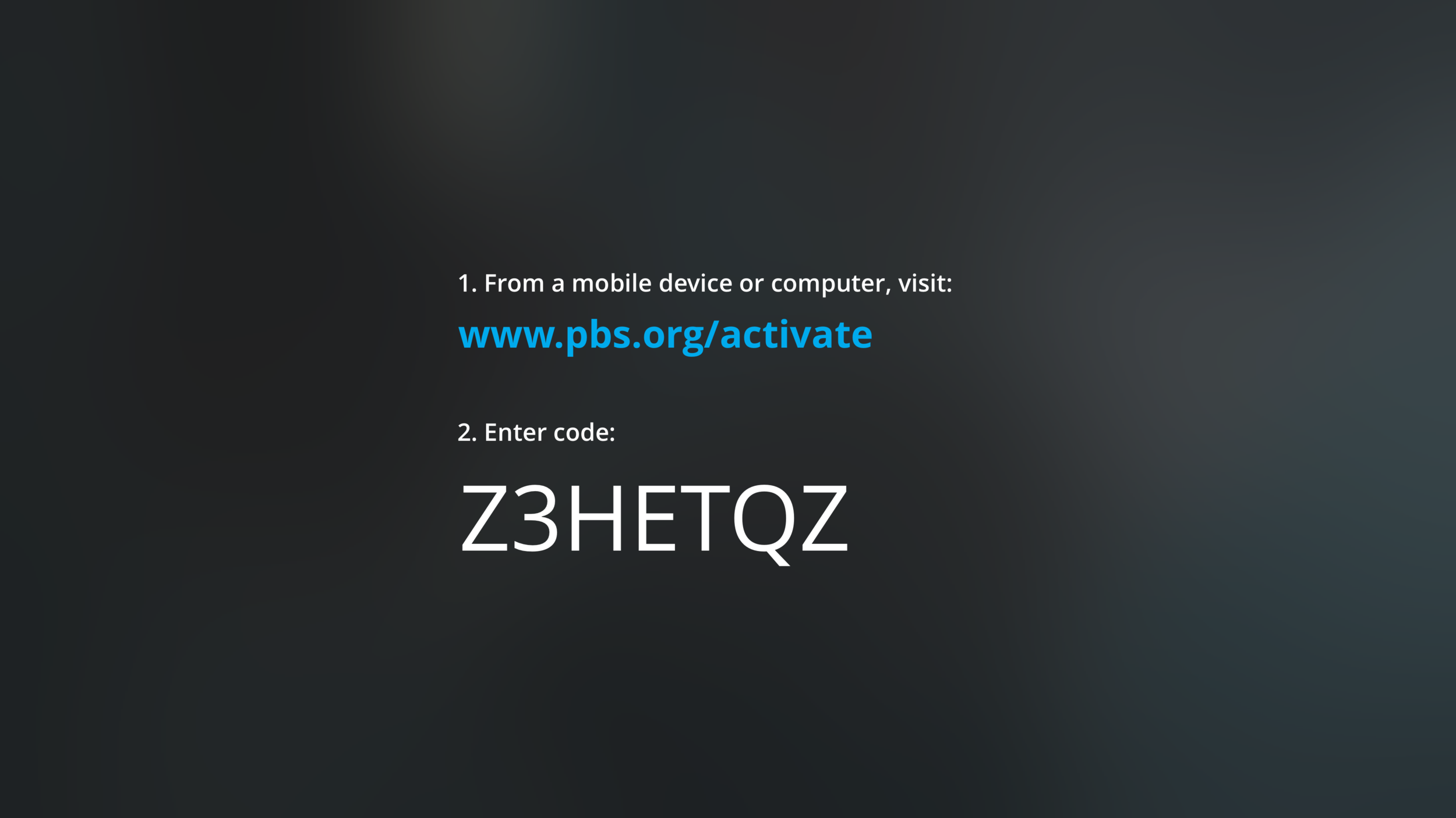
Activation, Home and Main Landing Screens Flow

Franchise, Show, and Video Flow
Outcomes
Our measures of success for this project focused on engagement, frequency, and reach. In the first month after the Core Data Model updates were released on tvOS, we saw:
51.7%
48.7%
7.8%
Increase in the average number of streams per user, from 2.6 streams to 4 streams/month
Overall increase in the number of sessions per user, from 4 sessions to 6 sessions/month
Increase in the number of new users
Team Members
Chris Koth (UX Direction), Jeff Tubb (Product Management), Denis Ujavca (Development), Susan Frazier and Eliza Jacobs (Audience Segmentation Study)